PROJECT INFORMATION
Olivier Brouard
Skidmore, Owings and Merrill
Harshul Singhal
- Excel
- jEplus+EA
- Openstudio
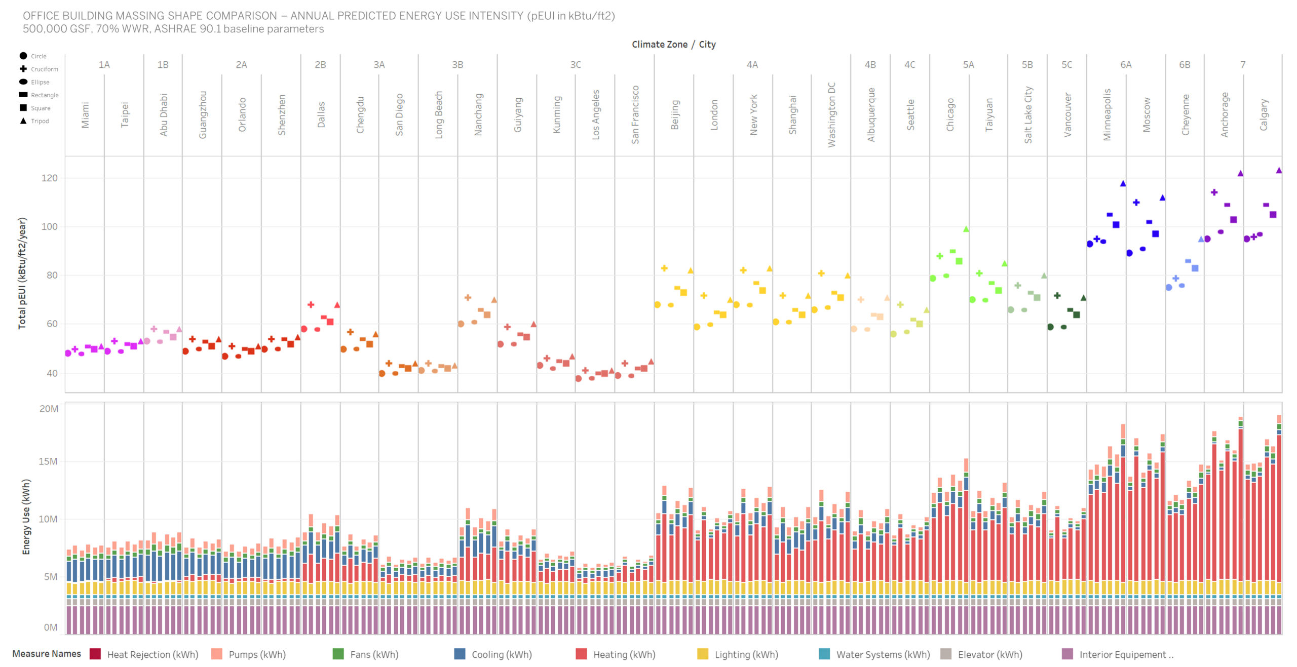
bar chart
Window-to-wall ratio, Massing Shape, Geometry
Graphic Information
The graphic shows an interactive dashboard aggregating all the energy runs made of different massing shapes (office building, 31 floors, 500,000 gsf, WWR 70%) across 7 climate zones in the world focusing on major cities where urban habitat is very dense. The results are aggregated into a single interface and normalized together using the predicted energy use intensity of the building expressed in kBtu/ft2 to allow various comparison.
- used Open Studio to create the building shape and set up the ASHRAE 90.1 baseline parameters - used jEplus to run parametric energy simulation across various climate zones - concatenated the results into a single Excel Spreadsheet - designed a dashboard with Tableau Software - hosted the dashboard on an internal server on the firm intranet for Designers to access and use
How the energy use is a function of the severity of the climate and what are the predominant loads driving the energy use of a building. What massing shape is the most efficient Where is the energy use going What are the climate zone and cities leading to the least and most energy use in the world Where is it more achievable to go for Net Zero How is the facade area and perimeter length of a massing driving energy use
The graphics offer a quick way to understand what massing perform the best and how the climate drives energy use. Larger surfaces area to floor area ratio increases the building energy usage. Across all climate zone, compact shapes perform better. The energy consumption is directly proportional to the amount of outer envelope in contact with the surrounding environment. The R² value of 0.842 shows a goodness-of-fit measure showing the pEUI of the building is almost linearly proportional to the Outer skin to floor area ratio.
It allows designers to access to a graphic summary that is straight forward and dynamic informing different outputs scaled at different levels.
Finding a way to graphically show how different orientations of the building could affect positively or negatively building energy and occupant comfort focusing on Predicted Mean Vote at the perimeter of the office spaces.
This is a joint effort of 3 people: - Olivier Brouard, Sustainability Engineering Team Leader - Harshul Singhal, Building Performance Analyst - Christine Tiffin, Daylighting Performance Specialist