What is the impact of chiller sizing and staging on annual plant energy consumption?
Michael Sweeney
AKF Group
Jeffrey Rios, PE, LEED AP - Partner
Project Information
Annual Chilled Water Load Profile from eQUEST model, efficiency matrices for several chiller configurations.
Annual energy cost to operate each chilled water plant, taking into consideration both consumption and significant, highly-variable demand charges.
1,100,000 SF
4A
- Office
SIMULATION PROCESS SECTION
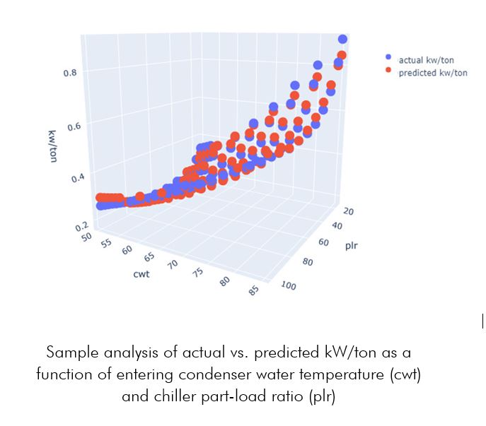
The primary question that drove the study was how chiller sizing would impact annual energy consumption and cost. The chillers being evaluated were very efficient at low part-loads and low entering condenser water temperatures; the fact that the manufacturer was able to provide us with a wide range of efficiency points enabled a more targeted and granular analysis than otherwise would have been possible.
- MEP Firm
- eQuest
- Schematic Design
The simulation was tightly integrated with the design throughout the SD phase. Pricing and full plant layouts were obtained for all chiller configurations, with the goal being to select the most energy-efficient configuration while remaining cognizant of practical design concerns such as available MEP space and first cost. The client was very hands-on and collaborative throughout the process, and there were frequent discussions between the MEP, modeling and client teams as the study progressed and design alternates were added and/or removed.
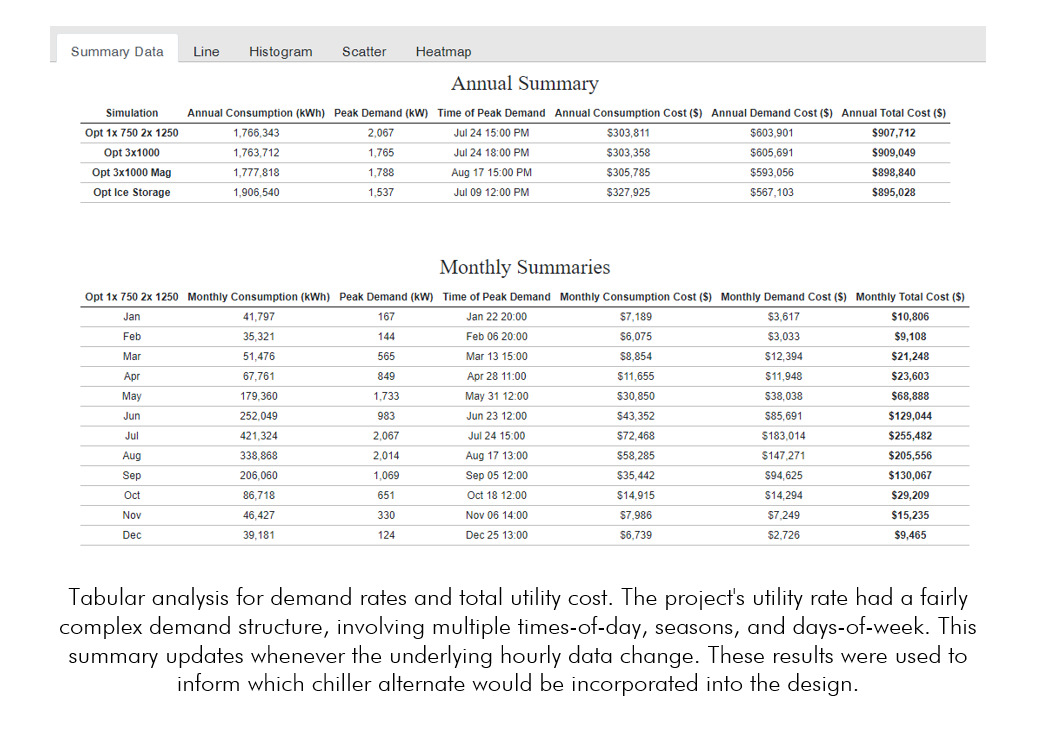
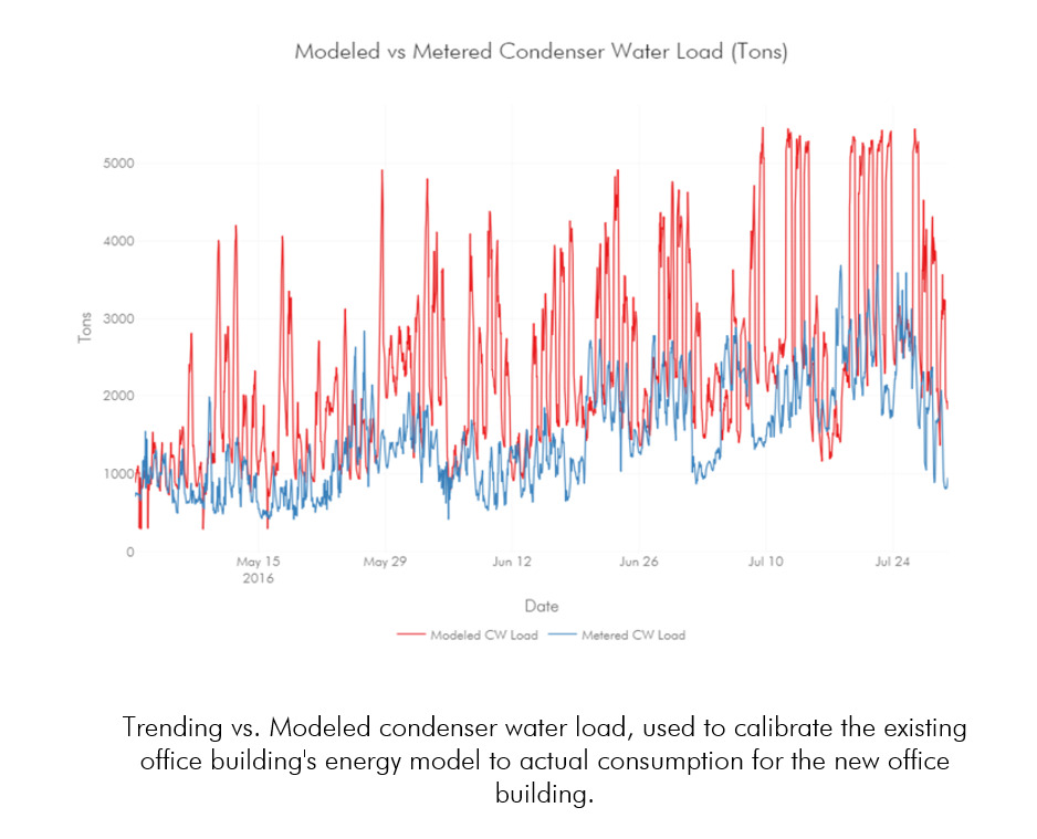
The initial chiller plant alternates were defined by the MEP Design team and owner: - (3) 1,000-Ton Conventional Centrifugal Chillers - (3) 1,000-Ton Magnetic Bearing Centrifugal Chillers - (1) 750-Ton and (2) 1,250-Ton Conventional Centrifugal Chillers - (1) 300-Ton and (2) 1,250-Ton Conventional Centrifugal Chillers - (3) 1,000-Ton Conventional Centrifugal Chillers plus an Ice Storage plant We used an eQUEST model developed for the client's existing office space, re-calibrated the chilled water load based on actual condenser water trending data, and then made adjustments for anticipated changes in square footage and critical loads in order to develop an hourly chilled water profile for the new space. The hourly annual chilled water load profile was then entered into eQUEST models for each plant alternate. Load management strategies were developed within eQUEST to maximize each chiller's efficiency based on part-load and condenser water temperature. Hourly results for chiller loads, condenser water temperature, pump energy and cooling tower fan energy were then exported from each simulation using Python. Once the results were in Python, we used SciPy to develop a multiple regression for the manufacturer-provided efficiencies, and we post-processed chiller compressor energy for each alternate accordingly. Hourly results for total plant kw were re-grouped and transformed using Pandas to conduct a time-of-day, day-of-week, and seasonal demand charge analysis.

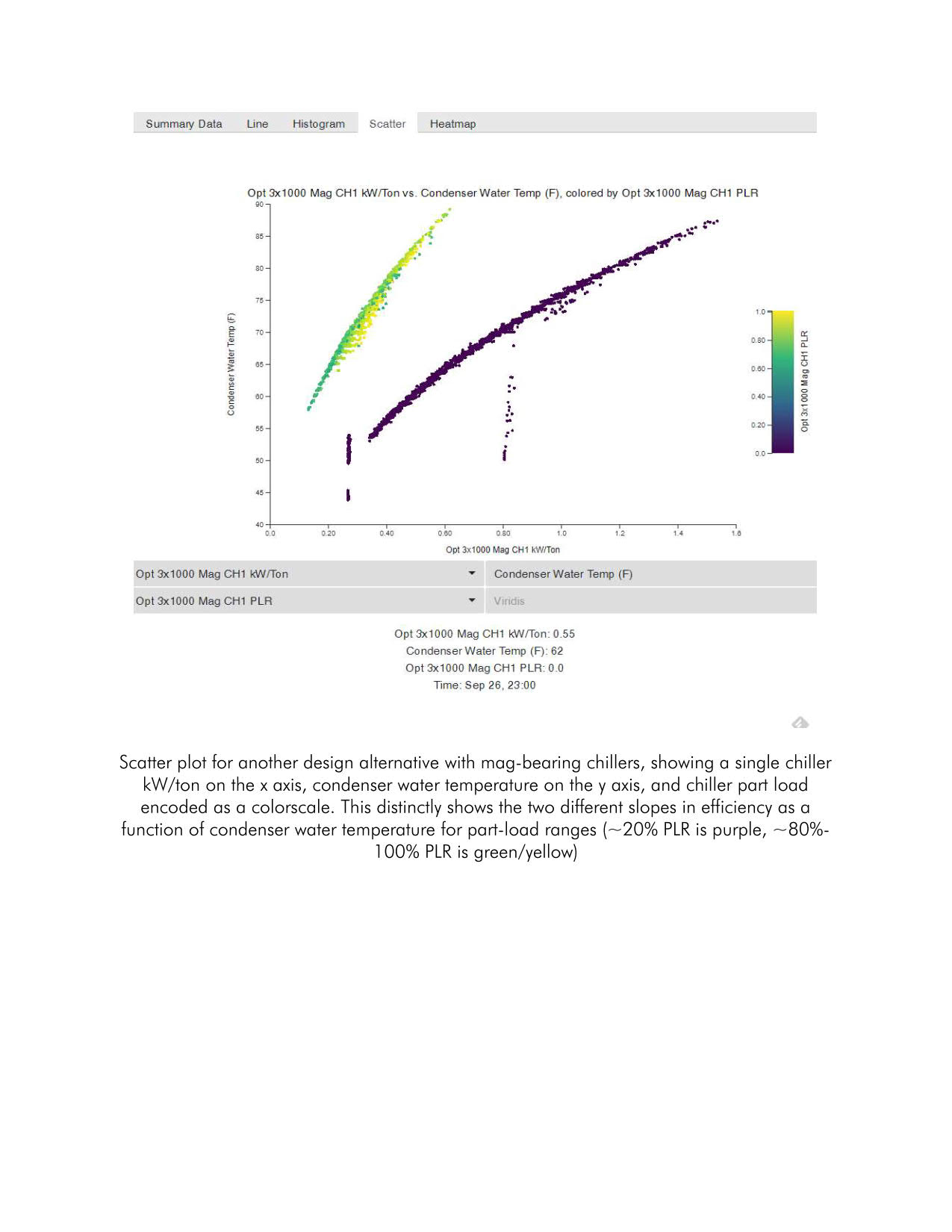
Because the entire project team was invested in the simulation results and chiller optimization strategies, we developed an easily-shareable interactive visualization platform that provided several different visualization types, including scatter plots, heatmaps, histograms and line charts. This enabled us to investigate the study in granular detail in real-time in project meetings, as well as share the platform to team members for their own targeted exploration. We found that being able to explore the dataset in real time enabled the project team to identify potential issues with their own assumptions, as well as help them understand trends and results in a deeper way than a simple annual cost table would have allowed.
We'd like to note that the initial graphics were developed using Python's Plotly/Dash visualization libraries, but they were subsequently transitioned into a more customizable JavaScript / D3.js web-based interface. Plotly and Dash are incredible platforms, and their teams deserve recognition for being the main inspiration for this visualization effort. The final results and visualizations of the study are available for exploration at the below link: https://michaelsweeney.github.io/chillervis/ (note: this website is best viewed on Chrome)