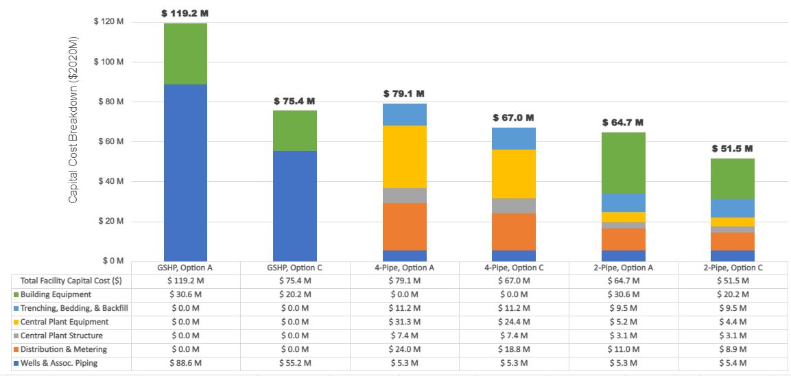
What is the impact of different GSHP options (DES -4-pipe/2-pipe, Building level GSHP)) on Capital Cost ($ M)?
Project Location:
Simulation Scale:
Application:
Audience:
What is this graphic showing? Describe the different parts of the graphic and how it communicates the data.
This graphic shows the total facility capital cost in $ M and its associated component breakdown. It helps to identify the breakdown of the total capital cost in each category and helps in identifying the implication of using different Ground Source Heat System options. In this graphic Option A represents 25% better than code building and Option C represents a Carbon Neutral Design. GSHP indicated each building on site have their own GSHP infrastructure, 4-Pipe system represent the high temperature system at District scale which eliminates the cost at individual building level and 2-Pipe system represents the ambient temperature system at District scale which requires additional equipment at the building level to get the desired loop circulation temperature in the buildings. Note, the project involves carrying out pre-feasibility of a community energy system - whether it makes sense to have a district system serving the whole community (5.5 Million Sf New Construction) or have buildings running on their own system. If yes, what are the options for a district energy system.
What type of graphic is this?
- Table / Chart
Design Variables
- HVAC performance/system selection
- Other
Is this part of the ASHRAE-209 cycle?
- Cycle 7 Energy Simulation-Aided Value Engineering
What tools were used for the simulation analysis?
- Excel
- IES-VE
What tools did you use to create the graphic?
- Excel
What was successful and/or unique about the graphic in how it communicates information?
Following can be identified as some of the successful features of this graphic: 1. 6 different options analyzed in 1 graphic (3 types of systems & 2 levels of bldg. performance) 2. Identifies total costs for high level comparison 3. Identifies individual breakdowns & associated categories 4. avoids using large number of pie charts & additional summary required to explain same amount of content
Is there anything else you would like to mention?