PROJECT INFORMATION
Olivier Brouard
Graph
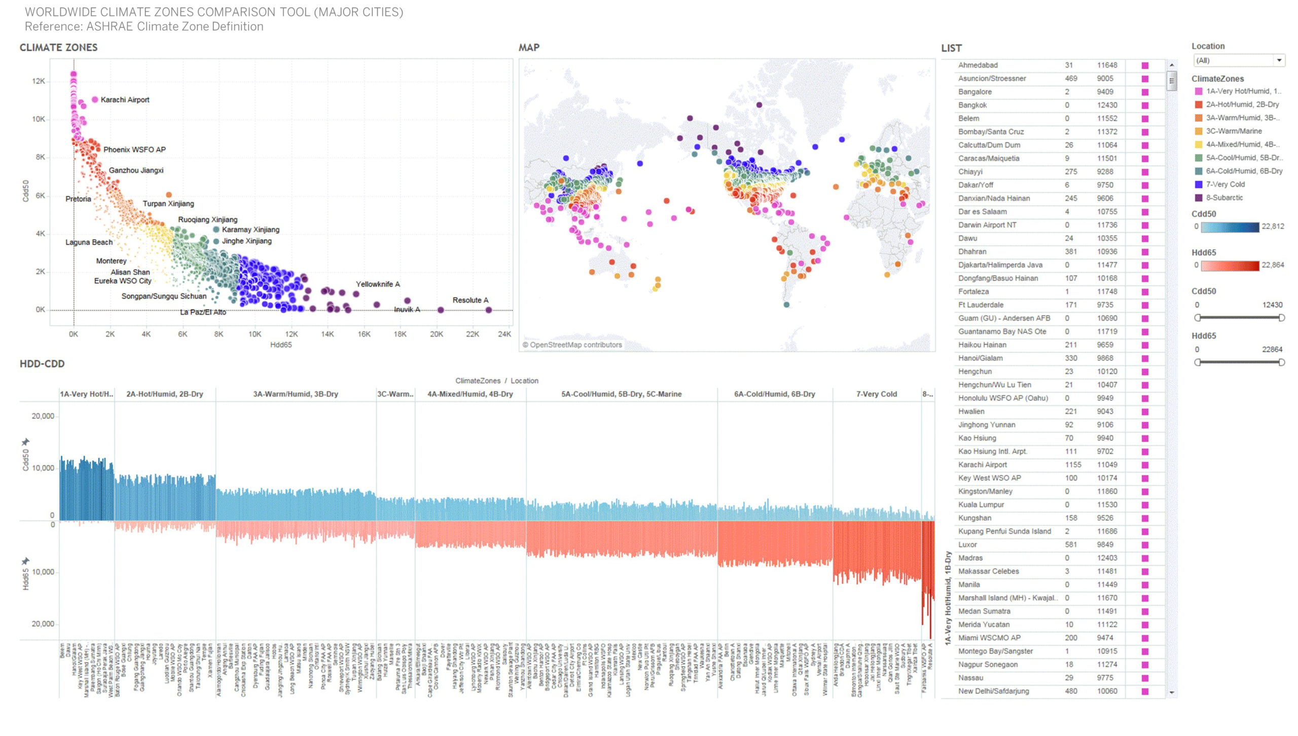
The World Meteorological Organization (WMO) weather file taken from the ASHRAE 2017 Handbook F14 Climatic Design Conditions (Heating, Cooling degree days, Climate Zones, Latitude, Longitude, City and Country)
Graphic Information
The graphic is showing climate severity as a function of the Heating and Cooling Degree days occurring in various climate zones and major cities in the world. The filtering options allow refining a selection browsing through the interactive dashboard to compare similar climate profiles across the globe (ie: Baltimore climate similar to Beijing climate) and to therefore establish design strategies as a starting point using precedents. The world map also locates specifically as a function of the latitude and longitude where is the weather station located.
The dataset was extracted from the ASHRAE handbook database referencing the WMO stations. Excel was used to parse and clean the data. Tableau software was used as a front end to graphically highlight each weather station variables. Additional filtering options were customized to make the tool engaging, interactive and dynamic.
Figuring quickly the climate zones for a specific project can take time browsing through the existing incomplete database and/or through each "epw and stat" files accessible from the DOE energy plus website.
The graphic allows a quick reading of the climate zones as a world scale in which the project sits and establishes a comparison with other locations in the world to identify similar potential high-performance design strategies.
The quick interactive feedback it provides to a design team without browsing through an excel table.
Embed a web link to download the epw, stat, ddy Energy+ files to get more detailed information. Link each station to a web link to the epw.klimaat.ca website to access the concatenated Climate summary PDF reports. Establish high-performance design strategies as a function of the climate zones and the program use type.
This is a joint effort of 3 people: - Olivier Brouard, Sustainability Engineering Team Leader - Arathi Gowda, Sustainability Engineering Team Leader - Neil Katz, Digital Designer Specialist