PROJECT INFORMATION
Kelsey Wotila
Comparative Charts
Structural Material Systems
Graphic Information
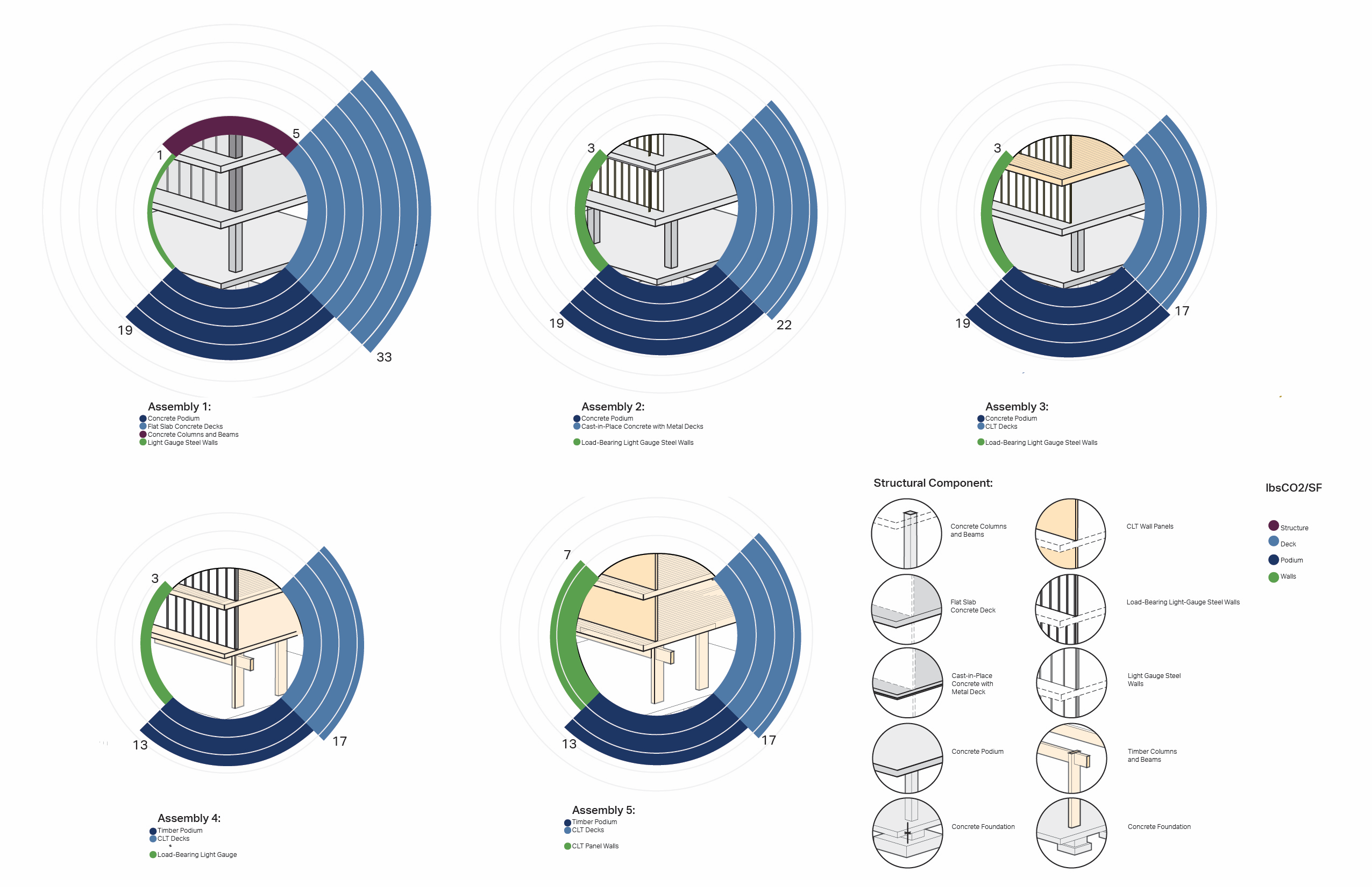
The comparison of each image within the graphic demonstrates the CEI (shown as relative area) of various components-clockwise from the top, Additional Structure (Columns and Beams), Deck, Podium, and Walls-of structural assemblies. An axonometric drawing within the graph shows individual components combined, and concentric circles match the lbsCO2/SF of that piece of the assembly. Visually, you can immediately read which assembly is most carbon-intensive, and which aspect in particular.
After building a shoebox model in Revit, the components were run through Tally to calculate a lbsCO2/SF quantity for each piece of structure. After totalling each assembly, the varied pieces become a "kit of parts" from which to mix and match. Their individual lbsCO2/SF corresponds to the width of that circle segment, charting and graphically displaying CEI both of the piece and of the assembly.
What impact does a building podium have on its overall embodied carbon footprint? How much carbon emissions does a mass timber structure save? What is the impact of podium on overall building structure?
The graphic explores 5 different design approaches to structure, from an aesthetic standpoint. The study of CEI per structure was meant to aid in the discussion of a mass timber architectural aesthetic, as well as making design decisions integrated with resilience and sustainability.
The graphic is simple, describes both the architectural decisions (structure type) and their implication to sustainability and climate, quickly and visually. Even without numbers, the "heaviest" or most carbon-intensive, option is apparent.
Integrate whole building lbsC02/SF, make the graphic interactive, and clarify the relationship of the axonometric drawing structural component to its CEI