PROJECT INFORMATION
Carl Sterner
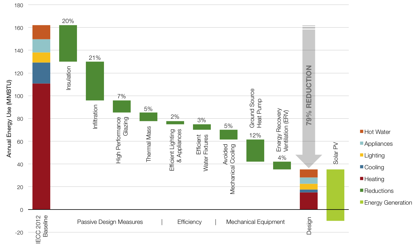
Chart
Envelope insulation (wall, roof & floor R-values), infiltration, glazing properties (U-value, SHGC), thermal mass properties, internal loads (lighting & appliances), DHW equipment, water fixture flow rates, HVAC systems, and on-site renewable energy generation.
Graphic Information
The graphic is answering the question “What combination of strategies gets the project to Net Zero Energy?” in a way that is accessible to a non-specialist audience. It begins with a code baseline case, showing the predicted annual energy use and end use breakdown of a new home built to IECC 2012 standards. It then shows reductions in energy use achieved by implementing a series of strategies, starting with passive measures, then efficient lighting & appliances, and finally efficient HVAC systems. The idea is to show both the relative importance of different measures, but also how, step by step, they add up to a significant reduction. The arrow above the Design Case highlights the overall reduction from the baseline. The Design Case is broken down by energy end uses to facilitate comparison to the baseline. Finally, the graphic shows the estimated on-site PV potential, which dips below the x-axis to show the potential for Net Positive Energy.
1. I built a baseline case in Sefaira and exported the annual energy consumption by end use. 2. Then I studied a number of combinations of strategies until I found a bundle that represented a realistic, cost-effective path toward the goal of Net Zero Energy, and again exported annual energy consumption by end use. 3. I then went back to the Baseline Case and added one strategy (or group of strategies) at a time, saving the annual energy use result at each step. 4. On-site PV potential was also modeled in Sefaira. 5. I compiled the data and created the graphic in Excel. 6. Finally, I used Photoshop for a small amount of post-processing (adding the reduction arrow and some of the text).
Is it possible to achieve Net Zero Energy for this project (given the site and programmatic constraints, and on-site renewable energy potential)? What is the best path toward Net Zero Energy for this project? How can I effectively communicate the strategy for achieving Net Zero Energy to a non-technical audience?—Specifically the importance of investing in passive design and efficiency measures?
This graphic was created in Schematic Design as a way of charting a path toward Net Zero Energy. The investigation that preceded the graphic was one of the more important (and most intensive) modeling exercises of the entire project, as it involved studying a large number of combinations of measures. The graphic concisely summarized the findings of that study, and provided a useful roadmap as we designed the envelope and mechanical systems. The specifications that came out of this analysis (e.g. R-45 walls, R-60 roof, high air-tightness) drove subsequent design decisions to a significant extent.
The graphic provides a clear, non-technical overview of a path toward an energy reduction target. This is helpful both for communicating results or recommendations, as well as for crystalizing the strategy in order to guide design decisions.
1. Find a way to incorporate basic design moves such as massing, orientation, and window-to-wall ratios. The fundamental problem with the “baseline and reduction” paradigm is that it misses the outsized impact of these key early design moves, because the baseline typically assumes the same geometry as the design case. 2. Better explain the “avoided mechanical cooling” item. Cooling was avoided by a combination of passive strategies (earth berming, shading, natural ventilation, ceiling fans) that got short shrift in this diagram. 3. Improve the color scheme and graphic quality. While the graphic is serviceable and clear, it is not as eye-catching as it could be.