PROJECT INFORMATION
Olivier Brouard
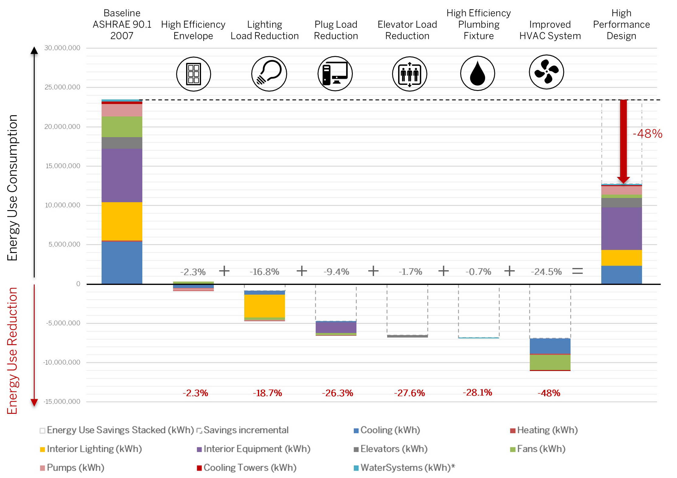
2d Chart
Window-to-wall ratio, Double Glazing, SHGC, R-Value Wall, Plug Load Density, Dayligthing Sensors, Elevator Loads, Light Power Density, HVAC system
Graphic Information
The graphic shows incremental energy savings measures and how each impact different end uses (cooling, heating, fans, pumps, heat rejection, plug loads, elevator loads, lighting loads) through each step. The following measures were incrementally implemented. 1- High Efficient Envelope Glazing percentage Optimization (40%) Horizontal sun shading (0.75m deep) N/E/S/W Improved glazing solar control (SHGC: 0.22) Improved envelope thermal control (U value) Reduced infiltration rate 2- Lighting Load Reduction: Reduced Lighting Power Density (LPD) by 40% to 6.4W/m² Daylighting dimming controls Occupancy controls 3- Plug Loads Reduction Reduced Plug loads by 20% with High efficiency equipment 8.6W/m² Plug load controls (ghost loads) 4- Elevator Loads Reduction Reduced elevator loads by 20% with Regenerative Elevators 5- High Efficiency Plumbing Fixtures Reduced Hot water demand by 40% with high efficiency plumbing fixture (reduced flow rate) 6- Improved HVAC System Decoupled Air Conditioning system (Ventilation and Cooling/Heating) Dedicated Outdoor Air System (DOAS) coupled with local Fan Coil Terminal Unit (FCU) Variable terminal units with Electro commutated motor (ECM) and local CO2 sensors
I used the output files of the Energy+ report and reformated each incremental run to graph them showing a stepped road map toward energy savings.
The envelope passive measures didn't have much impact on the overall energy savings as compared to the active measures given the fact this is an internal load driven office high rise building. Using daylighting sensors and LED lighting to lead to a big improvement as much as the improved HVAC system (DOAS with Smart Fan Coil Units) relying on a decoupled system compared against a Variable Air Volume system.
This graphic shows a possible road map to achieve 48% energy savings. The initial thought was to show how to get to a 50% target. It was learned that increasing the U-value of the enclosure lead to a small fan penalty trapping the heat generated by the plug load equipment increasing the cubic feet per minute airflow to cool the occupant down.
The way each incremental steps show on which end-use component the energy conservative measure has the most impact on.
Add a dollar-cost value to it to understand the ROI on each measure.
