PROJECT INFORMATION
John Nichols
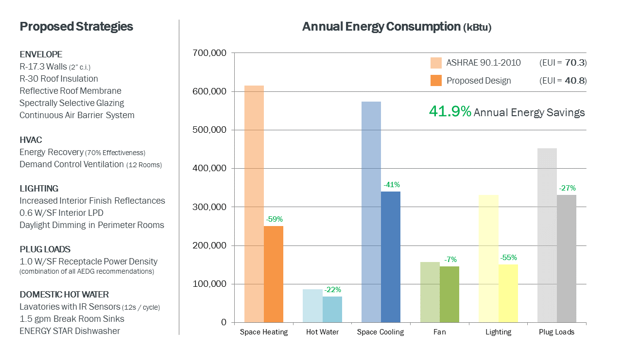
Chart
Wide range of ECM’s (envelope, HVAC, lighting, plug loads, domestic HW)
Graphic Information
The left-hand side of the graphic lists the various energy conservation measures (ECM’s) that were selected for the proposed design of an office building based on the results of a sensitivity analysis (see related graphic in previous submission). Different end use categories (e.g. space heating, space cooling, etc) are plotted along the horizontal axis of a clustered column graph, with their modeled annual energy use plotted along the vertical axis (in kBtu / yr). Shaded bars represent the ASHRAE 90.1-2010 baseline case with solid bars representing the proposed design. End use categories are color-coded with shaded bars to add visual interest and additional clarity. Green data labels indicate the modeled energy savings for each end use category. The total annual energy savings of the proposed design relative to the baseline case is also identified in large green font.
1) I started with the results of an energy model performed within Willdan’s NEO software and Sefaira’s web application (see related graphic in previous submission), focusing on the ECM’s that were ultimately selected by the design team for the proposed design. 2) I transferred the results of these simulations into an Excel spreadsheet to create a clustered column graph of the baseline vs. proposed design. 3) I finished by importing the Excel graph into Microsoft PowerPoint to combine it with a list of the proposed design strategies and the total annual energy savings resulting from the analysis.
- How can we demonstrate the annual energy savings of the proposed design relative to the ASHRAE 90.1 baseline case quickly and easily to our client? - Which end use categories (e.g. space heating, space cooling) have the highest and lowest energy use in both the baseline case and proposed design?
- The graphic demonstrated that space heating and space cooling constituted more than half of the total baseline energy use, making them good targets for strategies that could reduce peak heating and cooling loads (e.g. glazing type and air-side energy recovery). - This graphic also showed that domestic HW and fan energy represented only 10% of the total baseline energy use, allowing the design team to invest less time and money on ECM’s targeting these end uses. - Importantly, the client came away from this graphic with a better understanding of the energy efficiency strategies being proposed for their building and how these strategies resulted in considerable savings for different end use categories.
The simplicity of the graph (end use categories on one axis, results on the other) combined with the detailed list of the proposed ECM’s on the opposite side of the graphic makes the information easy to interpret for a wide range of audiences. The use of a clustered column graph as opposed to a stacked column graph makes it considerably easier to understand the contribution of each end use category to the total energy consumption. This type of graphic has proven especially helpful during design discussions with our clients.
Given the goals of the analysis (quickly communicate the impact of the proposed ECM’s on the total energy use), this graphic does a good job of presenting the primary findings without requiring much time to create. Future adaptations of this graphic may organize the list of ECM’s in descending order of impact (i.e. strategies with the highest annual energy savings at the top).