PROJECT INFORMATION
Olivier Brouard
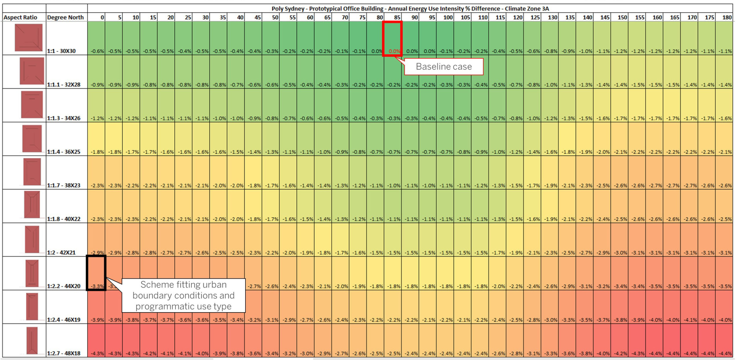
2d Chart
Orientation, Width and Length, Same Gross Floor Area, Same conditioned floor area, Same unconditioned floor area across all schemes
Graphic Information
The graphic shows a heat map reflecting 370 whole building energy modeling simulations following 2 main variables: rotation and variation of the dimensions (length and width) of an office massing, made of 23 floors. Each rotation is incremented by an angle of 5° from 0° north to 180° (shown on the horizontal axis). 10 different aspects ratio is proposed using the same gross square footage for each scheme (shown on the vertical axis). The climatic information shows the sun radiations come from the north in Sydney. The heating and cooling degree map suggest a mild climate where insulation is necessary as much as solar radiation control. Thus the impact of the orientation and aspect ratio of the scheme was the first step to underline where is the fine line between performance and urban site fitting.
The graphic was made using Excel after aggregating the pEUI of the output energy runs. A conditional formatting rule is applied to show low to high values.
Understand the impact of the orientation and aspect ratio of the scheme on the overall energy use before optimizing the envelope and addressing the active systems and renewables if applicable.
This graphic shows the magnitude impact of the climate environmental variables on a building (temperature, solar radiations) and how to best understand bioclimatic design as it relates to low solar angle beam radiations. Shortening the west and east exposure leads to a few % of energy savings as compared to maximizing their exposure to the west and east orientations inducing more cooling penalty.
The graphic shows that a compact massing performs better overall by 4.3% as compared to the worst case. The best case was a squarish massing orientated 85/90 degrees north with a side core located to the East to address the low beam solar radiations. The envelope area to volume ratio drives the variable load energy use.
I would have formatted the heat map into Tableau software to allow a dynamic selection of a specific case highlighting the energy use pie diagram showing how cooling and heating loads can vary as a function of the orientation and aspect ratio.