PROJECT INFORMATION
Kevin He
- Grasshopper
- Grasshopper DIVA
- Rhino
temp
Primary Inputs: Louver Material, WWR, Building Lifespan, Louver Sizing and Placement, Location. Secondary Inputs: Carbon intensity of aluminum, wood, and glass louvres by volume, Carbon intensity of assumed cooling necessary to offset conductance and solar heat gain in scenarios with and without louvers
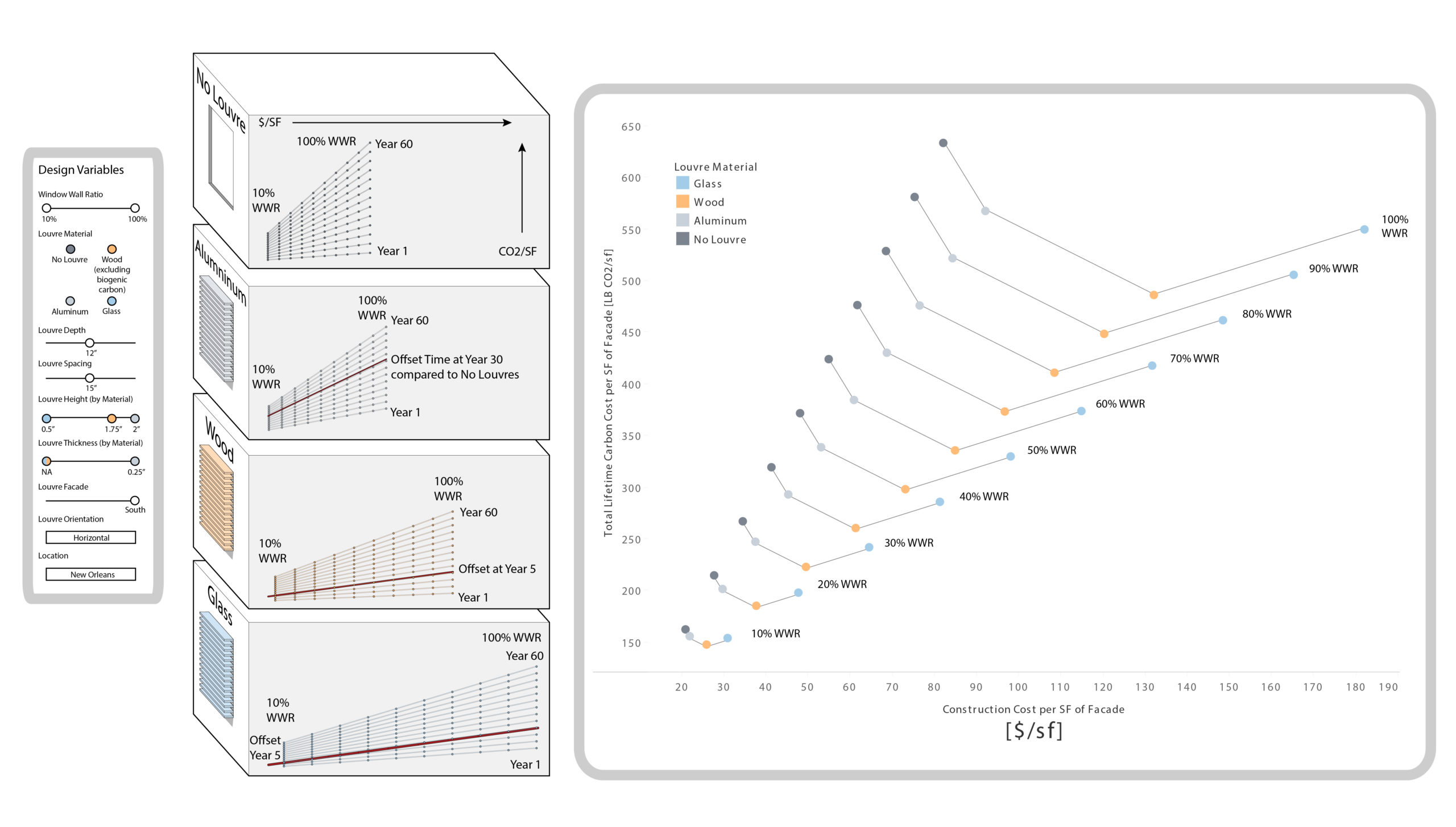
Graphic Information
The graphic displays the design variables in the model, how the shoebox model is laid out, and the final result of the study. The design variable table shows the inputs that generated the results, and they also double as the range of inputs that are available in the parametric grasshopper model. The set of shoebox models show the geometric output of the variables along with respective graphs that detail each louvre material types' relative carbon intensity and cost efficiency. The time of offset (when the total lifetime carbon footprint of a no louvre system exceeds the carbon footprint of a louvre system) is shown as the time when the slope of carbon values from the no louvre results for a given year exceeds the slope of values for louvre results in the same year. The final graph forms a quantitative decision tree for selecting a WWR and louvre type to reach carbon and cost benchmarks. The graph charts 4 different variables: total lifetime carbon cost per sq. ft. of the facade assembly (carbon intensity), construction cost per sq. ft. of the facade assembly (cost efficiency), louvre types, and Window-Wall Ratios. By displaying results through two quantitative axes, the graphic allows for decision-making on account of carbon and cost efficiency.
The shoebox model was constructed in Rhino using the inputs as dynamic controls in Grasshopper. A Diva analysis generated the solar heat gain values that were then transferred to an excel sheet with all inputs and constants. The total lifetime carbon was then calculated and graphed in Tableau. Finally, the visualizations for inputs, the shoebox model, and the graph were compiled in Illustrator.
What louvre type, if any, should be used to minimize the carbon footprint of a facade? What Window-Wall Ratio (WWR) is optimal for different louvres? Given a specific construction budget and maximum WWR, what wall system is the least carbon intensive strategy?
The graphic showed that to transform a study/tool into functional information requires multiple levels of knowledge distillation/refinement. Multiple conclusions can be made using the model depending on how much time the user has to examine it.
The graphic details the specific inputs that were used in the calculation of the results. In essence, the graphic also informs the process of the study and allows for adjustment of variables in future studies. The final graph also gives a set of design decisions that can be made for real world project constraints such as by construction and carbon budget instead of merely showing performance data. By quantifying the results in project terms, designers can more easily make design decisions without the difficulty of trying to interpret performative data.
More time would have been spent on refining the model so that more inputs could be accounted for.