PROJECT INFORMATION
John Nichols
- Sefaira
temp
Wide range of ECM’s (envelope, HVAC, lighting, plug loads, domestic hot water)
Graphic Information
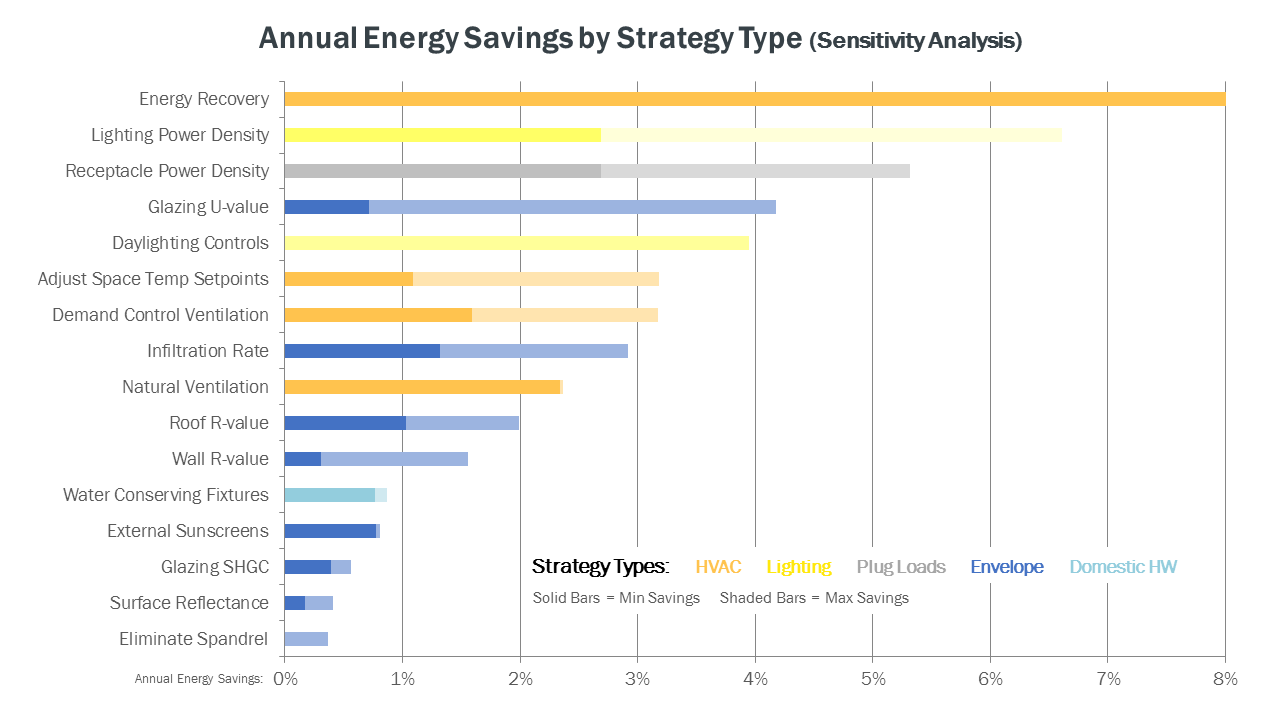
Different energy conservation measures (ECM’s) for a proposed office building are plotted along the vertical axis of a stacked bar graph, with their modeled annual energy savings plotted along the horizontal axis (in $ / yr). ECM’s are plotted in descending order with those that resulted in the largest annual energy savings located at the top of the graph. ECM’s are also color-coded by category (HVAC, lighting, etc) to help the viewer discern which categories led to the most energy savings as a group. A high and low range for the potential impact of each ECM is plotted on the graph through the use of solid and shaded bars.
1) I started with a wide range of different ECM’s that were simulated within Willdan’s Net Energy Optimizer (NEO) software and Sefaira’s web application. 2) For each ECM, I simulated two different inputs representing the high and low end of what the design team deemed to be achievable for the proposed building. 3) I then populated the results from these simulations into an Excel spreadsheet created specifically for this type of analysis to display the results in a stacked bar graph format.
- Of all the various ECM’s available to the design team, which ones have the most and least impact on annual energy savings? - Which category of ECM’s (e.g. envelope, HVAC, lighting) is this particular building the most sensitive to?
- The graphic demonstrated that investments in annual energy recovery (e.g. enthalpy wheels) and lighting power density reductions (e.g. improved fixture optics) yielded the greatest annual energy savings. Ventilation rates were slightly higher for this building vs. typical office buildings due to a number of lab spaces. - This graphic also confirmed the design team’s hypothesis that most envelope ECM’s (e.g. increased roof and wall insulation beyond code) would have only a limited impact on annual energy savings, which is a common obstacle we face for most of our medium to large commercial buildings in this climate zone (4A). - Glazing U-value was the one major exception within the ”envelope” category, with even modest reductions in thermal conductance leading to significant annual energy savings. - All of these results were used during budget and design meetings throughout the Design Development phase to help the design team focus on the ECM’s that had the “best bang for the buck.”
The combination of color-coding, descending sort order, and solid / shaded bars helps the graphic quickly communicate a large volume of information that would be much more difficult to analyze in the default tabular form generated by most energy modeling software. The simplicity of the graph (input variables on one axis, results on the other axis) makes the information easy to interpret for a wide range of audiences. This type of graph has proven especially helpful during design discussions with our clients.
Given the goals of the analysis (quickly communicate the impact of multiple ECM’s), this graphic does a good job of presenting the primary findings without requiring much time to create. By combining this graph with information on the installed cost for each ECM, the design team has been able to identify which ones may be cost prohibitive vs. those that have a very favorable payback period and return on investment. Future adaptations of this graphic may incorporate this cost data through the use of simple symbols (e.g. $, $$, etc) or actual numerical amounts.
One caveat we always include with this type of graphic is that evaluating individual ECM’s in isolation can result in an incomplete understanding of their aggregate impact. By “bundling” different ECM’s together in response to this analysis, the design team can identify potential trade-offs and diminishing returns between strategies (e.g. a better building envelope may reduce the savings associated with a more efficient HVAC system, but may also reduce the peak loads and required size of that system).