PROJECT INFORMATION
John Nichols
- Adobe Illustrator
- Excel
- PowerPoint
temp
Envelope U-values (roof, wall, floors, and glazing), infiltration and ventilation rates, occupant density, interior lighting power density, and interior equipment power density
Graphic Information
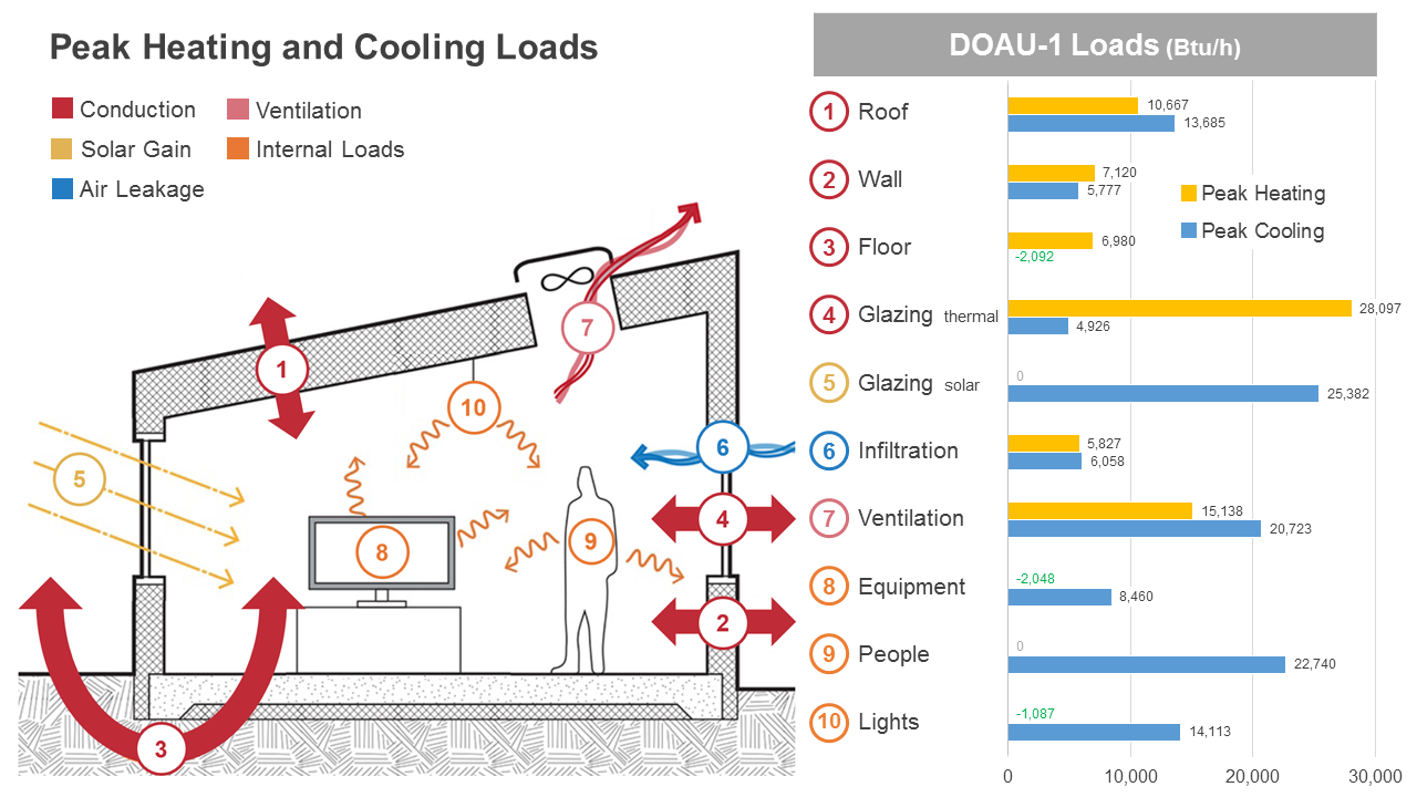
Different internal and external loads are shown in the illustration of a prototypical space. These load types are individually numbered and color-coded by category: Conduction (1-4), Solar Gain (5), Air Leakage (6), Ventilation (7), and Internal Loads (8-10). The right-hand side of the graphic consists of a clustered bar chart detailing the contribution of each load type (1-10) to the peak heating and cooling demand experienced by the system (in this case, a Dedicated Outside Air System (DOAS) for an elementary school admin wing). Load types with a beneficial impact on peak demand are labeled in green text (e.g. conductive loss through the floor slab during peak cooling conditions).
This graphic was developed jointly by John Nichols of Moseley Architects and Carl Sterner of Sol Design + Consulting. 1) We started by drawing a prototypical space in Adobe Illustrator, using graphic representations of the external and internal loads. 2) After creating and labeling the illustration, we simulated the project’s peak heating and cooling demand within Trane TRACE 700 using ASHRAE 90.1-2010 as a baseline. 3) We then exported the “Systems Checksums” report in TRACE to identify the contribution of each load type to the peak demand experienced by the system. 4) These loads were imported into an Excel spreadsheet to create a clustered bar graph of the data before combining the original illustration and the bar graph within Microsoft PowerPoint.
- Of all the various internal and external loads experienced by the system, which ones have the most and least impact on the peak heating and cooling demand? - Are there any load types that have a negative impact on peak heating loads but a positive impact on peak cooling loads, or vice versa?
This graphic identified a number of key “drivers” of the peak heating and cooling loads for this project, which were used throughout the Schematic Design and Design Development phases to identify additional load reduction strategies for each one: - Ventilation has a significant impact on both heating and cooling, incentivizing the adoption of strategies such as air-side energy recovery, demand-control ventilation, and HVAC occupancy sensors. - Glazing U-value was much more important to peak heating than peak cooling, primarily due to the delta-T between indoor and outdoor temperatures in this climate zone (4A). The design team explored significantly lower Solar Heat Gain Coefficients (SHGC’s) for the South-facing and SW-facing glazing in response to these load calculations and preliminary energy modeling. - The floor slab had only a small impact on peak heating and a modest but positive impact on peak cooling (green text). This finding confirmed the design team’s decision to only insulate the slab perimeter where required by code. - Building occupants, interior lighting, and receptacle equipment all have a significant impact on peak cooling, but only the latter two can be realistically reduced. Strategies that reduce interior lighting power density (LPD) and receptacle power density (RPD) were found to greatly reduce peak cooling demand as well as the direct energy consumption attributable to those two end uses.
The combination of an eye-catching illustration with a simple bar chart allows the graphic to communicate a great deal of information in a format that non-experts can easily understand. This graphic has been successful for discussing project-specific data with clients and design teams as well as conveying the underlying building science principles associated with heat transfer and HVAC load calculations. This graphic is also adaptable in that it can incorporate data from preliminary load calcs or detailed energy models, depending on the timing and purpose of the analysis.
Given the goals of the analysis (identify the main drivers of peak heating and cooling demand), this graphic does a good job of presenting the primary findings without requiring much time to create. However, since HVAC load calculations are typically performed for individual rooms or systems, this graphic is currently representing only a portion of the building rather than the entire project as a whole. Future adaptations of this graphic may investigate the use of a spreadsheet format in lieu of the bar chart to display the peak loads for multiple systems (e.g. DOAU-1, DOAU-2, etc) as well as the date/time when each one peaks.