PROJECT INFORMATION
John Nichols
- Excel
- Sefaira
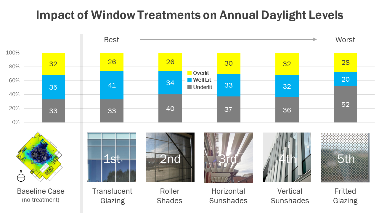
bar chart
Five different potential window treatments (translucent glazing, roller shades, horizontal sunshades, vertical sunshades, fritted glazing)
Graphic Information
The left-hand side of the graphic displays an sDA daylight visualization for a college dining hall with no window treatments (“Baseline Case”). Five different potential window treatments are shown on the right-hand side of the graphic. The graph running along the top half of the graphic communicates the amount of floor area in each option that is considered Underlit (falls short of LEED v4 sDA target), Overlit (exceeds LEED v4 ASE limit), and Well Lit (achieves both the sDA and ASE targets). Data labels display the modeled percentages for each option. Window treatment options are organized from left to right as “Best” to “Worst” based on how much floor area in each option qualified as Well Lit. This ranking is further communicated through the use of numerical values for each option (1st, 2nd, etc).
1) I started by simulating the sDA and ASE values for the proposed dining hall project without any window treatments using Sefaira’s SketchUp plugin, following by simulating these same values for the five different window treatments. 2) I tabulated the results of this analysis into an Excel spreadsheet to create a 100% stacked column chart showing the Underlit, Well Lit, and Overlit areas for each option. 3) I then imported this Excel graph into Microsoft PowerPoint in order to combine it with photographic examples of each window treatment and additional text summarizing the results. (Photographs used in the graphic are a combination of images from public domain and Moseley Architects’ past projects).
- Which window treatments will result in the best and worst daylight performance (as measured by Well Lit floor area)? - Which options will result in significantly less daylight (as measured by Underlit area) and/or glare (as measured by Overlit area)?
This graphic revealed a number of expected and unexpected results, which were used by the design team to decide which window treatment(s) to include in the proposed design: - Fritted glazing led to a drastic increase in the amount of Underlit area with very little improvement in the Overlit area, leading to considerably less daylight reaching into the building core. - Vertical sunshades were largely ineffective at reducing glare and redirecting daylight due to the path of the sun bypassing these fins for most of the year. Using different depths and angles did not lead to significant improvements. Horizontal sunshades were slightly more effective, but blocked daylight on most facades instead of redistributing it. - Translucent glazing resulted in the most Well Lit area since this option allows daylight to be redistributed into the building core while reducing glare and direct sunlight in the perimeter areas. The design team used these results to propose a combination of translucent glazing and interior roller shades for additional solar control. It was noted that the results of this analysis were very much project-specific, since the relative ranking of each option could vary greatly depending on floor plan layout, façade design, and building orientation.
The simple “rank order” layout of this graphic allows it to be easily understood by the design team and client, while still communicating sDA and ASE values through the column graph for those interested in more details. Photographic examples of each window treatment helped to ensure that team members had the same understanding of what was being considered for each option and their aesthetic relevance to the proposed design.
Given the goals of the analysis (quickly identify the “best” and “worst” window treatments in terms of their daylight performance), this graphic does a good job of distilling complex information without requiring much time to create. Earlier versions of this graphic attempted to include the annual energy consumption of each option for a more complete understanding of their relative merits. This approach ended up being visually cluttered to the point where daylight and energy results were better displayed on two separate pages, but future adaptations may find a way to effectively combine both sets of results in one single graphic.