PROJECT INFORMATION
Sukreet Singh
- Excel
- Sefaira
heat map
Glazing Ratios, Wall R-Value, Glazing Properties, Roof R-Value
Graphic Information
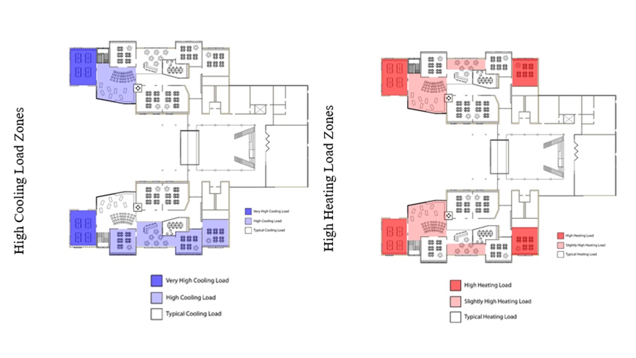
The data is communicated using the gradation of the color. Darker the color more impactul the area on overall loads. Red is for heating load and blue for cooling load.
The tabular output from Sefaira was interpreted and converted to graphical format. Certain thresholds were set in excel which categorized the color in Very High/ High / Typical load categories depending upon how far the values were from typical rule of thumb for high performing building. The colors were then overlaid on floor plan using photoshop.
What's the optimum window to wall ratio? Which areas are high impact areas for reducing or optimizing WWR or glazing properties. Would increasing envelope insulation values make a difference?
The analysis informed the design to understand the troublesome areas and then put thought on exploring different designs that would reduce the overall load on the building. Glazing were moved, removed, replaced or changed orientation as an outcome.
Easy way to illustrated the troublesome areas instead of trying to figure out what's going on with the loads report or let the engineer deal with the design decisions.
Saved all the different iterations and created a final combined graphic that shows the iteration on one side and loading calcs on the other.