PROJECT INFORMATION
Elliot Glassman
- Excel
- Grasshopper
temp
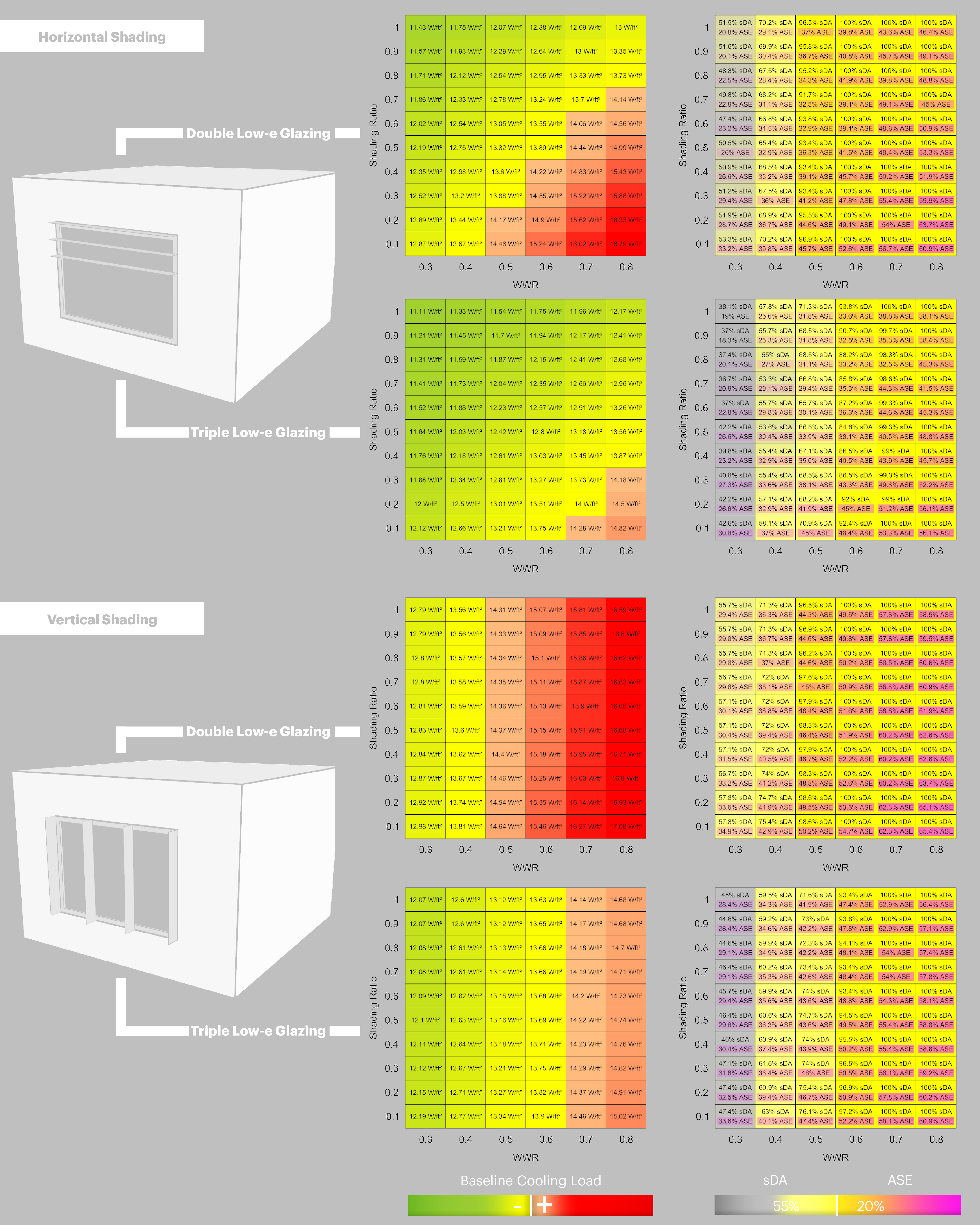
Window to wall ratio, shading type, shading ratio, and glass selection
Graphic Information
The matrixes represent the different combination of window to wall ratio and the shading ratio. The load diagrams are color coded based on an ASHRAE baseline facade to indicate which passive design options beat code. The diagrams will indicate whether horizontal or vertical shading is more effective and what increase in shading is needed to compensate for an increase in WWR. The daylight diagrams show the daylight and direct sun performance of the same options.
A Grasshopper script was set up to do the parametric runs for daylight and energy on a shoebox model and record the results in an Excel database. Another script created the result matrixes from this database and color coded the cells based on the results, exporting images files for each façade.
At an early phase of the design, we wanted to investigate the façade parameters that would allow the project to meet a stringent energy code compliance. We decided to do a parametric analysis to find options that would work an understand the tradeoffs between WWR, shading, and glazing properties.
The graphic was one of multiple such images produced for critical zones and orientations around the buildings that represented the majority of conditions found in the building. Each were studied with parametric shoebox models and this allowed us to find viable façade solutions to reduce loads against a baseline given a given set of solar and internal conditions. The images showed the tradeoffs between WWR and shading and indicated that horizontal shading was more effective than vertical. It also indicates that a moderate WWR is sufficient to provide good daylight. By using a better glazing, there was more flexibility in WWR without increasing shading.
The color coding gave a very clear indication about the performance of various options against the code baseline and the 2D graph is very intuitive.
Tried to find a way to integrate the two glazing types into a legible 3D graph to incorporate more parameters.