PROJECT INFORMATION
John Nichols
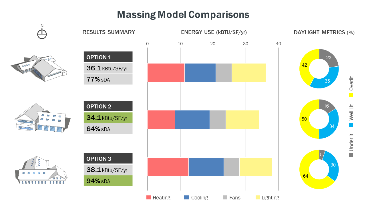
Bar Chart
Three different massing models with significant differences in building form, solar orientation, and the number of floors
Graphic Information
Three different massing models for a proposed fire station project are shown on the left-hand side of the graphic with the remainder of the graphic used to communicate the results of the energy and daylight analysis: “Results Summary” summarizes the EUI and sDA results for each massing. Green shading is used to indicate the options with the lowest energy consumption and highest annual daylight levels. “Energy Use” displays the modeled energy use for each option broken out by end use (heating, cooling, fans, and lighting). Plug loads and domestic HW were held constant for each option and therefore not displayed. “Daylight Metrics” communicates the amount of floor area in each option that is considered Underlit (falls short of LEED v4 sDA target), Overlit (exceeds LEED v4 ASE limit), and Well Lit (achieves both the sDA and ASE targets).
1) I started by simulating the annual daylight levels for each option within Sefaira’s SketchUp plugin, followed by uploading each massing to Sefaira’s web application for more detailed analysis of each option’s annual energy consumption. 2) I populated the results of each analysis into an Excel spreadsheet to create a stacked bar chart for the energy use results and a series of donut graphs for the daylight results. 3) I then imported these Excel graphs into Microsoft PowerPoint in order to combine them with screenshots of the proposed massings and a simple table summarizing the EUI and sDA for each option. The original inspiration for this layout came from the great graphical work of Sumele Aruofor at Sefaira (used with permission).
- Which conceptual massing model will have the lowest EUI and best daylight performance? - What factors contribute to these differences and how can they be optimized in subsequent design phases?
This graphic identified a number of key “drivers” of the energy use and daylight levels in each option, which were explored during Pre-design and further refined during SD: - Proper solar orientation of the apparatus bays is a high priority for both energy and daylight performance due to the unique nature of these spaces, which are heavily utilized but heated-only. - Skylights were heavily utilized in each of the original massing concepts, but resulted in excess heat gain and glare. The subsequent design focused primarily on small tubular skylights to supplement daylight levels where needed. - The elevated EUI of Option 3 was partly attributable to taller ceiling heights, which were more carefully managed in the actual design. This graphic was utilized during the interview stage for a recent fire station project to help explain the pros and cons of different design options. The results of this analysis were further explored during the SD phase of that project to arrive at a design solution that optimizes both performance and function.
The “Results Summary” segment of the graphic allows a wide range of audiences to understand the main findings with minimal explanation, making it suitable for both project interviews and design charrettes. The use of stacked bar graphs and donut graphs allows audiences with more technical backgrounds (e.g. architects and engineers) to further explore the results for each option to help identify some of the possible causes for their differences.
Given the goals of the analysis (quickly communicate the pros and cons of each massing option), this graphic does a good job of presenting the primary findings without requiring much time to create. Earlier versions of the graphic attempted to include the daylight visualization for each option to show where the overlit, well lit, and underlit areas were occurring in each one. This approach ended up being visually cluttered, but future adaptations may do so via linked PDF’s to facilitate the transitions between both sets of graphics.