PROJECT INFORMATION
Rawad El Kontar
- Grasshopper Ladybug
- Python
- Rhino
temp
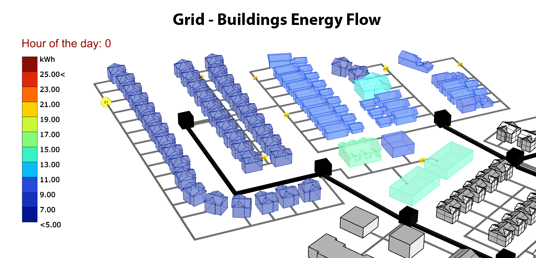
Primary inputs for this analysis are spatial information of building geometry and grid network model, and hourly net energy use data for each building.
Graphic Information
This graphic (GIF) shows spatio-temporal visualization of energy demand in a smart and connected community. There are 2 different part of this model a) buildings model and b) grid network model. The buildings models represent the actual building geometry of the community while the grid network model illustrate the grid connection of buildings and electric transformers through electric phases (3 different phases branch from each transformer – blue phase, red phase, green phase). Hourly total energy use data for each building is mapped on the building geometry. While total energy values for a group of buildings that share the same transformer are aggregated. These aggregated values are illustrated through a moving ball. This ball is tagged with the aggregated total energy value and its size change to represent the energy demand for this group of building and the load on a specific transformer in relation to other transformers and building clusters in this community. The ball is always moving along the electric grid phase and take the total energy value at each timestep -the size of the ball change based on the results of each hour(Note that the balls size does not change according to its position in phase; the ball is size just change to reflect the energy demand at each timestep) . The movement direction of the ball shows if the buildings are giving back energy to the grid or consuming energy from the grid. A cluster of buildings will be using energy from the grid when the ball moves from the transformer toward the buildings cluster. While a reverse movement show that the net energy use of these buildings is negative and is giving back generated energy to the grid.
Building and grid network model is made using rhino CAD software. Grasshopper plugin to rhino is used to map energy use results from excel file to geometry. Ladybug tools, tt toolbox, and customized python scripts n grasshopper are used to animate the moving ball and map results on the different geometries. From TT Toolbox a Colibri 2.0 tools are used to automate all the process of creating a GIF. Animating sliders move through each time step, mapping data on geometry while a snapshot is taking at each step and a GIF is generated in an automated process.
The main goal of this graphic is to visualize energy demand at the community scale and to show grid - building energy interactions. PV and battery deployment in smart and connected communities are becoming more common. If not managed efficient, these technologies will cause PV curtailment in certain times of the day. In this regard, spatiotemporal visualizations are important order to detect hours of PV curtailment, and peak hours of energy demand and energy stress moment on the grid.
Our grid infrastructure is developing rapidly. In the near future, the grid networks will allow for a building to building direct energy sharing. Such visualizations necessary to visualize all these temporal interactions, hence informing urban planners and building electric grid designers on the decision. This type of visualization can also be used to detect anomalies and disruptions at a community scale when new technologies are implemented.
This graphic allows us to visualize multi layers of data through different modes and visualization techniques. It also demonstrates new techniques to visualize spatio-temporal information in a single graphic.
Use this visualization techniques to also map power flow in the phase line to show the power/voltage stress on grid network and detect high voltages/ low voltages and power disruption. Allow the ball size to represent the net energy value at each building node segment rather than an aggregate for the whole cluster.
The graphic is a GIF. I have higher resolution version that failed to upload, please let me know how I can send these to you. I am in process of updating these graphic and would be happy to send updates.