PROJECT INFORMATION
Olivier Brouard
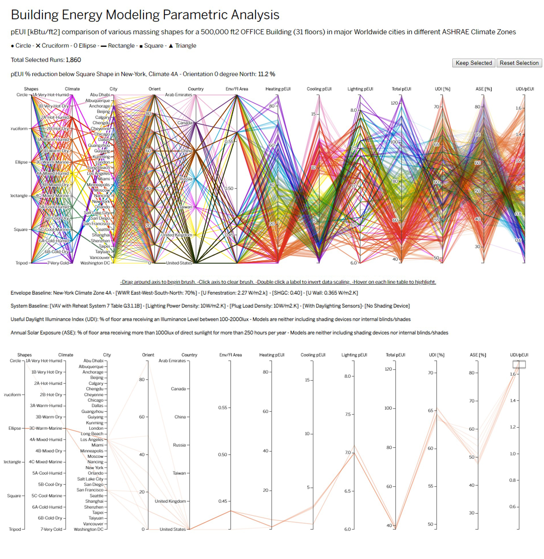
Parallel Coordinates
Orientation, Location, Weather file, Window-to-wall ratio, Double Glazing, SHGC, VLT, R-Value Wall, Plug Load Density, Dayligthing Sensors, Light Power Density, HVAC system
Graphic Information
The graphic is showing all the possible permutations (1,860 energy runs total) that exist combining various building shapes of a 31 floors office program (Square, Cruciform, Ellipse, Rectangle, Circle, Tripod) with the same gross square footage (500,000ft2) in major cities in the world in various climate zones to compare their distinctive energy performance. The tool uses parallel coordinates showing the inputs on the left and the outputs on the right. Browsing through the axis tick marks allows the refinement of a selection filtering graphically the entire dataset. This interactive and dynamic front end tool allows designers to simultaneously see the impact of a design solution on multiple performance criteria. The circular floor plate with the smallest ratio is the most efficient design. Massing with the highest UDI/pEUI ratio are likely to perform the best in mild climate (Los Angeles, San Francisco) while achieving the most optimized day lighting autonomy. Larger surfaces area to floor area ratio increase the building energy usage. Across all climate zone, compact shapes perform better. The energy consumption is directly proportional to the amount of outer envelope in contact with the surrounding environment. Overall in various climate the building pEUI is almost linearly proportional to the Outer skin to floor area ratio.
Using Powerpoint to assemble the images, PDF Acrobat to print out, Excel to compute the pie diagrams and charts, and D3 and Javascript embedded into an HTML page to assemble the visualization interface.
The energy performance and daylight level optimization of a specific massing as a function of its shape, climate.
This graphic is a starting point to assess the energy performance and daylighting optimization of a particular massing meant to be explored during Concept Design or Schematic Design Phase. It provides a range of pEUI and what to expect from as a ballpark using a shoebox energy model.
The causality of design elements and effects can be quickly linked together between inputs and outputs. It reads back end simulation and can be considered as a live energy model. It puts at the forefront graphic outputs meant to be used by designers and visual thinkers. It provides a comparison of pEUI from one scheme to another.
Adding the upfront cost of design variables and potential Return On Investment.
This is a joint effort of 4 people: - Olivier Brouard, Sustainability Engineering Team Leader - Harshul Singhal, Building Performance Analyst - Christine Tiffin, Daylighting Performance Specialist - Eric Anastas, Digital Designer Specialist