PROJECT INFORMATION
behrooz khalilinasr
- Excel
- Grasshopper Ladybug
- IES-VE
heat map
Temperature
Graphic Information
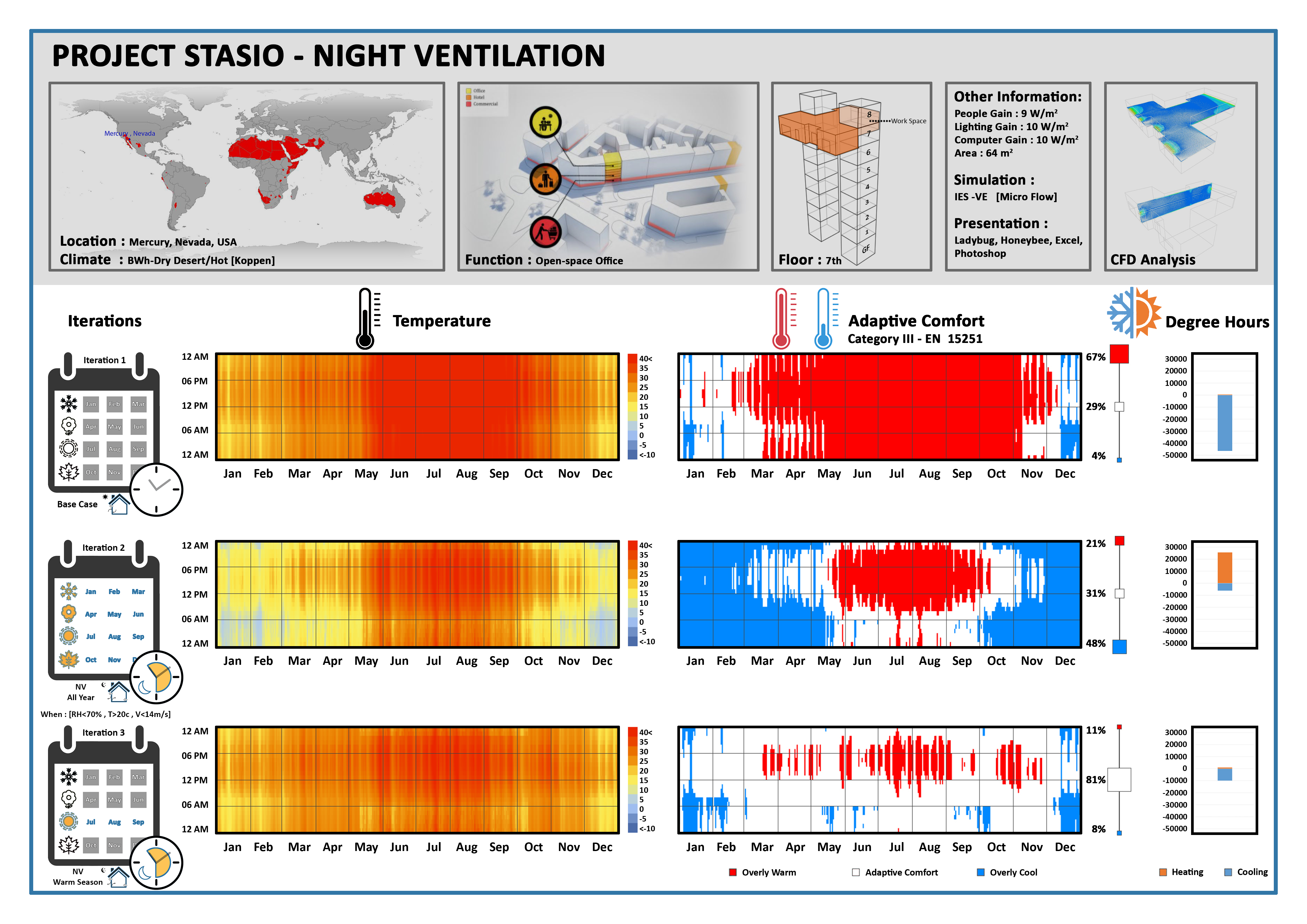
This presentation contains three different analysis. The left column shows the variation of temperature during the year, the middle one describes the overly cool, overly warm and comfort hours of the year based on category III in EN-15251 and the last column presents the annual degree hours for both cooling and heating. Besides the simulations have been done in three different iterations. The first row is related to base case in which night ventilation has not been adopted yet. The second row is when the night ventilation has been implemented for whole year and in the last one the time of night ventilation in limited just for warm season of the year. Generally the improvement of all outputs are clearly visible in three different iterations after adapting night ventilation.
The results have been obtained by IES-VE then have been exported in excel after that they have been imported in ladybug and honeybee in order to create the annual maps.
The fact that how night ventilation as a passive strategy can affect reducing total loads and the hours put in comfort in the hot and dry climate of the desert of Arizona.
Considering not only comfort but also ventilation and day lighting and solar radiation all as indoor environmental qualities it is possible to evaluate the indoor condition in preliminary design stage at the same time with the aim to reach the lowest level of energy consumption for built environment
In terms of comfort hours the color for each specific hour in the annual map is responsible for the adaptive comfort condition of that specific moment as a patch in the map that explains with red (overly warm), white (comfort) and blue(overly cool), on the other hand since this analysis is not quantitative, the number of heating and cooling degree hours for each iteration interpret the results and gives the possibility to architects to compare the results easily and evaluate the percentage of improvement for the final iteration.
it could be mixed with ventilation autonomy in order to provide enough fresh air for increasing productivity of the occupants and also with thermal autonomy and present all of them together as a matrix.