PROJECT INFORMATION
Rawad El Kontar
- Grasshopper
- Python
- Rhino
temp
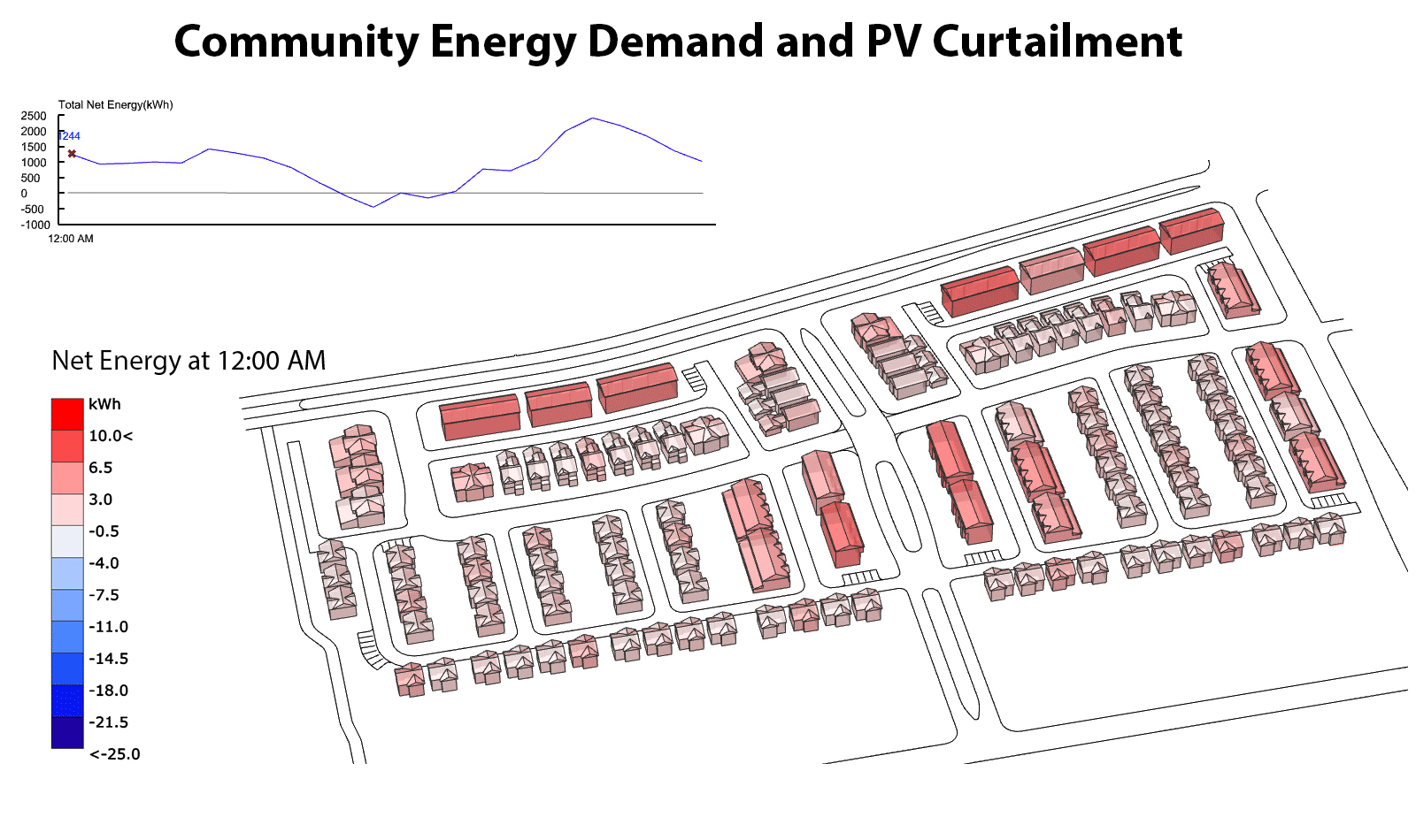
Primary inputs for this analysis are spatial information of building geometry, and hourly net energy use data for each building.
Graphic Information
This graphic (GIF) shows spatio-temporal visualization of energy demand in a smart and connected community. Hourly net energy use data for each building is mapped on the building geometry. A graph showing net energy demand for the whole community is illustrated in the dynamic graph.
Building and grid network model is made using rhino CAD software. Grasshopper plugin to rhino is used to map energy use results from excel file to geometry. Ladybug tools, TT toolbox, and customized python scripts in grasshopper are used to animate map results on the different geometries. Conduit suit was used to generate the interactive graph showing the net energy use for the whole community. Then from TT Toolbox, Colibri 2.0 tools are used to automate all the process of creating a GIF. Animating sliders move through each time step, mapping data on geometry while a snapshot is taking at each step and a GIF is generated in an automated process.
The main goal of this graphic is to visualize energy demand at the community scale. PV deployment in smart and connected communities are becoming more common. If not managed efficient, these technologies will cause PV curtailment in certain times of the day. In this regard, spatiotemporal visualizations are important order to detect hours of PV curtailment, and peak hours of energy demand and energy stress moment on the grid.
Such visualizations necessary to visualize temporal energy demand behaviors at a community scale, hence informing urban planners and building electric grid designers on the decision regarding grid modeling and PV and battery deployment. This type of visualization can also be used to detect anomalies and disruptions at a community scale when new technologies are implemented.
This graphic allow us to convey a lot of information simultaneously in an animated visualization . It also demonstrates new techniques to visualize spatio-temporal information in a single graphic.
I would have added the grid model and visualized the power results along with the net energy.
The graphic is a GIF. I am in process of updating these graphic and would be happy to send updates