PROJECT INFORMATION
Pil Brix Purup
Various Charts
Room and facade geometry, thermal properties of constructions and fenestration systems, user schedule, ligthing system, HVAC system settings, and weather data.
Graphic Information
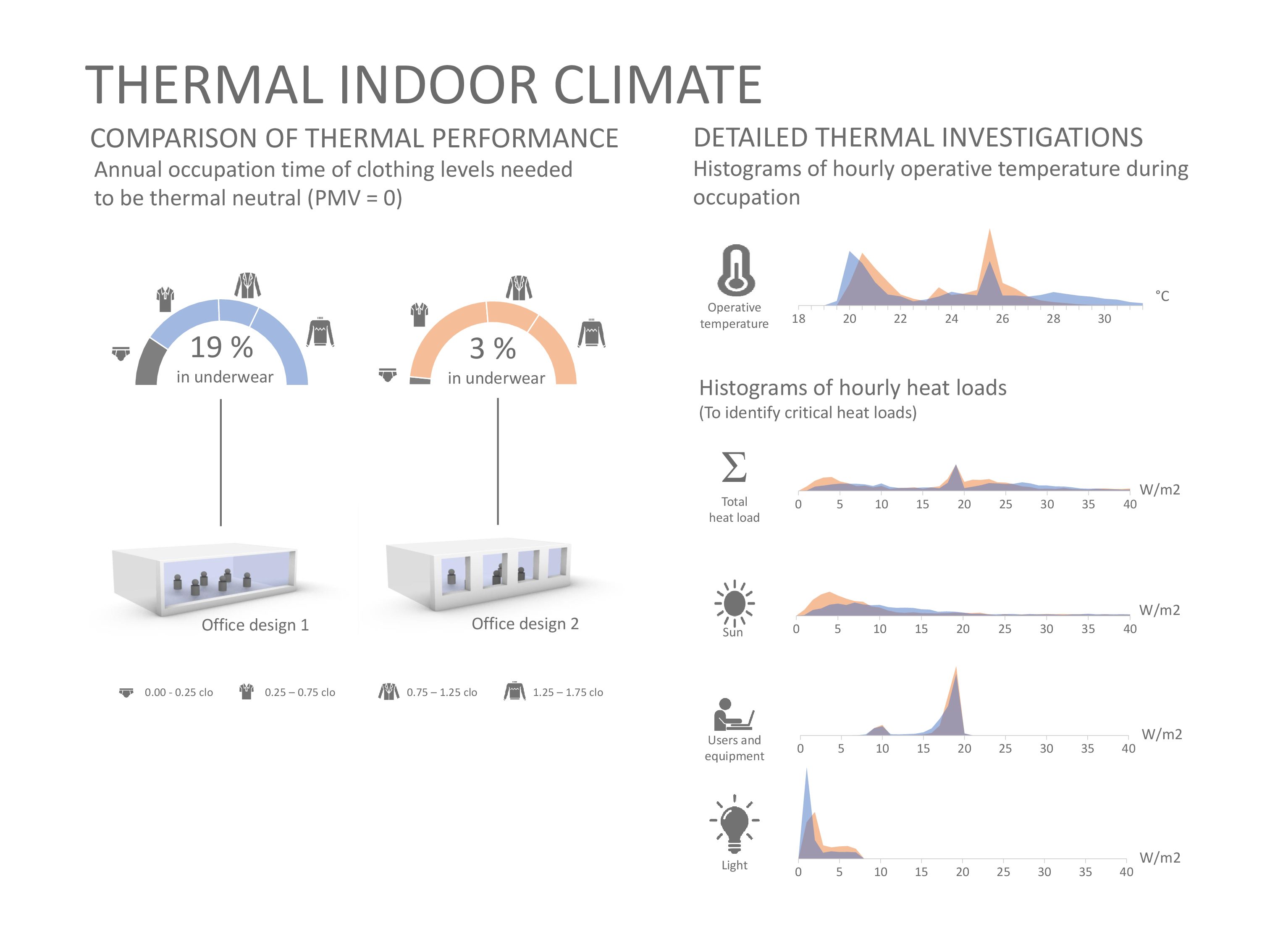
The simulated operative temperature in two office designs are compared. The designs are depicted as 3D-renderings from the CAD model. The half circles above each room design illustrates the level of clothing needed to stay thermal neutral (PMV = 0) in % of occupation time (assuming static activity level, relative humidity, and air velocity). The intention is to help non-experts to evaluate whether the thermal indoor climate is acceptable. To the right, the hourly distribution of the simulated operative temperatures during occupation time for both designs are plotted together in a histogram for comparison. The intention is also to illustrate the temperatures causing the needed clothing levels. Below, hourly heat loads are illustrated in histograms to identify the type of heat load that may cause any overheating (the need for underwear): sun load, user and equipment load, and/or lighting load.
The operative temperature and heat loads of two different room designs were simulated in ICEbear using the Rhinoceros-grasshopper environment to define geometry. Hourly data was then exported to excel, in which doughnut charts and histograms were created. 3D-renderings of room was created in Rhinoceros. Everything was arranged in Power Point together with icons.
- Is the thermal indoor climate acceptable? - What design alternative has the best prerequisites for thermal comfort? - Which heat loads are dominant and thereby probably the reason for overheating in the designs? - which heat loads should consequently be in focus for the further design development?
Design decisions during the design process is often happening in a collaborative process involving different types of experts. This graphic is an attempt to illustrate the level of thermal indoor comfort in design proposals using a metric and a graphical language that is immediately understood by non-experts in thermal indoor climate in the design team. The graphic also helps the team to identify potential reasons for overheating. During production of this graphic, non-engineer stakeholders (i.e. clients, constructors and architects) were invited to a workshop session discussing improvement on visualizations of thermal indoor climate. From this workshop, it was concluded that graphics should be recognizable, why a “speedometer”-like graphic and histograms were chosen, since they are common known from car-driving and math in elementary school, respectively. Other graphical technics were also investigated but discarded. Furthermore, some stakeholders found “temperature” to be quite abstract – What temperatures are acceptable? Discussions gave rise to the idea that clothing level was an understandable measure of thermal comfort – e.g. if you need to be in underwear at office then the office is obviously too warm.
Everybody can relate to clothing levels: I will not accept going to office in underwear! Using clothing level to illustrate the impact of potential design decisions on thermal indoor climate is therefore easy to interpret by all decision-makers – also the non-experts in thermal indoor climate. The graphic furthermore helps designers to identify reasons for the occurrence of overheating. The graphic thereby motivates and empowers designers to engage in the thermal aspects of the design in a unique way.
Other performance issue such as visual comfort and energy performance – as well as their dependencies – together with other relevant inputs such as heat losses could also be presented graphically. It would furthermore be interesting to present the proposed graphic to a larger group of design professionals for feedback.
https://youtu.be/9H50qr9dgQA