PROJECT INFORMATION
Nikhil Bharadwaj
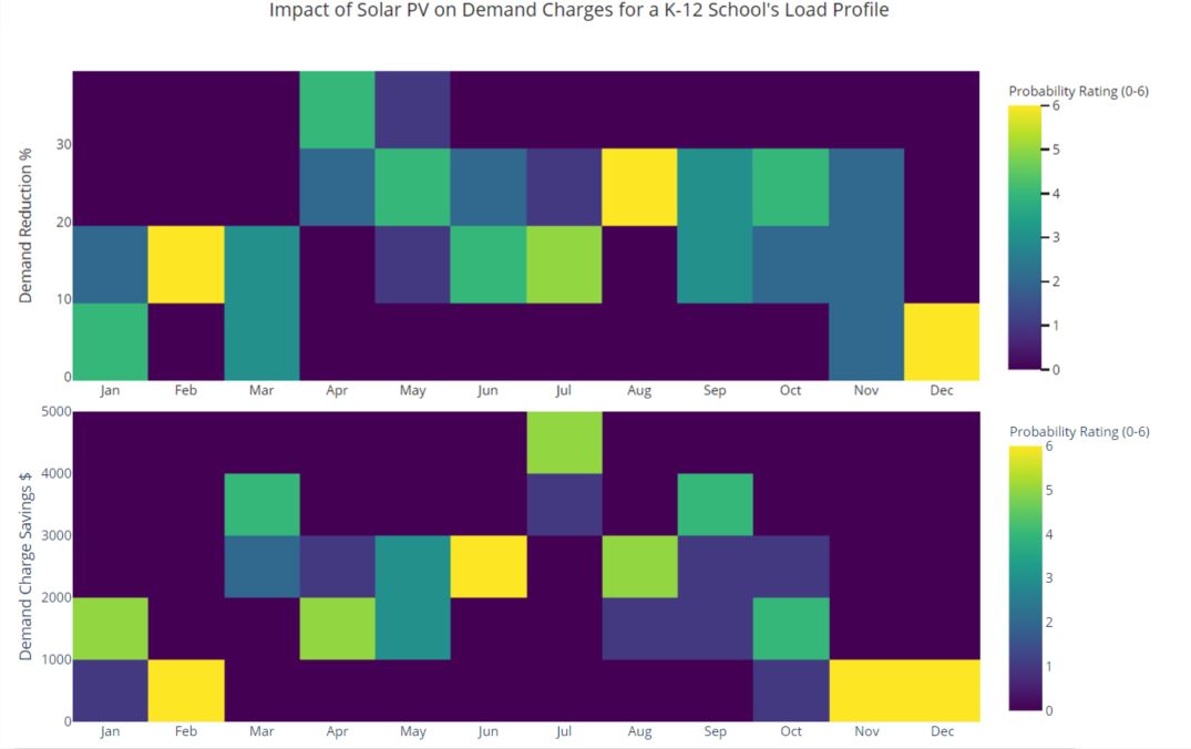
2d False Color Chart
8760 Solar Data for 6 different years, Load Profile Building (15 minute interval data), weather/TMY Irradiance file, rate tariffs and utility bills
Graphic Information
Y axis- Demand Charge Reduction (Either kW or $) X axis - Month Probability Rating - 6 Years of Solar Data Binned into each incremental demand reduction percentage to showcase levels of confidence in selecting/predicting demand profile after solar is installed on a site
1) Modeled a fixed solar size in Helioscope for a single facility in California. 2) Generated 8760 Production Profiled for 6 sample TMY years from a nearby weather station 3) Analyzed facility interval data through Energy Toolbase 4) Processed and Simulated Solar Integration at Facility to produce pre and post bills on Energy Toolbase 5) Created a Demand Charge Reduction % from pre and post utility data generated in step 6 for different weather years selected in step 2 6) Cleaned and processed the data to stack properly in Excel 7) Used plotly library to generate multiple graphs and simply stitched the graphs together into graphic. 8) Ready
Project Developer/Construction Manager and Customer needs to understand why a large portion of the bill would remain (demand charges) after installing solar at a site even if storage is coupled. They need to understand why some sites have a better chance of offsetting significant portion of their bills because of their load profile. They'd like to understand why a large solar array may reduce demand savings potential of battery storage even though most solar projects are based on showing only kWh savings numbers. 1) What would future bills actually look like after installing solar at a site? 2) We can reasonably predict kWh production for any site but how do we establish kW savings when a single cloud cover at the wrong 15 minute interval could wipe out all savings? 3) What's a risk adjusted way to simulate a way to showcase demand savings? 4) Why do battery savings drop sometimes when co-optimizing with solar? Does solar flatten out load profile to such a level that the kW savings from storage starts to take a hit? How to get them to work together effectively?
I touched upon those points in the last questions. Lessons learned: There can be large variance even with a random pool of solar production years. It's also easier to showcase demand savings in summer months. School load profiles align well with solar production profiles to have a greater probability of kW reduction.
The graph helps quickly unravel kW reduction and savings based on project risk appetite of the installer/construction team/performance manager/ and sales team. It's a hybrid of a heat map and a histogram which makes it a fairly simple graphic to understand.
Increased solar production years to 20+ years as input (if available) Simulated it with different solar sizes