PROJECT INFORMATION
Elizabeth LeRiche
- Excel
- Grasshopper Ladybug
- Rhino
temp
The primary inputs would include the 4 tested shading devices, which vary with regards to general design strategy, porosity of pattern, and angle of shutters.
Graphic Information
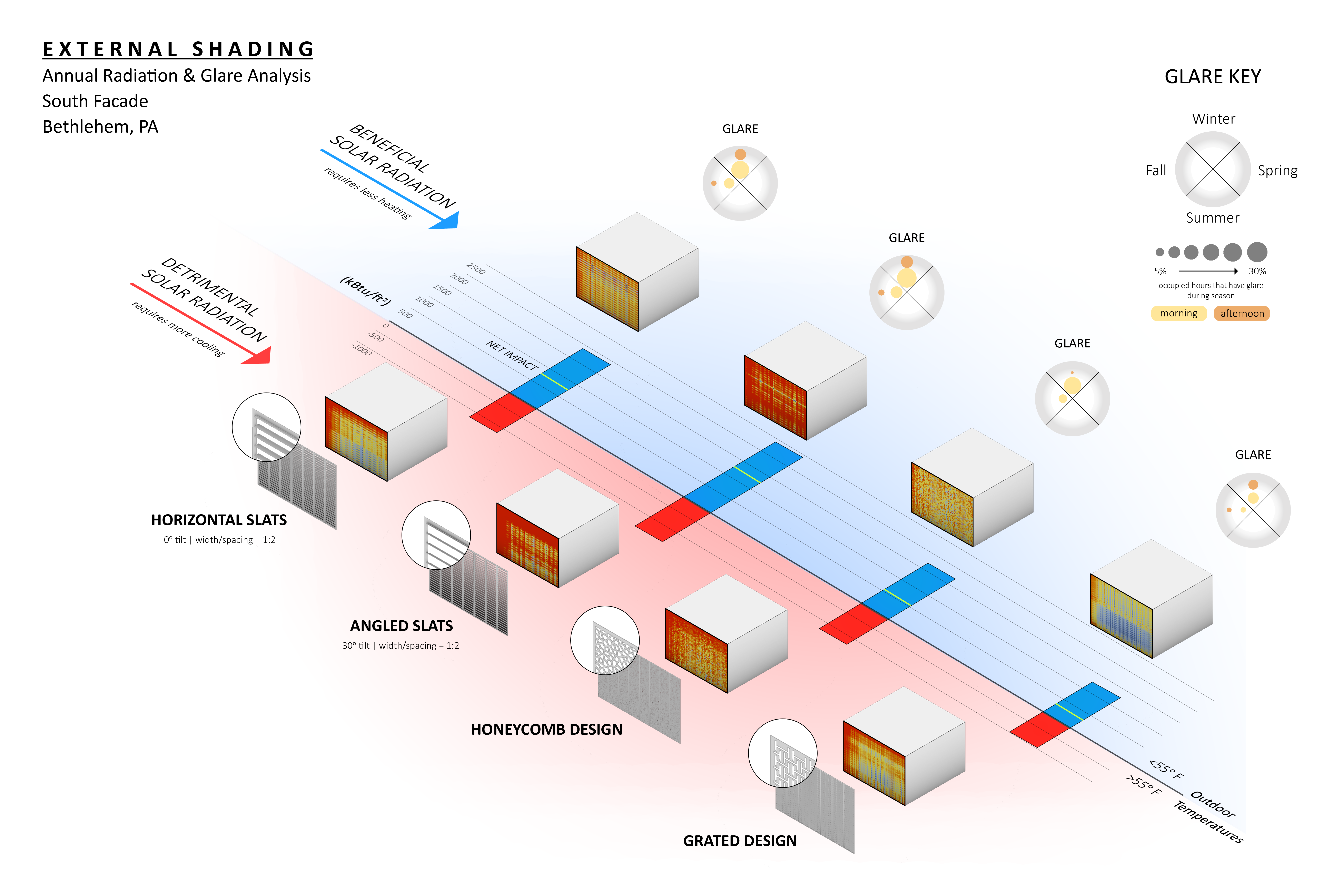
This graphic is showing the impact of various shading devices on the south facade of a project based in Bethlehem, PA. At the request of the project architect, two analyses were conducted side-by-side: annual solar radiation and annual glare. In order to display information in a way that is easily understandable but also directly related to the design of the shading device, an axonometric view of the south facade was used. Solar radiation was analyzed for two time periods -- 1. All hours when outdoor temperatures were greater than 55 F and 2. All hours when outdoor temperatures were less than 55 F. A psychrometric chart displaying potential passive strategies for our climate allowed us to realize that radiation occurring within time period #1 would be detrimental and radiation occurring within time period #2 would be beneficial. The two analysis periods are displayed via a bar graph split (the data) which is placed in tandem with their respective radiation analysis surface (the visuals). We decided to show the annual glare analysis in an easily digestible circle diagram that allows for a quick comparison between shading device options. Glare was broken out into separate seasons and grouped together as simply morning or afternoon glare in order to create brevity and remove extraneous information that may not be useful for the project. The overall objective was to create helpful comparisons that the architects could quickly grasp and help inform design decisions considering the sustainability impact and occupant comfort.
Radiation analyses were run in Ladybug in order to extract the two separate solar radiation surface graphics for each analysis period. An axonometric view was saved in Rhino for exporting the same view for each shading device. The graphics were exported out of Rhino using the "View Capture to File" command. Exported screenshots from Rhino were organized and displayed in Photoshop. Ladybug radiation data was plugged into Excel to create 2D bar charts. These bar charts were then manipulated and recreated in Photoshop and displayed as an axonometric view in-between the Rhino exports. The above photoshop file was exported as a PNG and imported into Illustrator for further cleanup, color diagrams, and fonts. The glare circle diagrams were created. Glare percentages came from an Excel document that broke out glare analysis data from DIVA into separate seasons (only occupied hours). The excel data for this was displayed as filled-in circles, for morning and afternoon glare. Using the same procedure for each shading device, screenshots were taken of these filled-in circle graphs, exported into photoshop for removal of background, imported into the Illustrator file as separate PNGs (separated out by each season and morning/afternoon), and scaled down by the same percentage within Illustrator so they remain proportionate and correct.
What can help this project from a sustainable design perspective? How do different shading devices stack up to one another with regards to energy efficiency? Will a shading device help or hurt the program? How can we balance aesthetics while also reducing glare?
This graphic aided in a big step forward to investigating not only the sustainability and energy consumption impact of external shading design but also considering the resulting occupant comfort within the space. Producing this graphic demonstrates the balance involved with finding a design solution that allows the building to use passive solar heating while maintaining comfortable occupant conditions. Having the results shown side by side allows designers to directly compare the performance of the different designs based on the priority of their project whether that be energy reduction or glare management.
The graphic's success comes from the direct visual connection between sunshade design and analysis results. It allows for quick comparison between options and allows architects' to understand what may be causing a particular design to perform better with regards to allowing/blocking the sun, which directly impacts radiation hitting the surface and glare.
As a control, we would have incorporated a facade that does not include any shading device for analysis. This would have helped to show and compare the benefits of including any shading device vs. having nothing there.