PROJECT INFORMATION
Elliot Glassman
- Grasshopper
temp
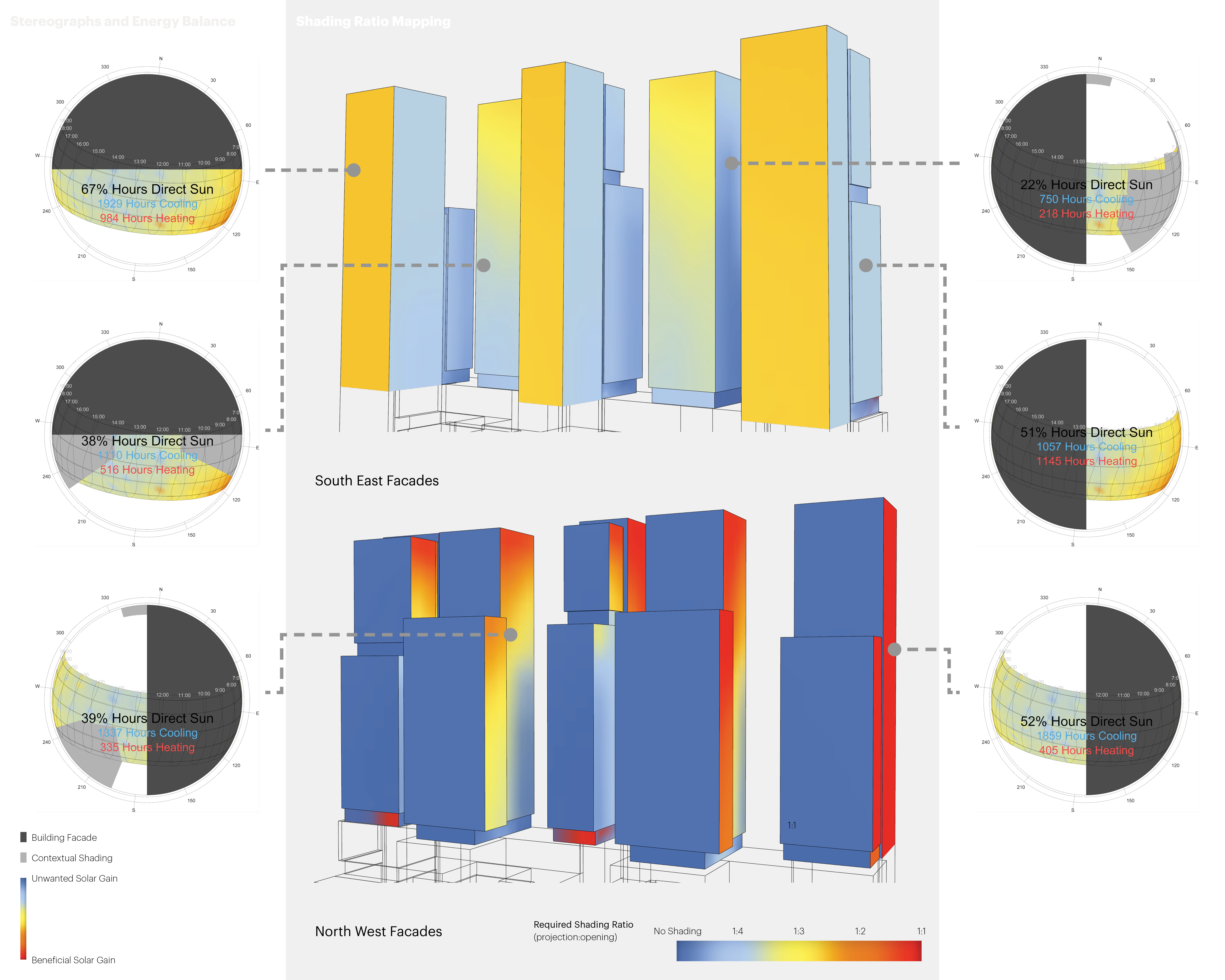
Surrounding buildings, annual solar angles, balance point temperature
Graphic Information
Stereograph diagrams show the hours that each façade is exposed to direct sun, indicating any contextual shading from adjacent towers. Each hour on the sunpath is color coded to indicate if passive solar gains would be useful for offsetting heating loads or would impose a cooling load. Color coding of the massing itself shows the recommended shading ratio across the facades.
A Grasshopper script was used to generate the stereographs from a number of points placed on the facades of the model. The color coding of the solar graphs is based on the outdoor air temperature and a balance point temperature from shoebox models of each orientation. The script also calculated the recommended shading ratio based on the cut off necessary to block the majority of solar angles at the hours when solar gain was not desirable.
The design of the clustered towers created a number of unique conditions that provided the opportunity to create a façade design that responded to the solar exposure. The team wanted to know not just how the conditions varied by orientation, but how they varied within the same façade. The mapping of the shading ratios based on the calculation of the solar angles and desirability of the solar gains that provided a basis for that architectural differentiation.
We did this analysis in parallel with parametric shoebox modeling and stereograph generation. The shading recommendations were pretty well aligned between the two, although the shading ratio mapping allowed us to provide recommendations across the whole façade instead of a at specific locations. This specific climate had some unique features; the mornings were chilly and could benefit from solar gains while the afternoons were warm and needed to be protected from the sun. Although typically the east and west facades have low angle sun, we learned from an energy perspective that modest shading on the east was sufficient but that the west would need more extensive shading where there was not contextual protection.
This type of mapping is not yet commonplace. Yet it clearly provides a definitive recommendation for ideal shading ratios. The differentiation across the facades can provide a template for an interesting architectural response to the shading design.
There are multiple layers of information in the graphic between the stereograph and the façade mapping. With more time, it would have been nice to play with different ways of balancing that information to maintain legibility and hierarchy.