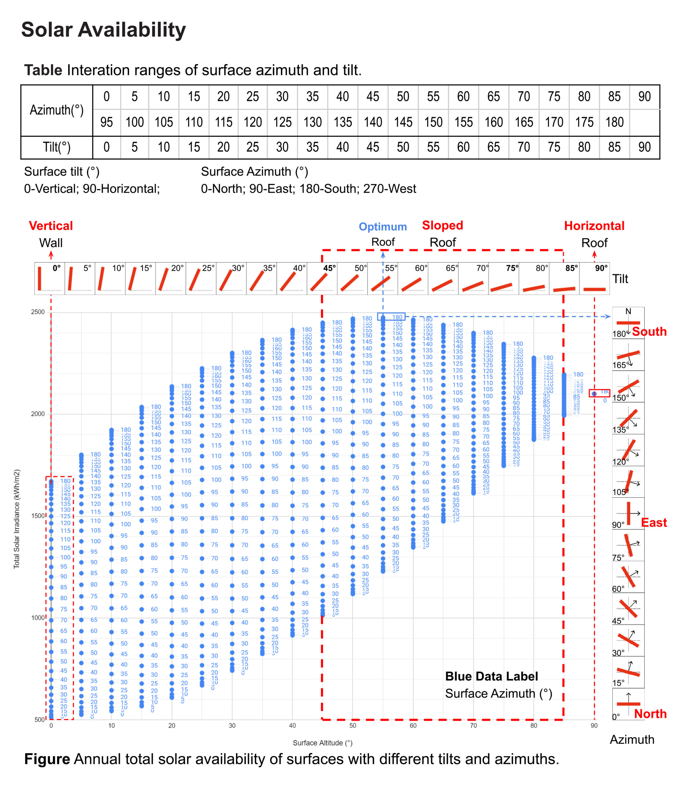
What is the impact of surface’s tilt and orientation on solar availability at 40 N?

Project Location: Zone 0A Extremely Hot Humid
Simulation Scale: Shoebox Model
Application: Research
Audience: Academic
What is this graphic showing? Describe the different parts of the graphic and how it communicates the data.
The chart illustrates the correlation between solar availability on surface with varying altitue and azimuth. Each data point represents a specific surface, detailing its altitude and azimuth, and the corresponding solar irradiance. The table provides the range of variation for azimuth and altitude. Take a close look, roofs (with altitude ranging from 0° to 90°) receive significantly more solar radiation than walls (at an altitude of 0°), with sloped roofs receiving even more than flat ones. The peak solar energy is attainable when the surface's altitude is 55° and its azimuth is 180°.
What type of graphic is this?
- Diagram
Design Variables
- Passive strategies
Is this part of the ASHRAE-209 cycle?
What tools were used for the simulation analysis?
- Ladybug Tools
What tools did you use to create the graphic?
- Adobe Illustrator
- Excel
- Grasshopper/Rhino
What was successful and/or unique about the graphic in how it communicates information?
This diagram describes a method employing parametric modeling of thousands of variations to understand the configurations that are most effective in a specific climate. It explores a large solution space at the beginning of design process, providing architects with insights into diverse successful approaches within the climate - an approach commonly known as “feed forward".
Is there anything else you would like to mention?
Additional credits and other contributors:
Special thanks are given to Prof. William W. Braham for his invaluable guidance and help throughout this research.Included in the competition:
2024 Annual Project StaSIO Challenge - Deadline 03.30.24
January 18, 2024-November 22, 2024

