What is the impact of envelope, lighting, and mechanical upgrades on cost and energy efficiency of a 1960s commercial high rise building?

Project Location: Zone 5B Cool Dry
Simulation Scale: Whole Building
Application: Real Project
Audience: Engineer
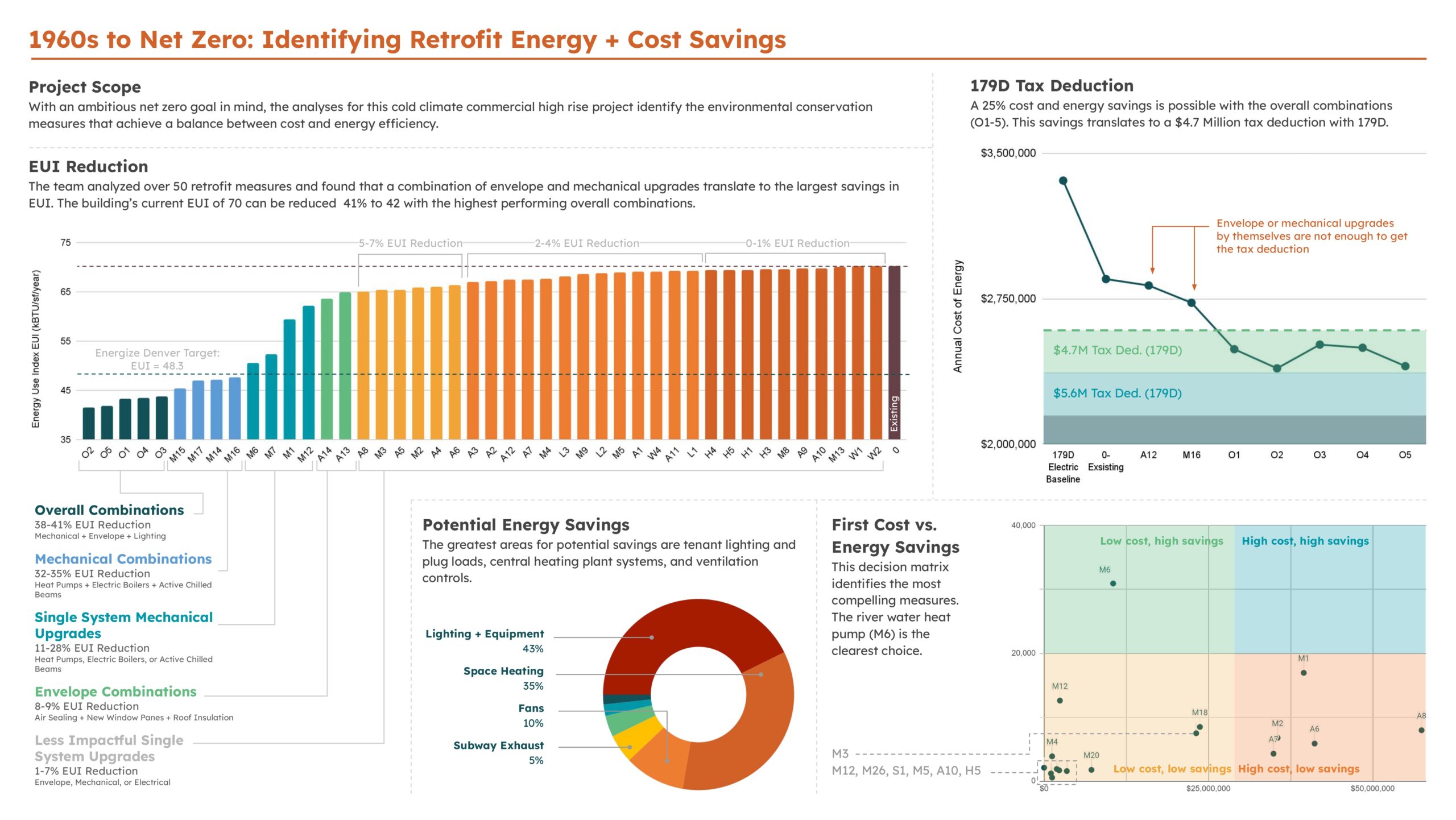
What is this graphic showing? Describe the different parts of the graphic and how it communicates the data.
This graphic shows around 50 energy conservation measures that were explored for the retrofit of a 1960s commercial high rise to become net zero. The top left rainbow bar chart graph demonstrates the impact of each measure on EUI in relation to the existing building and the Energize Denver EUI target of 48.3 kbtu/sf/yr. The top right line graph shows that a combination of envelope and mechanical upgrades are necessary to attain the 179D tax incentive. The bottom right graph shows the cost of each measure relative to the energy savings. Lastly, the donut chart demonstrates where the greatest potential for savings reside.
What type of graphic is this?
- Case Study / Multiple
Design Variables
- Glass U-value / SHGC
- Glazing Fraction/Window to Wall ratio
- HVAC performance/system selection
- Insulation R-value
- Renewable energy
Is this part of the ASHRAE-209 cycle?
What tools were used for the simulation analysis?
- Excel
- IES-VE
What tools did you use to create the graphic?
- Excel
- Other
- PowerPoint
What was successful and/or unique about the graphic in how it communicates information?
This graphic tells the story from selecting which areas to assess for energy usage reductions to measuring the economic implications of the measures against their energy saving potential. The graphic uses a variety of metrics to help clarify which measures are the most impactful like EUI, first cost, annual energy savings, and tax incentive potential.
Is there anything else you would like to mention?
Included in the competition:
2024 Annual Project StaSIO Challenge - Deadline 03.30.24
January 18, 2024-November 22, 2024

