What is the impact of occupant behaviour on daylight availability in homes?

Project Location:
Simulation Scale:
Application:
Audience:
What is this graphic showing? Describe the different parts of the graphic and how it communicates the data.
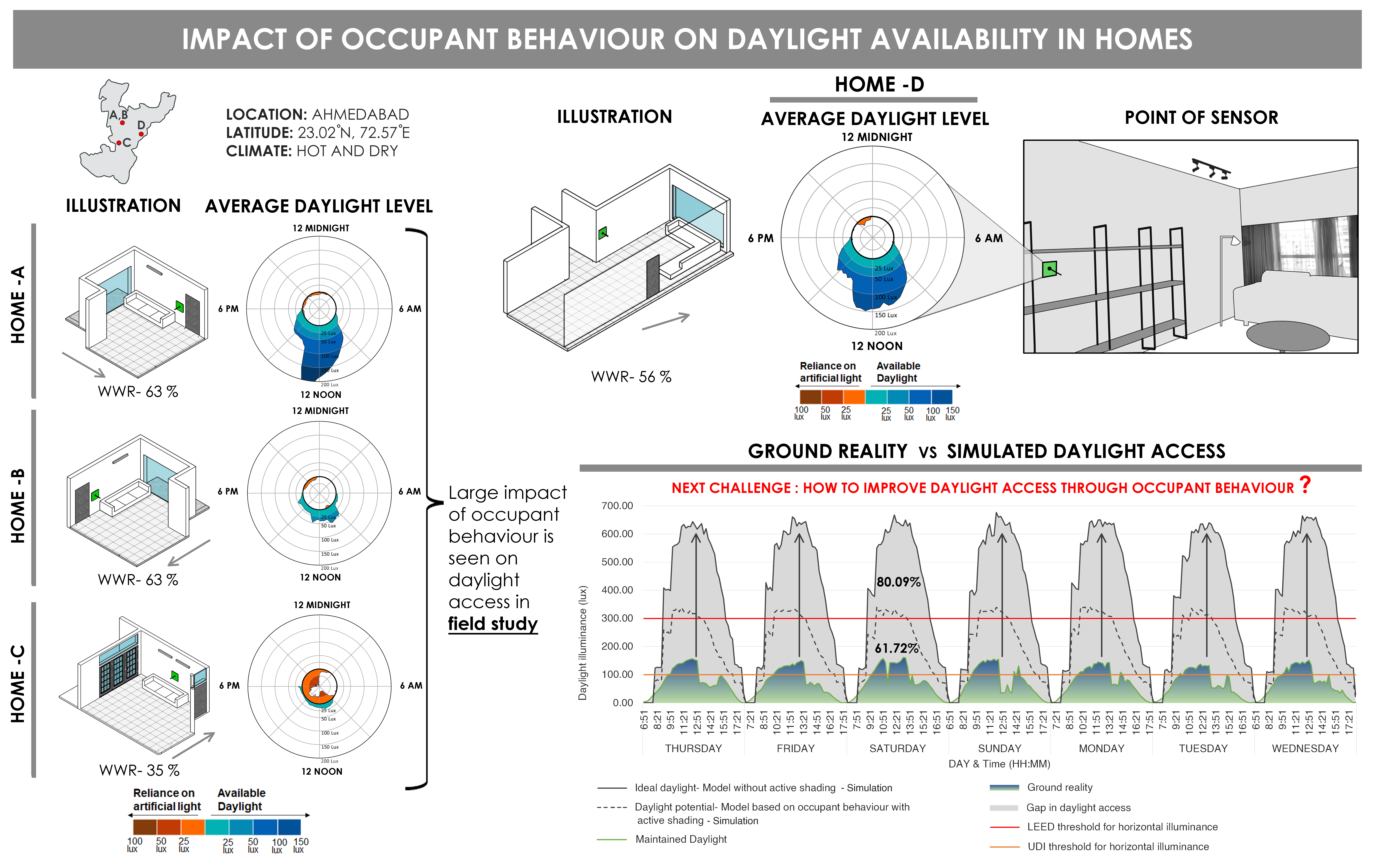
This graphic tries to show the impact of occupant behaviour on daylight availability in homes, where Home-A, B and C shows the average available daylight in homes over a week. Homes A and B have the same orientation and the same WWR of 63%. In Home-A, the peak available daylight (vertical illuminance on the wall) exceeded 200 lux, but in Home- B the peak available daylight levels was 50 lux. This showed a large impact of occupant behaviour on daylight access in homes (from the field study). Home- C has Window to Wall Ratio of 35%, where the average available daylight was less than 25 lux, and the home shows the reliance on artificial light during daytime due to less daylight access inside the home. Home-D shows the comparison between simulated daylight access (simulation) to ground reality with occupant behaviour, where there has been a gap of 61.72% from daylight potential to the ground reality. And 80.09% from ideal daylight to the ground reality. This gap is caused due to weather differences and occupant behaviour of curtailing (trade-off) the daylight access to maintain thermal and visual comfort in the home.
What type of graphic is this?
- Case Study / Multiple
- Diagram
Design Variables
- Glazing Fraction/Window to Wall ratio
- Passive strategies
What tools were used for the simulation analysis?
- Design Builder
- Excel
- Other
What tools did you use to create the graphic?
- Adobe Photoshop
- Excel
- Python
What was successful and/or unique about the graphic in how it communicates information?
The exploration was to understand the impact on daylight access in the reference homes.Polar plots are used in this graphic for easy understanding and comparison of data for designers. This polar plot is divided into 4 segments based on time of the day, concentric circles for the illuminance levels. It shows the correlation between the home’s available daylight and its reliance on artificial light
Is there anything else you would like to mention?
This analysis was done as a part of the Directed Research Project in Master's in Building Energy Performance at CEPT University, Ahmedabad, under the guidance of Dr Minu Agarwal.
Included in the competition:
2023 Annual StaSIO Challenge
March 21, 2023-June 12, 2023

