What is the impact of sleep comfort temperature on energy consumption and discomfort?

Project Location: Zone 0A Extremely Hot Humid
Simulation Scale: Shoebox Model
Application: Research
Audience: Academic
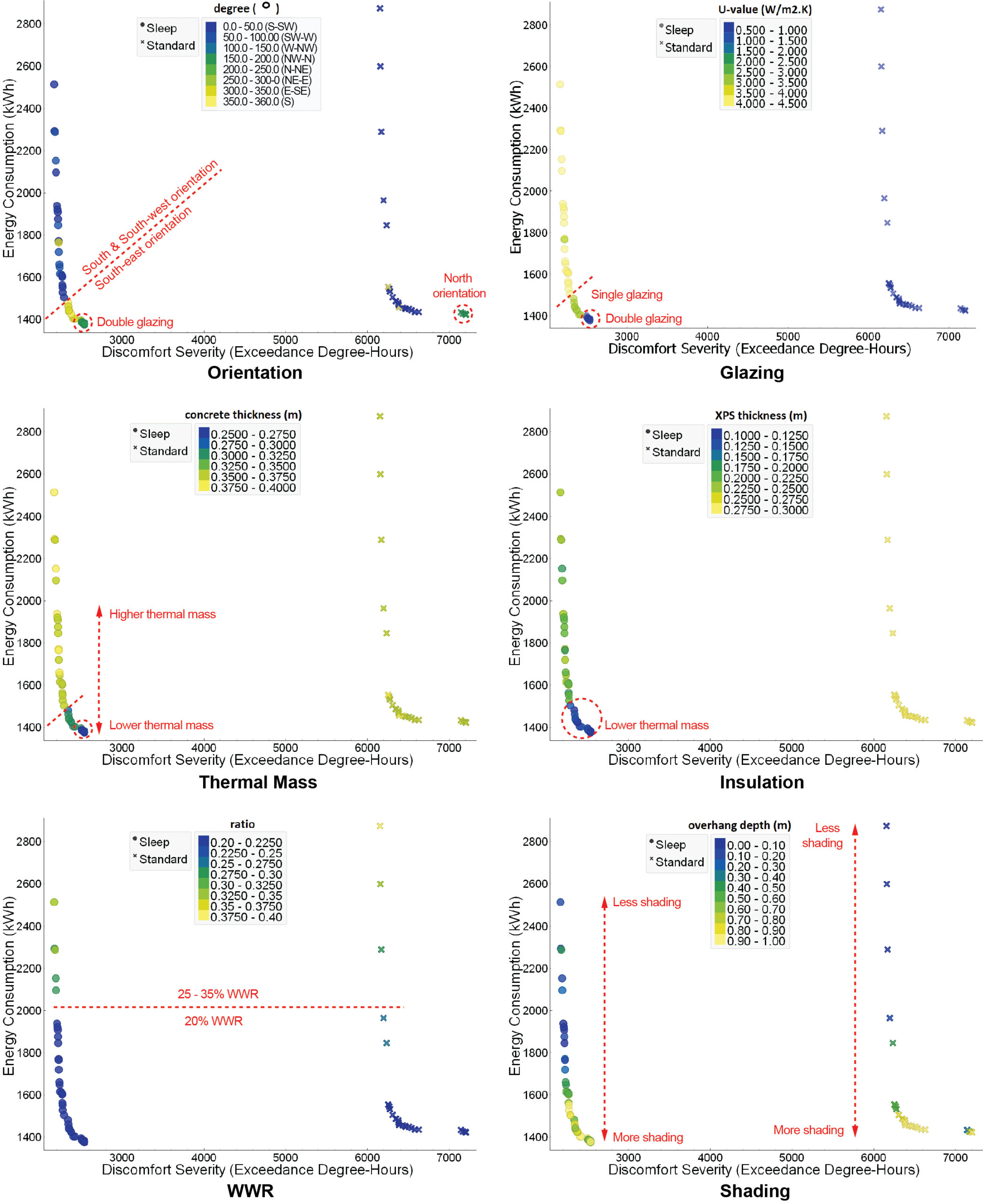
What is this graphic showing? Describe the different parts of the graphic and how it communicates the data.
The graphic aims to show how utilizing a sleep thermal comfort instead of a standard thermal comfort model impacts the design of optimal solutions. An existing sleep thermal comfort model by Lin and Deng (2008) was used to define comfortable temperature ranges for sleep, while awake thermal comfort was defined per ASHRAE 55-2020. This graphic shows all optimal design solutions for a mixed-mode building utilizing either sleep or standard comfort models, corresponding to the Pareto fronts, with a graph for each design variable. Solutions are illustrated in relation to energy consumption (y-axis) and discomfort severity (x-axis), and color-coded according to design options. Annotatios in red highlight trends and/or solution clusters.
What type of graphic is this?
- Other
Design Variables
- Building Massing
- Building Materials
- Glass U-value / SHGC
- Glazing Fraction/Window to Wall ratio
- Insulation R-value
- Window shading/sun control
Is this part of the ASHRAE-209 cycle?
What tools were used for the simulation analysis?
- Design Builder
- EnergyPlus
- Other
What tools did you use to create the graphic?
- Adobe Illustrator
- jEplus+EA
- Other
- Python
What was successful and/or unique about the graphic in how it communicates information?
It proposes an unique way to compare two Pareto fronts, which is not usually achievable in a single graphic. Besides the usual axes (here indicating energy consumption and Discomfort Severity), it includes information about the design of each optimal solution, making it very easy to find trends and differences within each graph and among different design variables.
Is there anything else you would like to mention?
Additional credits and other contributors:
Graph created by Shide Salimi utilizing jEplus+EA and Orange, post-produced by Esteban Estrella in Adobe Illustrator, paper co-authored by Holly Samuelson.Included in the competition:
2024 Annual Project StaSIO Challenge - Deadline 03.30.24
January 18, 2024-November 22, 2024

