PROJECT INFORMATION
Graphic Name: What is the impact of the most important design parameters on multiple outputs: energy demand, thermal comfort and daylight availability?
Submitted by: Torben Østergård
Firm Name: MOE Consulting Engineers
Other contributors or acknowledgements (optional) Aalborg University
What tools did you use to create the graphic?
-
D3
-
JS
What kind of graphic is this?
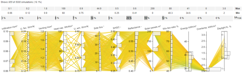
Primary Inputs: The design space is represented by ten uniformly distributed inputs (sort right to left by overall sensitivity)
Primary Outputs: Energy demand, over temperature (unmet hours), and daylight factor (in teaching rooms)
GRAPHIC INFORMATION
What are we looking at?
The graphics displays the interactive parallel coordinate plot (PCP), which contains the results from 5.000 simulations of a 15.000 m² educational institution. The first 10 coordinates represent uniformly distributed inputs, which are sorted (right to left) by their combined sensitivity on the three outputs represented by the three rightmost coordinates. The outputs are constrained by three criteria: energy demand maximum of 41 kWh/m², overtemperature maximum of 0 kWh/m², and daylight factor of minimum 2%. Minimum and maximum limits are shown above the PCP. Moreover, the bar plots made using “real-time” sensitivity analysis (SA) indicate how much the different parameters have been affected by the current user-defined criteria. Here, the applied constraints have affected (room) reflectance and solar panels area the most. On contrary, the three input distributions to the far left show no or very small changes, which indicate they have no or insignificant influence on meeting the current constraints. For each coordinate, a histogram shows the distribution meeting the user-defined requirements. For instance, most solutions are found for the largest values for room reflectance and solar panels, whereas a SHGC of 0.42 is slightly favorable. The parallel coordinate plot, histograms, bar plots, and limits are updated interactively when adding or changing the user-defined constraints for both input and output coordinates. Thereby, the solution space and consequences are immediately highlighted and displayed when exploring the design space using this interactive graphics.
.
How did you make the graphic?
The graphics displays the results from Monte Carlo based building simulations. These simulations were made using Excel and the Danish normative software Be15. Excel is used to describe the parameter variations and run the “black box” Be15 calculations. The results are aggregated in Excel and uploaded to the PCP using a comma separated file. As part of my industrial PhD, we extended the features of a parallel coordinate plot available from D3.js. We added the histogram functionality and I developed sensitivity methods to rank inputs according to multiple outputs and to indicate how much each parameter is affected by user-defined constraints. The visualization is available at https://buildingdesign.moe.dk/phd/ibpsa.html. The site also allows the user to construct rapid metamodels based on neural networks. Thereby, millions of new predictions can be made in a few seconds. These will be displayed in another PCP below the original.
What specific investigation questions led to the production of this graphic?
In general: How can we explore a multi-dimensional design space in a multi-actor decision-making process? How can we help decision-makers navigate the PCP and highlight the most influential parameters and the most favorable input spans? How can we meet the computational challenges of Monte Carlo simulations? (leading to the metamodeling feature) How can we answer “what-if” questions Case specific for the shown example: Can we avoid photovoltaics and still meet the requirements? What is the appropriate window-to-wall-ratio which leads to the largest possible solutions space? How should the louvres (side fins) be design while balancing daylight availability with energy demand and thermal comfort? Is venting necessary and if so, how much air flow should it provide? Should the contractors aim for the lowest level of airtightness (infiltration) or focus on insulation levels of the facade and windows?
How does this graphic fit into the larger design investigations and what did you learn from producing the graphic?
This type of interactive graphic is essential when dealing with multidimensional data such as Monte Carlo building simulations, which are growing in popularity. Indeed, a Monte Carlo based framework fits very well with the large uncertainties and variability, which are dominant i building design. The plot can be used recurrently in the iterative design process and help identify the solutions that meet the requirements of all decision-makers.
What was successful and/or unique about the graphic in how it communicates information?
The extension of the PCP with histograms, sensitivity analysis and metamodeling strengths the already popular PCP and makes it easier for the decision-makers to investigate an enormous multi-dimensional design space and observe the consequences of different decisions.
What would you have done differently with the graphic if you had more time/fee?
Primarily, I would like to develop and test another method for real-time SA based on variance-decomposition, which may be better than the current one based on the two-sample Smirnov test. In addition, I would like to extent and improve the metamodeling features (using larger neural networks) to improve accuracy of those. In general, I would like an experienced front-end develop to enhance user-flow and design. Finally, there are a few bugs that must be dealt with.