PROJECT INFORMATION
Graphic Name: What is the impact of climate on human comfort and design strategies?
Submitted by: Xiaofei Shen
Firm Name: AECOM
Other contributors or acknowledgements (optional) Amam Singhvi, Jason Vollen
What tools did you use to create the graphic?
-
Grasshopper Ladybug
-
Adobe Illustrator
What kind of graphic is this?
Primary Inputs: Weather Data
Primary Outputs: Outdoor Comfort, Design Strategies
GRAPHIC INFORMATION
What are we looking at?
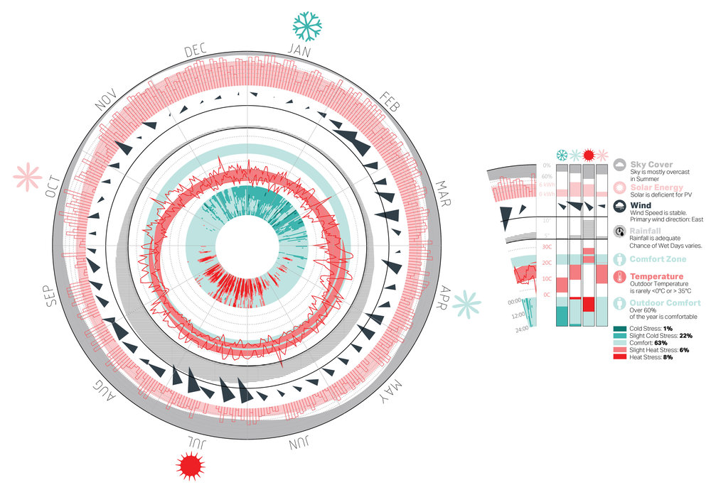
The Climate Clock visualizes annual weather data including temperature, rainfall, wind, solar, and cloud in different rings. The original data is averaged daily/ weekly/ monthly and cross tabs queried by the values. The central donut of heat map plots annual hourly values of outdoor comfort where the axis shows each day of the year and the ring shows each hour of the day. The blue represents cold stress and the red represents heat stress.
How did you make the graphic?
The original data was pulled from TMY3 file through Ladybug Tools and translated into the clock style through a customized script in grasshopper. The final step was to color code the graphics in Adobe Illustrator.
What specific investigation questions led to the production of this graphic?
The Climate Clock provides an integrated infographics highlighting the unique climate condition of the area where the project is located.
-
Is the climate overall comfortable for natural ventilation?
-
Is rainfall frequent in the area?
-
Is precipitation efficient for recycling?
-
Where do the winds predominantly come from?
-
Is there enough solar to maximize PV capacity?
How does this graphic fit into the larger design investigations and what did you learn from producing the graphic?
The Climate Clock is intended to act as a tool by the design team to inform the design decision process. It is useful at the early stage of design to establish a holistic understanding of the climate condition. Multiple plots can be viewed on a single graphics where the interrelationships between each other can be noticed easily.
What was successful and/or unique about the graphic in how it communicates information?
Both clients and designers can get an instant look at the visualized weather data for better understanding of the environmental context and quicker decision making of design strategies. It can be printed big and be always pinned in the design charrette space for quick reference.
What would you have done differently with the graphic if you had more time/fee?
In addition to visualize more hourly weather data, such as precipitation and earth temperature, the next step is to have more simulated hourly results to be integrated into the same clock during design development, such as heating/ cooling load and daylight autonomy. The Clock can therefore be utilized as more than a visualization tool, but a design option comparison tool.