PROJECT INFORMATION
Graphic Name: What is the impact of building improvements on thermal comfort?
Submitted by: Melissa Kelly
Firm Name: WSP Built Ecology
Other contributors or acknowledgements (optional)
What tools did you use to create the graphic?
-
EnergyPlus
-
Excel
What kind of graphic is this? Stacked bar chart
Primary Inputs: Envelope and lighting power density improvements for a planned renovation
Primary Outputs: Zone operative air temperatures and hours per year in various comfort categories
GRAPHIC INFORMATION
What are we looking at?
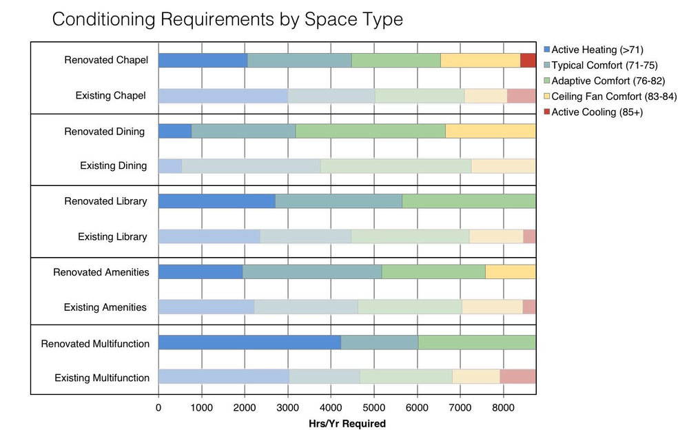
This graphic is a stacked bar chart summarizes the hours per year by thermal comfort categories for sample rooms in a renovation project, with the goal of improving thermal comfort through primarily passive interventions. The results for the existing conditions are shown alongside the renovated conditions for a comparison of how thermal comfort changes with the added interventions. The raw data is at an hourly basis and the x-axis is hours per year, with each bin color-coded according to the temperature range.
How did you make the graphic?
The adaptive comfort range with and without ceiling fans was calculated per ASHRAE 55 in Excel. Hourly zone mean air temperatures were extracted for the sample rooms from the energy model, and then processed with a frequency function with each thermal comfort category as a bin.
What specific investigation questions led to the production of this graphic?
One of the goals of this renovation was to improve thermal comfort conditions using minimal active systems and without increasing energy consumption. The graphic arose from a study of whether the interventions were successful, and whether there were any additional patterns or considerations based on space use types.
How does this graphic fit into the larger design investigations and what did you learn from producing the graphic?
This graphic helped to reinforce an energy cost analysis and confirm that interventions supported both thermal comfort and energy savings. It also confirmed that adaptive comfort is generally effective for this climate and that a passive approach is beneficial.
What was successful and/or unique about the graphic in how it communicates information?
By showing thermal comfort ranges on an annual basis, noise in the data is reduced, making it easy to compare directly between space types and between renovated and existing conditions.
What would you have done differently with the graphic if you had more time/fee?
This graphic only considers space types, but it would have been great to have more comparisons by orientation or floor level. For this study, the proposed mechanical systems were included in the model to ensure that effects of thermal mass were accurately included, but in the future I hope to adapt this graphic for studying passive survivability in blackouts or for comparing the impacts of climate change at different threshold years on thermal comfort.