PROJECT INFORMATION
Graphic Name: What’s the impact of glazing specifications on peak loads and energy consumption?
Submitted by: RJ Hartman
Firm Name: Clark Nexsen
Other contributors or acknowledgements (optional) Ryan Johnson, Architect. Ryan was the primary contributor/modeler of the graphic
What tools did you use to create the graphic?
-
Grasshopper Diva
-
Grasshopper Human UI
What kind of graphic is this?
Primary Inputs: Room massing, interior furniture, exterior shading, window geometry, and SHGC.
Primary Outputs: sDA, ASE, Lighting Energy, Peak Energy, and Chilled Beam Length
GRAPHIC INFORMATION
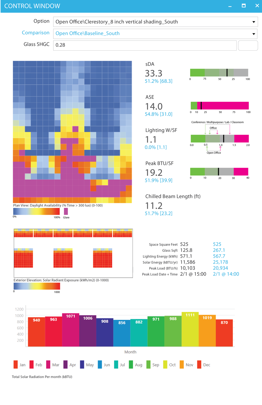
What are we looking at?
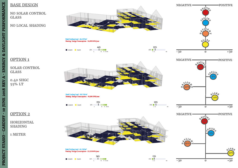
The graphic shows a dashboard like interface that shows a plan of the space with the sDA/ASE. Below the plan is an elevation of the exterior wall showing the configuration of the glazing and the amount of solar energy hitting the glass. Alongside the plan/elevation, there are several large metrics highlighting the impact of the glazing on the daylight and energy. There are indicators to the right of each metric that shows what is established as an industry standard for acceptable performance, or project specific goals for what is considered good/acceptable/poor performance.
How did you make the graphic?
Elements were first modeled as individual spaces/rooms in Rhino then brought into Grasshopper and analyzed using Diva energy and daylight analysis. Since the Diva output data is saved locally to the users' workstation, the Grasshopper script was set up to be able to run several analyses at once. After the analysis, the Diva data could be read off the workstation by Diva and processed with Grasshopper into the desired metrics. The graphic interface of Human UI, a plugin for Grasshopper, allows users to choose 2 specific options which are read by Grasshopper, processed, and graphically displayed via Human UI..
What specific investigation questions led to the production of this graphic?
-
How do we balance energy and daylighting via manipulating the amount of glass and shading?
-
How much glass is too much glass?
-
What “Window to Wall Ratio” do we want?
-
Does this external shade reduce glare?
-
What glass type should we choose?
-
What is the impact of frit on the glazing performance?
-
What is good daylighting?
-
What is bad glare?
-
What is good lighting energy?
-
What is our target energy use for the space?
-
How many chilled beams are required in this space?
How does this graphic fit into the larger design investigations and what did you learn from producing the graphic?
The architects were trying to design the façade of the building and wanted to know how much glass they could have in a space that provides a well daylit space while managing glare and solar gain. Using traditional outputs from daylighting and energy model tools, the team was having difficulty quickly determining what it meant to have good daylighting and what it meant to have good energy use. This is led us asking “How do we present our data/findings so that different team members (architects, electrical engineers, and mechanical engineers) can understand this data and can make design decisions from it as well.” The way that the Grasshopper + Human UI script worked, it saved an image to the server of each graphic automatically once it was displayed. These graphics were used in meetings to pull up multiple images of options side by side on the same screen like cards. This allowed for a quick literal side by side comparison of options. Ultimately these goals and being able to compare options helped decisions be made about shading, glazing configuration, and glass types for the final design of the building.
What was successful and/or unique about the graphic in how it communicates information?
Our graphic was successful in that we were able to convey a significant amount of information to our team, while maintaining a clean and easy to follow organization. It eliminated a lot of confusion and questions by the team and sped up the decision making process of the designers.
What would you have done differently with the graphic if you had more time/fee?
The plan with our graphic is to continuously update based on the needs of whatever project we are using it on. With this being said, we would have liked to have a clearer naming directory for the various options we were analyzing. In our submitted graphic, the description of the option is all the information we have about the option, which resulted in a cryptic naming convention not easily understood by the team. We would have preferred to include a description of the option within the graphic but could not come up with a good solution to this problem since all the data is being read from Diva. We potentially could try to read and write data to another place, (eg: excel) to be able to use that as a place to store data that is not stored in the Diva results. Examples of data that could be stored are a written description of the option, information about shading, orientation data, or anything that the team/project deems useful for the project. We also think that the bar chart at the bottom could be cleaner, and more useful with labeling/colors/etc but used the stock Human UI chart component.