PROJECT INFORMATION
Graphic Name: How do sun control strategies impact energy and daylight performance?
Submitted by: Aniruth Raghunathan
Firm Name:
Other contributors or acknowledgements (optional)
What tools did you use to create the graphic?
-
Sefaira
-
Adobe InDesign
What kind of graphic is this?
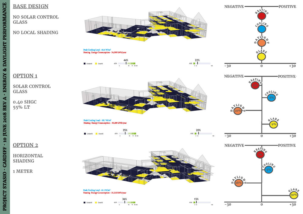
Primary Inputs: Solar control glass and shading device
Primary Outputs: Heating energy consumption (kWh/year), Peak Cooling Load (W/m2), Spatial Daylight Autonomy (sDA 300,50%)and Annual Sunlight Exposure (ASE 1000,250)
GRAPHIC INFORMATION
What are we looking at?
This graph is basically a comparative design study. It compares the performance of two alternate design options used to mitigate summer time discomfort through use of passive solar control strategies. Option 1 – solar control glass and Option 2 – shading device, both the options achieves summer time comfort. The energy and daylight performance of each model is represented in the middle through numbers and pictures.
On the far right corner is the key information which compares the options against the base model. It shows whether the design change have had led to a positive or negative impact on the performance and also quantifies it in percentages.
Four different metrics was used to support a holistic thinking – Annual Heating energy use (performance in winter), Cooling Load (performance in summer), Daylight autonomy (adequate daylight) and Annual sunlight exposure (to represent glare problems).
How did you make the graphic?
Sketch up was used to create the building model. The model was then imported to Sefaira plug-in. Daylight analysis was first carried out for the base model and other two design options followed.The models were then uploaded to the web application to do the energy analysis to fully understand the heating and cooling performance. .Data and pictures were downloaded and finally I worked on Indesign to make a readable graphic to show the relative performance.
What specific investigation questions led to the production of this graphic?
What is the impact of solar control strategies on energy and daylight performance for a cold temperate climate?
Are we overlooking daylight performance by concentrating on overheating issues?
How does this graphic fit into the larger design investigations and what did you learn from producing the graphic?
I believe that this graph would support the decision making process in a holistic manner by combining daylight and energy analysis.
What was successful and/or unique about the graphic in how it communicates information?
The outputs are presented in a relative/comparative manner which would help the design team to weigh pros and cons more easily. Sefaira does this for energy metrics in its web app, and I have added daylight metrics on top of this through a simple calculator and Indesign.
What would you have done differently with the graphic if you had more time/fee?
I would have tried to add one more option/design idea to the list.