PROJECT INFORMATION
Graphic Name: What is the Impact of Glazing Area based on Habitable Area on Annual Daylight?
Submitted by: Marty Brennan
Firm Name: ZGF
Other contributors or acknowledgements (optional) Heidi Bullinga
What tools did you use to create the graphic?
-
Grasshopper Honeybee
-
Adobe InDesign
-
Python
What kind of graphic is this?
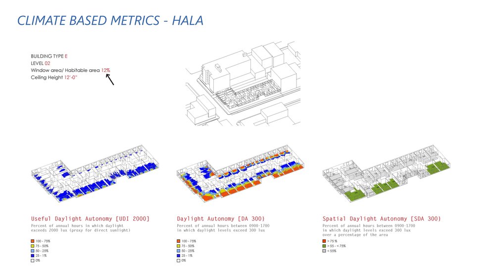
Primary Inputs: building type, apartment layout, floor to ceiling height, glazing area (8%,10%,12%)
Primary Outputs: UDI 2000 (proxy for direct sunshine), DA 300(daylight distribution), sDA 300/50% 55% (LEED threshold without ASE)
GRAPHIC INFORMATION
What are we looking at?
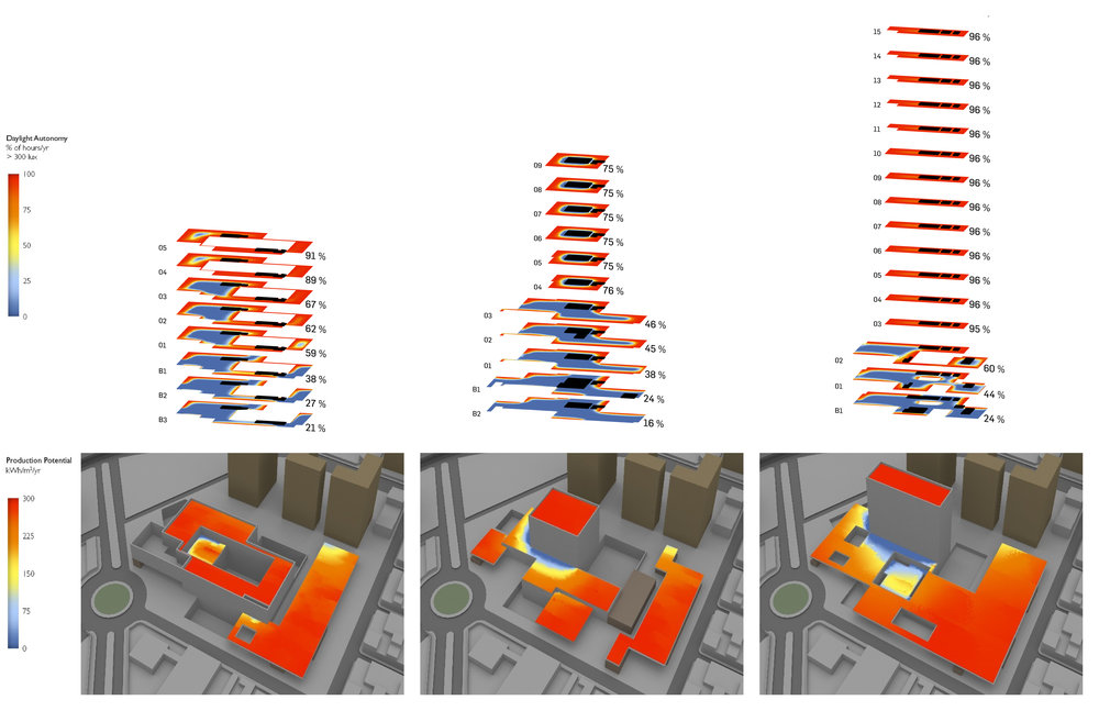
The graphic is intended to show various annual daylight metrics for residential apartments based on different parameters. There is an overall axon to show urban context and then three axonometric visualizations showing UDI 2000, DA 300 and SDA 300. Parameters like building type, level, window area and ceiling height are shown in the upper left corner.
How did you make the graphic?
A colleague fed me CAD plans of apartment layouts that had building envelope, apartment demising walls, habitable interior walls and non-habitable cores arranged by layers. A grasshopper/python script read these layers along with several parameter inputs mentioned above to build a parametric apartment building floor complete with exterior windows. This was fed thru a Honeybee daylighting analysis. Annual data expressed as a percentage (UDI 200) was grouped into four colored bins to simplify the typical gradient visualization. This grid data was exported as a raster image and layered over a wireframe vector of the geometry in indesign.
What specific investigation questions led to the production of this graphic?
It was important to visually communicate the impact of building depth, increased ceiling height and glazing area on annual daylight access for a diversity of building types. The graphic had to be compelling, get to the point but be backed with data to drive policy change.
How does this graphic fit into the larger design investigations and what did you learn from producing the graphic?
The investigation aimed to show increased “livability” for a range of one, two and three bedroom urban apartments. Axonometric drawings efficiently communicate 3d space. in this case, showing the apartment plan layouts, window apertures and daylighting data was really important. Adding the urban context gives an understanding of the impact of orientation and adjacent geometry. It can be difficult to make annual daylighting metrics meaningful to policymakers – borrowing LEED metrics for other building types allowed a “pass/fail” visualization that could be unpacked with the additional visualization.
What was successful and/or unique about the graphic in how it communicates information?
Grouping data in bins simplifies what you are looking at and allows one to talk about highs, lows and in-betweens. Combining a pass/fail visualization with backup data gives the audience something to work from, and dig in deeper if they choose. Using UDI2000 as a good thing instead of bad is unique – here it is celebrated as access to sunlight that every cat in a window appreciates.
What would you have done differently with the graphic if you had more time/fee?
The various parametric outputs are perfect for Design Explorer. One could more easily navigate parameter impacts and quickly come to the conclusion that window area and ceiling height matter to livability. Showing electric energy savings from daylighting would be a useful addition.