PROJECT INFORMATION
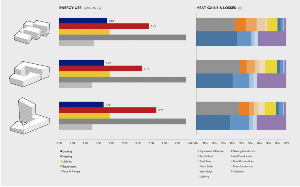
Graphic Name: What is the impact of building massing on annual energy end uses and heat gains & losses?
Submitted by: Carl Sterner
Firm Name: Sefaira
Other contributors or acknowledgements (optional)
What tools did you use to create the graphic?
-
Sefaira
-
Excel
-
Adobe Photoshop
-
SketchUp
What kind of graphic is this? Bar chart
Primary Inputs: Building geometry, and location- and building-use-specific assumptions related to building envelope (utilizing prescriptive values from ASHRAE Std. 90.1) and mechanical systems (utilizing system templates in Sefaira).
Primary Outputs:
-
Annual energy end use breakdown, normalized per square foot (kWh/ft2/yr)
-
Sources of heat gain and heat loss, shown as a % of total heat gains and total heat losses (rather than in BTUs)
GRAPHIC INFORMATION
What are we looking at?
The graphic is designed to assess the relative performance of the three massing options, and to provide enough information to help the design team come up with possible strategies for improvement. The bars on the left show energy end uses, normalized per square foot to facilitate quick comparison. For example, one can quickly see that the third option has the highest heating energy use per square foot among the three designs.
On the right are two bars showing annual sources of Heat Gains and Heat Losses, which shed additional light on the heating and cooling end uses. For example, the third option’s “Heat Losses” bar reveals much higher conduction losses through walls than the other options. Because the envelope properties are held constant in this analysis, this difference is due to the greater wall area (higher surface-area-to-volume ratio) of this design compared to the others.
How did you make the graphic?
-
Created massings in SketchUp and performed energy analysis using Sefaira.
-
Exported perspective images from SketchUp (without glazing, in order to maintain focus on massing and not facade design).
-
Logged results in Excel, including total energy end uses and annual heat gains and heat losses.
-
Normalized the results based on the floor area of each massing.
-
Created graphs in Excel.
-
Combined the graphs and model images in Photoshop, added a gray background, and adjusted text and alignment.
What specific investigation questions led to the production of this graphic?
-
Which design option performs best, and why?
-
What is driving the energy use of each design option?
-
What is driving the heating and cooling loads of each design option?
-
What strategies could improve the performance of each design option?
How does this graphic fit into the larger design investigations and what did you learn from producing the graphic?
This graphic is a very early-stage analysis. The most important learning is where to focus moving forward — in this case, on plug loads, glazing U-factor, and wall R-value. The graphic is designed to generate questions and hypotheses — for instance, “How high would the wall R-value have to be in Option 3 for it to perform as well as Option 2?” These questions are the logical next steps for subsequent analyses..
What was successful and/or unique about the graphic in how it communicates information?
Analysis alone rarely determine a design’s direction. Instead, such analyses are successful if they provide insight on why a design performs the way it does, and what can be done to improve that performance. This graphic sought to provide just the right information to inform decision-making, presented as clearly as possible. We avoided pie charts, as these are more difficult to compare. We used common-sense colors (e.g. red for heating, blue for cooling), and kept them consistent across all charts (e.g. lighting and equipment are the same in both the “end uses” and “heat gains” charts. The result is legible, aesthetically compelling, and above all useful for quickly assessing a design, understanding the factors affecting performance, and generating clear, actionable hypotheses that can be tested with further analysis.
What would you have done differently with the graphic if you had more time/fee?
Experimented more with the color palette, and with alternate compositions for heat gains and losses.
.