PROJECT INFORMATION
Graphic Name: What is the impact of different top lighting strategies / screening strategies on daylight?
Submitted by: Morgan Maiolie
Firm Name: NA
Other contributors or acknowledgements (optional) Integrated Design Lab
What tools did you use to create the graphic?
-
Adobe Illustrator
-
Adobe InDesign
-
Physical model + heliodon
What kind of graphic is this?
Primary Inputs: Material surface reflectance, screen perforations, skylight translucency
Primary Outputs: daylight factor across space
GRAPHIC INFORMATION
What are we looking at?
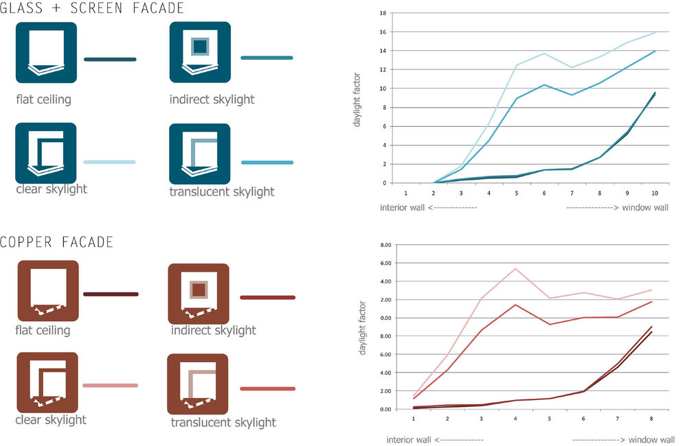
The graphic shows how daylight factor across a room is affected by different top lighting strategies with both clear and perforated screened glass along one wall.
How did you make the graphic?
I put daylight sensors in a physical model to detect changes in the skylight / screens. The data from the sensors was input into an excel sheet and used to generate charts that show daylight changes across the interior of the space. I used illustrator to edit the line work, colors, and add icons to denote each iteration of the model's analysis.
What specific investigation questions led to the production of this graphic?
What is the difference in illumination between a center aligned square skylight and a strip? How do different types of screen perforations affect each of these skylight geometries?
How does this graphic fit into the larger design investigations and what did you learn from producing the graphic?
This graphic was paired with photographs of the model to understand both performance and aesthetics of the screen / skylight changes. Together, they taught me that a strip skylight created more even lighting and larger perforations in a screen could provide more dynamic light bouncing around the space and illuminating the center more brightly. The copper facade studies showed that daylight was decreased considerably, but was spread more evenly.
What was successful and/or unique about the graphic in how it communicates information?
Keying colors and icons proved an effective way to quickly communicate different design decisions + performance implications.
What would you have done differently with the graphic if you had more time/fee?
Made the Y axis on the two graphs match! Can’t believe I didn’t do that.