PROJECT INFORMATION
Graphic Name: What is the impact of energy conservation measures (ECMs) on peak heating and cooling loads in comparison to the designed heating and cooling system capacity?
Submitted by: Daniel Lu
Firm Name: Steven Winter Associates, Inc.
Other contributors or acknowledgements (optional) Paula Zimin
What tools did you use to create the graphic?
-
eQuest
-
Excel
-
Python
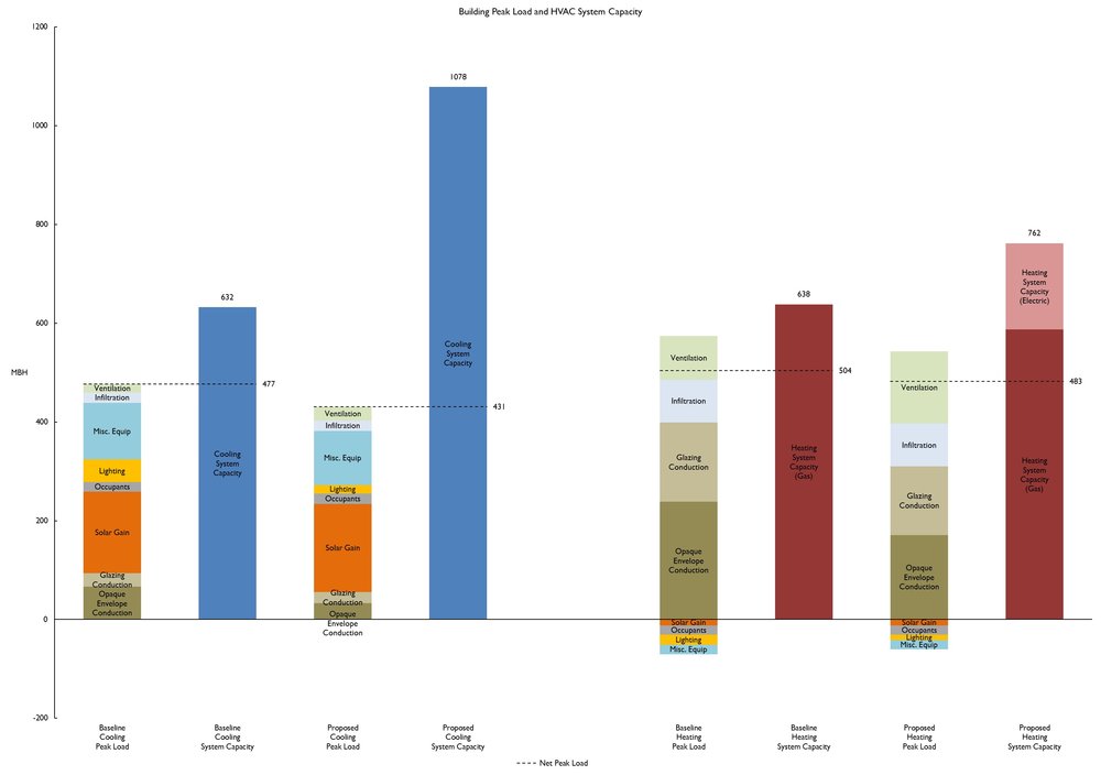
What kind of graphic is this? Bar Chart
Primary Inputs: Preliminary whole building energy model inputs, including values specified by owner’s project requirements, design documents, and typical modeling assumptions.
Primary Outputs: building peak cooling and heating loads, broken down by load component, total HVAC system capacity, with heating system capacities specifically differentiated by heat source (gas, electric, etc), all in units of MBH
GRAPHIC INFORMATION
What are we looking at?
The graph primarily compares the building cooling and heating peak loads to the corresponding total HVAC system capacity for both baseline and proposed design whole building energy model. Each peak load column is broken down into different colored and labeled load components. A dashed line indicated the net peak load extends from each loads column to highlight how HVAC system capacities are oversized. This is especially necessary for peak heating loads, which have dashed lines positioned lower than the top of heating peak load columns because of internal loads and solar gains reducing the need for heating and therefore given negative values. Values are shown right next to the dashed lines for more detailed comparison between net peak load and system capacity values (shown on top of the system columns). Finally, a legend defining the dashed line is shown at the bottom in case its meaning is not immediately clear. For this specific case, the baseline was developed per ASHRAE 90.1 PRM (Appendix G) so the combined building cooling capacity are confirmed to be 15% higher than peak, and the combined building heating capacity is 25% higher than peak.
Showing peak loads next to system capacity can raise important design questions, particularly why design HVAC system can be significantly oversized and higher than baseline even though design peak loads may have decreased. Displaying these columns in the same graph also enables other comparisons. How do peak loads change between baseline and proposed design? Which components have contributed the most to reduced loads and can this be further optimized? How do peak loads compare between heating and cooling season? How do heating and cooling system capacities compare within each design option and across multiple design options?
How did you make the graphic?
Peak load components were extracted from eQuest LS-B output reports in the SIM file for each model. Since no single eQuest output report shows total building peak heating and cooling loads broken down by component*, a Python script was written to extract and sum up the peak load components from each space’s LS-B output report. eQuest also does not report ventilation loads in any of its peak load reports, so an approximate sensible heat load is calculated for each case using the outdoor-indoor temperature difference at peak heating and cooling and the total HVAC outdoor air CFM rates. HVAC system capacities were derived from eQuest SV-A reports. All values from eQuest reports were then organized in Excel to generate a stacked column chart. Dashed lines are added within Excel as additional chart types.
*(An eQuest LS-A report does show individual peak loads for each space, but doesn’t break them down by components. An eQuest LS-C report shows total peak loads and components but treats the building as one continuous volume, not as separate spaces which can experience higher individual peaks at different times. Therefore, the LS-C values are not appropriate for comparison to mechanical engineer’s design HVAC system sizing.)
What specific investigation questions led to the production of this graphic?
Why is the high performance (high EER or COP) heating /cooling system in the proposed design not meeting energy cost savings targets?
By how much are HVAC systems oversized in baseline and proposed design cases?
How do peak loads change between baseline and proposed design?
Which peak load components changed the most? The least?
How do peak loads compare between heating and cooling season?
How do heating and cooling system capacities compare within each case and across cases?
How does this graphic fit into the larger design investigations and what did you learn from producing the graphic?
This graph came about when the energy analytics team recognized how projects not meeting savings targets tended to overventilate and/or oversize HVAC equipment. The energy analytics team also noticed how passive design strategies do not always translate into significant energy savings when those HVAC systems are oversized. This graph indicates load reductions or gains due to architectural design (e.g. solar gains from windows) and mechanical design (ventilation loads). If system capacities and outdoor air flowrates are significantly oversized, the graph can then prompt the mechanical engineer to align their sizing calculation assumptions with architectural design parameters, energy modeling assumptions, and owner’s project requirements. Hopefully this results in reducing the size of HVAC equipment and improving the design’s energy performance.
Through design team discussions on this graphic, the energy modeling team learned how efforts to get HVAC engineers to reduce sizes can eventually hit an institutional barrier: liability and risk lies with the MEP engineer, not the energy modeling consultant, forcing them to make much more conservative assumptions. Discussions also brought to light on how HVAC manufacturers tend to offer large sizes, limiting the minimum size MEP engineers can specify, especially with packaged terminal units.
What was successful and/or unique about the graphic in how it communicates information?
By placing design parameters relevant to architecture, sustainability, and mechanical engineering disciplines together, the graphic becomes a basis for more integrated discussions. By breaking down peak loads by components, the architect can see the outcomes of some of their design decisions: wall insulation affecting opaque envelope conduction, window wall ratios and glazing areas affecting solar gain and glazing conduction. At the same time, the mechanical engineer can see how significant passive design strategies have led to load reductions which could enable lower sized HVAC equipment. Overall, this graphic raised awareness to building owners and design teams about the holistic nature of sustainable design: load reduction and appropriate system sizing must go hand in hand to improve building performance.
What would you have done differently with the graphic if you had more time/fee?
I would also add to the graph lines showing Passive House requirements for heating and cooling, which specify limits of 4.75 kBtu/SF for annual heating demand and 5.71 kBtu/SF for annual cooling demand. There is some discussion among the energy modeling community of moving towards absolute metrics rather than relative metrics comparing to an ASHRAE baseline model. Passive House’s absolute targets can be shown as lines on the graph to benchmark the project and initiate discussions on upcoming energy code requirements.
An additional set of graphs could be placed between the baseline and proposed design columns for the case where peak loads are reduced via passive design but the energy model is still allowed to autosize HVAC systems. This can help directly compare the ideal case, where passive design leads to appropriate sizing, to the design with equipment sizes as specified.
The extraction of peak load components from eQuest could also be done with Excel macros, which would enable anyone to analyze simulation results completely within the Excel interface.