PROJECT INFORMATION
Graphic Name: What is the impact of design strategies on long term carbon emissions relative to a current code minimum building?
Submitted by: Daniel Lu
Firm Name: Steven Winter Associates, Inc.
Other contributors or acknowledgements (optional) Paula Zimin
What tools did you use to create the graphic?
-
OpenStudio
-
EnergyPlus
-
Excel
What kind of graphic is this? Stacked area chart
Primary Inputs: Preliminary whole building energy model inputs, including values specified by owner’s project requirements, typical assumptions, or calculations from design drawing takeoffs.
Primary Outputs: Equivalent carbon dioxide emissions from building energy usage.
GRAPHIC INFORMATION
What are we looking at?
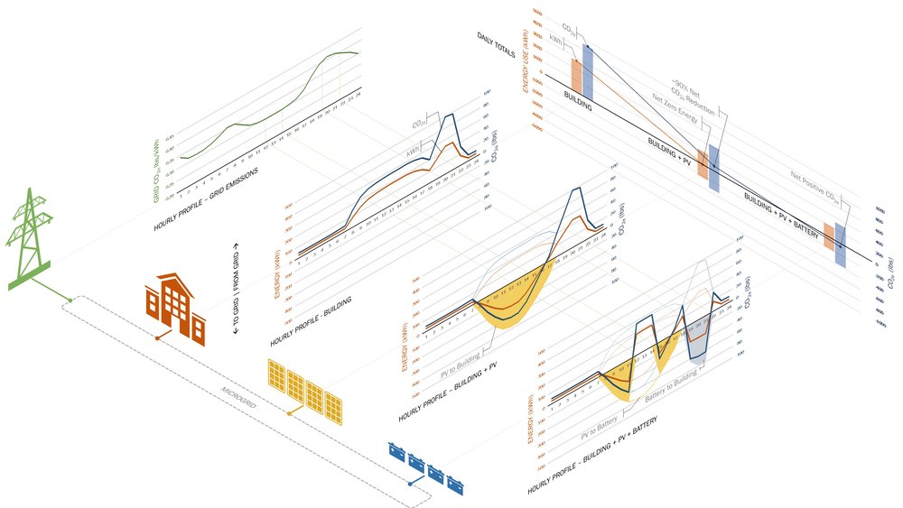
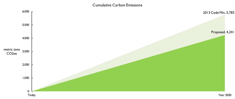
The graphic shows the projected carbon emissions reductions relative to an ASHRAE 90.1-2013 code minimum building over the anticipated life of the building or a common target year (Architecture 2030, NYC 80 by 2050, etc). Given both the AEC industry and the sustainability movement’s future goals of reducing carbon emissions to curb global warming, it is important to frame high performance building design in the long term. The graph’s x-axis shows time, from present day to the year 2050. The graph’s y-axis indicates metric tons of equivalent carbon dioxide. Two right triangles convey the cumulative carbon emissions resulting from energy usage of two building energy models: an ASHRAE 90.1-2013 code compliant baseline model and the proposed building design. The peaks of the two triangles are labeled with the estimated total carbon emissions values.
How did you make the graphic?
The energy models were created in OpenStudio, which uses EnergyPlus. EnergyPlus standard output was then copied into an Excel spreadsheet where equivalent carbon dioxide emissions were calculated and then displayed in the graph. An online database was used to obtain the equivalent carbon dioxide emissions for each unit of electricity and natural gas use. The projected cumulative emissions till the year 2050 is calculated simply by multiplying the annual CO2 emissions by the time between now and 2050. The values are then displayed on a shaded area graph in Excel. No factor for a potentially cleaner grid in the future was used in this analysis, but assumptions could be made to account for it.
What specific investigation questions led to the production of this graphic?
What’s the long term environmental impact of the building design?
How much greenhouse gas is the design saving compared to building code minimums?
How does this graphic fit into the larger design investigations and what did you learn from producing the graphic?
Building developers and owners are primarily interested in seeing if projects can earn sufficient energy cost savings for the purposes of earning tax credits and program incentives. This graphic, when paired with conventional energy cost analyses, can help illustrate that saving money and reducing environmental impact are not necessarily mutually exclusive goals. This graphic has been useful as providing the “wow” factor to visually describe the implications of a development. The question is often raised to an owner: do they want a bigger triangle, or a smaller one? It’s been a great conversation piece, although it hasn’t made as much of an impact on decision yet.
In the process of making the graphic, the energy analytics team learned that electricity currently emits significantly more carbon dioxide than natural gas in many parts of the US. This emphasized both how sustainable design can help achieve emissions reductions and how those efforts on the demand side are limited by the carbon emission rates of utilities on the supply side.
What was successful and/or unique about the graphic in how it communicates information?
This graphic helped give clients a sense of the long-term impact of the design team’s efforts by emphasizing how small changes to the current design can have magnified consequences.
What would you have done differently with the graphic if you had more time/fee?
As we continue to work to reduce carbon emissions from our building stock, it will be important to start adding embodied carbon calculations to this graphic. Certain energy conservation measures could involve a greater initial “carbon investment” but save greater carbon emissions on the annual basis. A graphic that illustrates tradeoffs between embodied and annual carbon emissions will help broaden the scope of sustainable design discussions.