PROJECT INFORMATION
Graphic Name: What is the impact of building form on solar radiation gains for an atrium space?
Submitted by: Michael Sawford
Firm Name: EDSL USA, Inc.
Other contributors or acknowledgements (optional) EDSL Tas consultancy services
Who performed the simulation analysis? (select all that apply) Architect – Internal Sustainability Personnel
What tools did you use to create the graphic? EDSL Tas
What kind of graphic is this? 3D projection of internal solar loads / spatially integrated
Primary Inputs: building and site geometry
Primary Outputs: solar radiation in (W/m2)
GRAPHIC INFORMATION
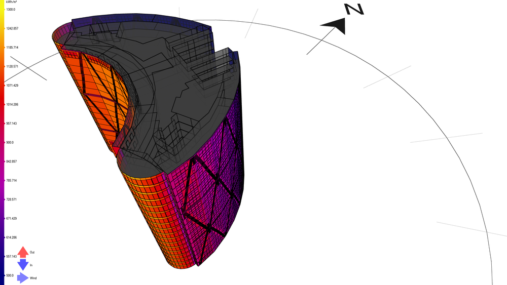
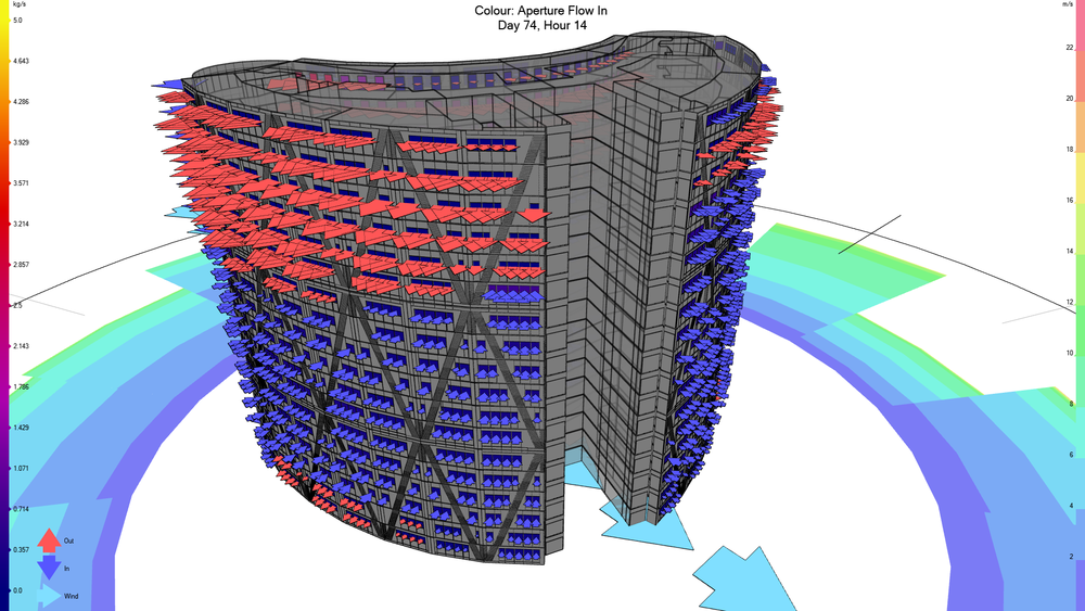
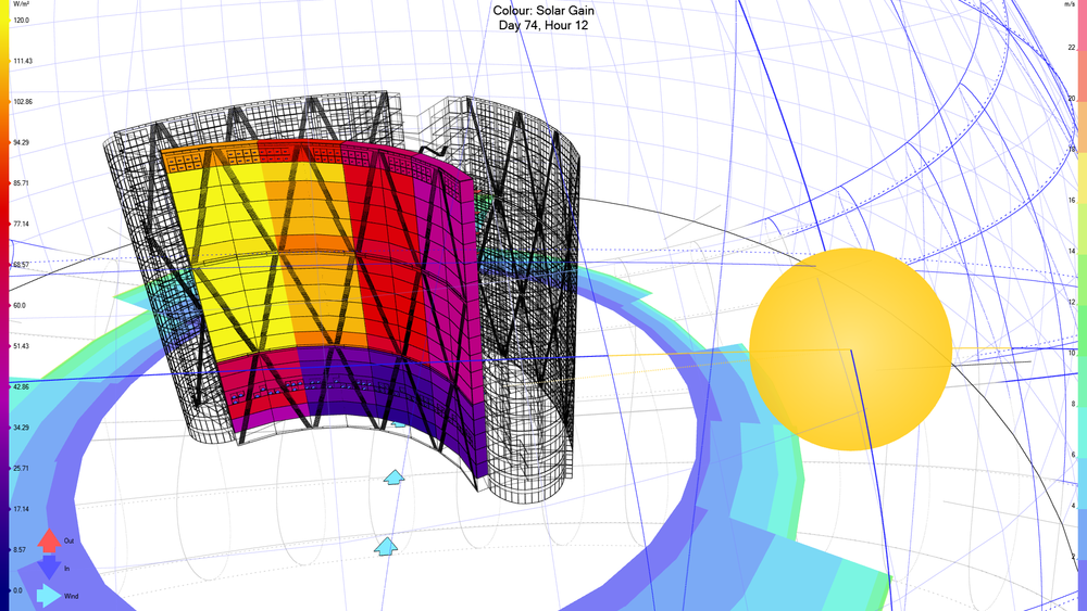
What are we looking at?
3D model of part of a building, isolating the spaces associated with an atrium space facing South, depicting the solar gain in the atrium spaces (the solar radiance transmitted through the building envelope) into the zone adjacent to the envelope for a given day and hour (day 74 hour 12, as shown at the top of the image) using the solar data from the weather data for the building’s location and building envelope performance parameters. The atrium spaces are colored by solar gain and the remaining areas of the 3D model are included only in wireframe so that the context of the model is included. The W/m2 scale for solar gain is found on the left-hand side of the image. The Sun position is also shown for the particular day and time as a yellow orb with a yellow dotted line indicating the Sun direction. There are multiple blue lines showing the varying sun arcs and analemma’s including the current Sun arc on which the yellow orb is located. The current Sun arc is indicated by yellow lines on the Sun arc extending from the yellow orb. Analemma’s and Sun arcs are also displayed below the horizon by grey lines. In addition, the sky dome is displayed by a grey grid. The wind rose is depicted on the ground plane, the metres per second scale for wind speed is found on the right-hand side of the image. The current wind direction is also displayed by the light blue arrows on the ground plane. Small inlet and outlet arrows can be seen at the bottom and top level of the atrium indicating the flow of air in at lower level and out at the upper level. (More display options have been chosen intensionally to highlight the need for clear intelligible graphics when communicating BEM results data).
How did you make the graphic?
EDSL Tas was used to create the 3D model. Building envelope performance data was then added to the model utilising the Tas constructions databases and created by user data entry. An example database included is the international glazing database for glazing materials, making it easy to create glazing constructions for investigation. New materials can be created as needed and saved in Tas Constructions databases for reuse as necessary also. The results of the solar gain in the model spaces can then be displayed after simulation of the building. The solar gain in the atrium spaces has been isolated by creating a group of zones for the atrium as an ‘output selection’. The results for this output selection of zones can then be shown visually in the tool for live interaction or report exports. The 3D model view can be interrogated in real time in an interactive fashion. However, using automated reporting tools in EDSL Tas software you are able to export images/videos. The uploaded image is an example of the output for one particular hour of one day from a particular view point.
What specific investigation questions led to the production of this graphic?
Investigation of the building form and its interactions with solar data for the buildings location. Solar gain values for different times of day, and days of the year can be investigated to see implications for the atrium space for extreme temperatures at the top of the atrium and the potential natural ventilation options driven by the stack effect to alleviate those peak temperatures at the top of the atrium space..
How does this graphic fit into the larger design investigations and what did you learn from producing the graphic?
This is one view of the visual data used to communicate the impact of solar gain in the atrium space and the potential for natural ventilation driven by the stack effect. Air flow arrows indicate air flowing in lower level apertures and exiting through upper level apertures in the atrium space driven by the stack effect and the prevailing wind direction for this hour. Videos stepping through hours of particular days can be created as well as showing the data from within the EDSL Tas software.
What was successful and/or unique about the graphic in how it communicates information?
Being able to show the solar gain, whether in still images or in videos stepping through a particular day, allowed for easier communication of the data in context with the building. Flexibility in choosing which information to display and how the output is created was a great benefit in visualising the data from EDSL Tas. (For example, options to create a single image for a particular view of the model, or a series of images created stepping through hours of a particular day could be automatically created. Or creating a video to capture the responses of the building to changing solar and wind conditions hour by hour). When viewing the 3D model view within the EDSL Tas software (prior to export), if you mouse over a particular zone/surface/air flow arrow in the view information about the zone/air flow rate is displayed. For example, the solar gain in a particular zone in the atrium or the flow rate in/out of the atrium is shown. This allows you to interrogate the data in real time in an interactive fashion.
What would you have done differently with the graphic if you had more time/fee?
I could have opted to exclude some extra visual data not pertinent to the analysis goals. For example, removing the Sun arcs and analemma’s below the horizon and the sky dome grid. By removing the extra data, the graphic could be understood more easily and therefor communicated the results in a more intelligible fashion.