PROJECT INFORMATION
Graphic Name: What is the most effective shading geometry for various facade orientations?
Submitted by: Elliot J Glassman, Associate
Firm Name: WSP Built Ecology
What tools did you use to create the graphic?
-
Grasshopper Honeybee
-
Adobe Illustrator
-
Adobe InDesign
What kind of graphic is this? Heat map
Primary Inputs: All annual solar vectors, window size and orientation
Primary Outputs: Hours of shade provided
GRAPHIC INFORMATION
What are we looking at?
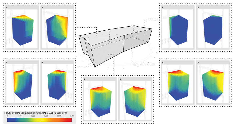
The graphic is showing the massing of a building in a hot climate surrounded by analysis of different facade orientations. A volume in front of the window on each of the orientations is color coded based on the number of hours that a shading device in that location would be successful at blocking direct sun from hitting the window. The analysis is suggestive of the idealized shape of an effective exterior shading element.
How did you make the graphic?
The analysis was run in Grasshopper based on the solar vectors hitting each of the windows. The images of the results were automatically recorded and compiled to the graphic using InDesign.
What specific investigation questions led to the production of this graphic?
Given that many of the buildings facades are oriented in a non-cardinal compass direction, what type of external shading device would be most effective at reducing the hours of direct sun hitting the windows? How can a unique architectural facade treatment be generated by a solar response? How can a solar device be designed to effectively block direct sun, but allow in indirect illumination?
How does this graphic fit into the larger design investigations and what did you learn from producing the graphic?
Rather than testing a series of different shading device lengths, the study was one analysis designed to suggest an effective solution based on the relationship of the annual solar angles to each particular facade orientation. Since this was a hot climate where passive solar gains were never beneficial, there was no concern about an energy penalty for excluding certain solar angles. The balance we were studying was how to block direct sun while not providing shade where it was not needed and thereby reducing indirect daylight levels. The graphic revealed the difference in the needs of each orientation and which parts of a theoretical external shade would be most effective. It fed into the discussion with the design team how to generate a unique architectural response for the facade that was also performative.
What was successful and/or unique about the graphic in how it communicates information?
The color coding was very suggestive of a shape of a projecting external screen. It was therefore clear to all members of the team what parts of a theoretical shade would be most effective for each of the orientations.
What would you have done differently with the graphic if you had more time/fee?
Studied how these shading elements may aggregate across the facade.


