PROJECT INFORMATION
Graphic Name: What is the impact of urban context on facade solar irradiance?
Submitted by: Jason Lackie, Building Performance Analyst
Firm Name: WSP Built Ecology
Other contributors or acknowledgements (optional)
What tools did you use to create the graphic?
-
Adobe InDesign
-
Grasshopper DIVA 4
What kind of graphic is this? Heat map
Primary Inputs: Project geometry, surrounding context
Primary Outputs: Annual solar radiation (kWh) per square meter.
GRAPHIC INFORMATION
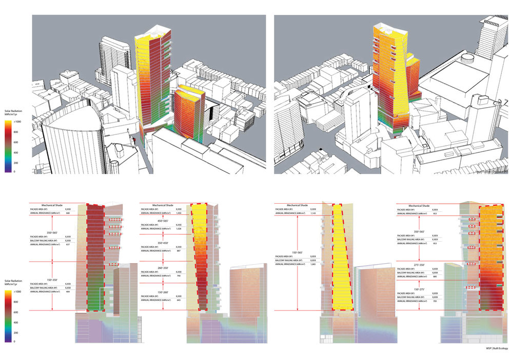
What are we looking at?
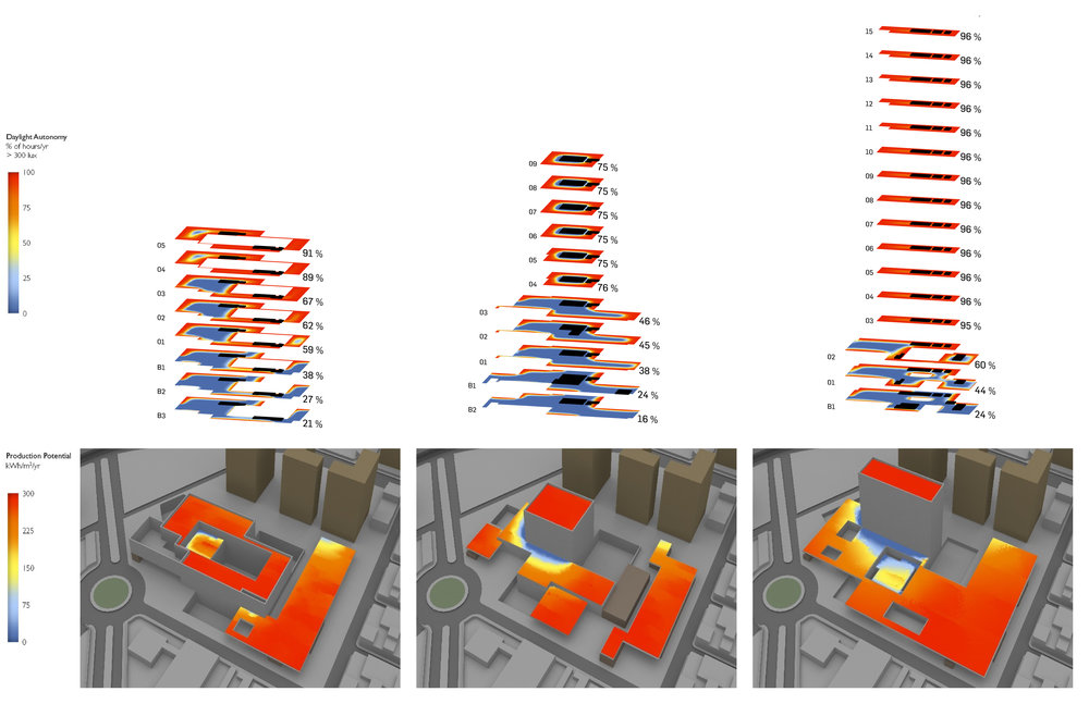
The graphic shows the annual solar radiation gain, per square meter, on the building’s façade accounting for orientation and surrounding context. The images along the bottom summarize annual irradiance for specific façade areas and orientations.
How did you make the graphic?
We used DIVA to perform solar irradiance calculation and a Grasshopper script to generate a radiation map and apply it to the façade of the model. Images were output from Rhino and combined and annotated in InDesign.
What specific investigation questions led to the production of this graphic?
This analysis was part of a study to review the viability of building integrated photovoltaics (BIPV). Beyond the performance characteristics of potential BIPV products, the impact of surrounding context, both current and future, needed to be considered.
We created a grasshopper script to calculate the average irradiance for specific areas of the façade. We than ran an annual irradiance simulation on the model, including surrounding urban context, to determine the impact of adjacent structures and surface orientation on potential BIPV yield.
How does this graphic fit into the larger design investigations and what did you learn from producing the graphic?
The intent of this graphic was to provide the design team with feedback on viable locations for integrating photovoltaics into the envelope. The outputs from grasshopper also allowed a more dynamic projection of panel production based on solar access and orientation.
What was successful and/or unique about the graphic in how it communicates information?
Applying the gradient map over the entire façade allowed the design team to quickly assess areas of the façade to consider for BIPV. Utilizing grasshopper to calculate specific envelope areas and average irradiance values allowed for different scenarios to quickly update PV generation calculations.
What would you have done differently with the graphic if you had more time/fee?
Currently the graphic shows annual solar irradiance. Adjusting the script to provide results for a single day and then creating two sets of graphics with the daily irradiance values at the solstice and equinox would allow a more dynamic visualization of the impact of seasonal variation.