PROJECT INFORMATION
Graphic Name: What’s the impact of different skylight geometries on daylight autonomy?
Submitted by: Andrew Corney, Product Director
Firm Name: Sefaira
What tools did you use to create the graphic? Sefaira
What kind of graphic is this? Graphic Matrix
GRAPHIC INFORMATION
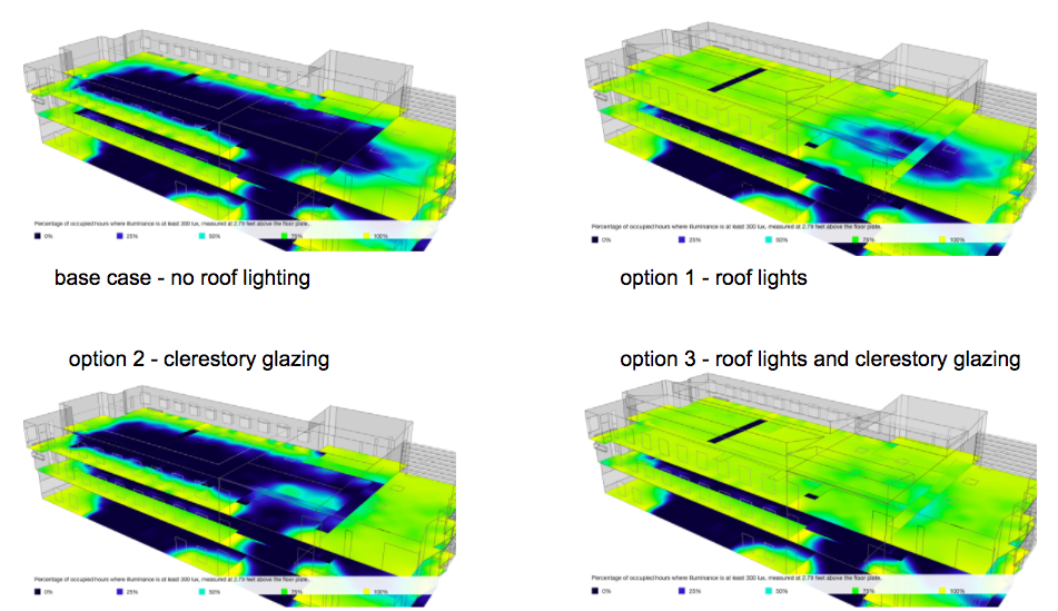
What are we looking at?
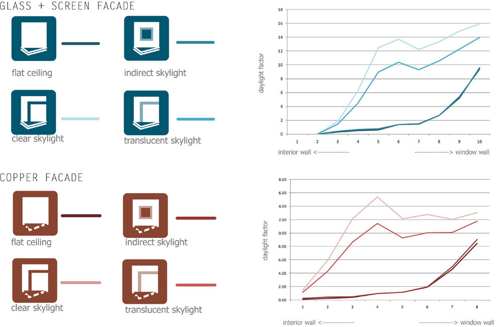
This is a visual showing 4 roof light options for a medical office building project. It compares different strategies – applying simple roof lights, clerestory glazing, both or neither. It aims to use colour to communicate which parts of the floor plate benefit from the different options.
How did you make the graphic?
I took 4 screen captures from 4 analysis runs in the Sefaira plugin and combined them using powerpoint.
What specific investigation questions led to the production of this graphic?
How well do these daylight options improve the amount of daylight entering the top floor of the building?
How does this graphic fit into the larger design investigations and what did you learn from producing the graphic?
This graphic was developed for a competition.
One goal was to introduce as much daylight as possible into the building and communicate how the design solution was able to do that. We needed to identify the problem first (deep floor plate with partitions) then a solution that could solve it.
Four different roof light and energy options were being considered:
- No Skylights – this was the base case and is the top right image. The analysis confirms that there is low daylight on the top floor. Including this image in the graphic helps baseline performance for the reader.
- Clerestory windows
- Flat Skylights
- Both Clerestory windows and flat skylights
The graphic helped to identify how well the options compared in terms of achieving the goal of more daylight. It did this through:
- Effective side-by-side comparison of results
- Glanceable detail from a distance with extra detail provided close up
Looking at the graphic, it becomes clear that for most of the floor plate, the skylights were far more effective at bringing in natural light than the clerestory windows. The diagram helped the team hone in on a solution that combined skylights and a subset of clerestory windows to achieve this part of the project goal. It was presented in tandem with energy results.
What was successful and/or unique about the graphic in how it communicates information?
This graphic tool very little time to generate. It’s a standard Sefaira output that I was able to make in about 10 minutes with the SketchUp model as a starting Point. It’s great because for something that’s very quick to generate, it clearly quantifies visually the differences between the options for a client who is not interested in numbers.
The graphic primarily uses colour to communicate the difference between options. This makes the 4 options glance-able for a lay person or for a person who is not close up to the diagram (eg in a presentation).
There is a scale provided on the image as well and importantly all images are shown at the same lighting scale to ensure a fair comparison between each.
I believe this graphic is successful because it does most of the important work for the reader:
- Consistent scale and viewpoint
- Intuitive use of colour to communicate performance
- Key focus on a single piece of information (There is not a whole lot of other information to confuse the reader.)
- Compares options fairly.
What would you have done differently with the graphic if you had more time/fee?
The graphic is great as is and we included more in the original study to communicate the impact on energy use as well. Showing the analysis in tandem with external views of the model is always a good way to reinforce the bigger story and overall picture for the 4 different solutions.