PROJECT INFORMATION
Graphic Name: What is the impact of glazing size & shape on daylighting and solar gain?
Submitted by: Carl Sterner
Firm Name: Sefaira
Other contributors or acknowledgements (optional)
What tools did you use to create the graphic?
-
Sefaira
-
SketchUp
What kind of graphic is this? Lux values / spatially integrated
Primary Inputs: Building geometry (including shading), building location (weather file), glazing VLT, material reflectance assumptions
Primary Outputs: Daylight Autonomy DA(300/50%), and Direct Sunlight (% of days that have more than 3 hrs of direct sunlight annually)
GRAPHIC INFORMATION
What are we looking at?
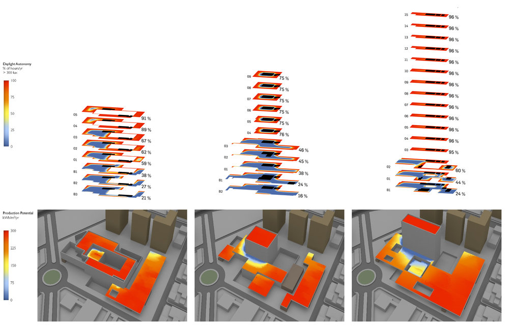
The graphic is looking at how to design glazing and shading to maximize daylighting (measured in terms of Daylight Autonomy) while minimizing solar gains (measured in terms of hours of direct sunlight), which are a liability for this cooling-dominated building. On the left is a Daylight Autonomy visualization, showing the percent of hours annually that receive at least 300 lux through daylight alone, with yellow representing 100% and black representing 0%. On the right is a Direct Sunlight visualization, showing the percent of days annually that receive more than 3 hours of direct sunlight, with yellow representing 100% and blue representing 0%. The graphic shows that there are significant areas of this building that are not receiving sufficient illuminance through daylight alone, and that skylights and unshaded south windows are allowing significant direct sunlight and associated solar gains.
How did you make the graphic?
1. Modeled simplified building geometry in SketchUp
2. Setup and ran a Daylight Autonomy simulation using the Sefaira Real-Time Analysis plugin for SketchUp, specifying the target lux levels and analysis grid height.
3. Setup and ran a Direct Sun analyses using the Sefaira Real-Time Analysis plugin for SketchUp, specifying the hours of direct sunlight and date range.
4. Exported the graphics from Sefaira.
What specific investigation questions led to the production of this graphic?
1. How does our current design perform in terms of providing good daylighting while minimizing solar gains during cooling months?
2. Are there problem areas (in terms of either daylighting or direct sunlight) that we need to address?
How does this graphic fit into the larger design investigations and what did you learn from producing the graphic?
This exploration was informed by previous energy modeling that showed the building was cooling-dominated, and that solar gain was a primary contributor to the cooling load in a number of the zones. A primary takeaway from this study was that daylighting was fairly effective in the gymnasium (with a continuous clerestory), but daylight penetration was not great in the rest of the building. This led us to look at slightly taller windows and light shelves that simultaneously bounced the daylight deeper into the space and blocked some direct solar gain.
What was successful and/or unique about the graphic in how it communicates information?
Decisions about glazing involve trade-offs between daylight and energy impacts. Showing both daylighting and direct sunlight side-by-side is a great way to evaluate both impacts, and the visual presentation is intuitive & accessible for non-experts, making this a good conversation starter.
What would you have done differently with the graphic if you had more time/fee?
It would have been good to look at the peak cooling and/or system sizing impacts of reducing solar gain, and to quantify the potential energy benefits of better daylighting. Light shelves, shading, and lighting controls can be difficult to cost-justify on the basis of energy cost savings alone, but if they can provide better daylighting, and/or reduce mechanical system size & cost, the case becomes more compelling.


