PROJECT INFORMATION
Graphic Name: What is the impact of different blind control strategies on illuminance over the course of an average day?
Submitted by: Jacob Dunn
Firm Name: ZGF
Other contributors or acknowledgements (optional) Chris Chatto – ZGF
What tools did you use to create the graphic? Grasshopper / Indesign
What kind of graphic is this? Graphic Matrix
Primary Inputs: building geometry, glazing specifications, blind controls (automated vs. manual)
Primary Outputs: illuminance (lux)
GRAPHIC INFORMATION
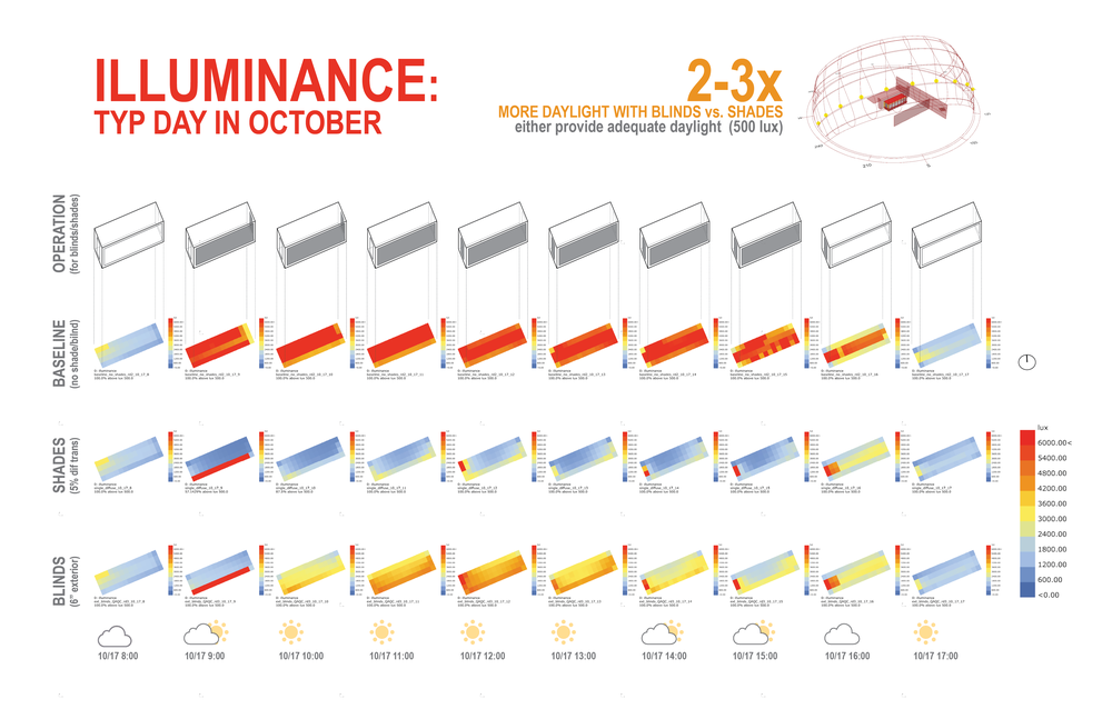
What are we looking at?
This compilation graphic compares the amount of illuminance in a single space for a typical day in October for two different automated shading strategies: external blinds and internal roller shades. A baseline case is also shown without any type of shading for the windows. Each illuminance map is reported for a single hour throughout the day, while a 3d axon image at the top of the graphic shows when the automated shading is deployed for each of the 3 windows. The labels next to each illuminance map describe the run name and displays the % of the space above the 500 lux threshold for the workshop/maker space being analyzed. Weather symbols at the bottom of the graphic provide insight into the sky condition during that hour, which relates to whether or not the external radiation trigger (>50 w/m2) on each of the windows is activated. Larger text labels at the top of the page cover at a glance the key insights of the analysis, i.e. that the blinds option provides 2-3 times more daylight that the diffuse shade due to their light redirection and reflection characteristics.
How did you make the graphic?
Leveraging the graphic output capability of grasshopper was crucial in the creation of this graphic. Honeybee was used to run the single-point-in-time analyses, while Ladybug components were used for grid visualization. But instead of looking at a single illuminance map for a single run case, the components allow you to input a list of .ill files (the output file of the illuminance simulation) within a single folder, while defining ‘move’ vectors within Grasshopper to place each subsequent grid next to the one before it. This group of components was then copied for each of the other cases and the result is the matrix that you see in the graphic. Custom labeling can be included to name the runs and report different text labels, such as the % threshold values. This process saved a lot of time when taking the imagery into Indesign to add the other graphic elements. Typically, each grid would need to be placed individually within Indesign, but Grasshopper’s ability to automate the visualization and placement of the 30 grids added significant efficiency to the visualization process.
What specific investigation questions led to the production of this graphic?
Is there a difference in the amount of daylight admitted between automated roller shades and automated exterior blinds for a typical day in October? If so, what is the magnitude of this difference and is it worth the extra cost?
How does this graphic fit into the larger design investigations and what did you learn from producing the graphic?
The single-space analysis targeted a heavily glazed workshop/maker-space zone where some form of automated shading was needed for glare control, and potentially for solar load control. The two options on the table from the design team were an automated external blind case, and a less expensive automated interior roller shade case. To truly understand the difference in performance, two things needed to be modeled accurately: 1) the automation control based on an external radiation trigger, and 2) the rotation of the blind slats, since this would have an impact on how the case redirected reflected sunlight. Blind slat rotation is typically simplified in most simulation programs, so a custom Grasshopper script was created to rotate the blinds to achieve full solar occlusion based on the position of the sun in the sky. This ensured the blinds would perform as they would in the real world, and thus capture accurately any sunlight redirection in comparison to the diffuse characteristics of the roller shade.
We knew that the blinds would perform better than the roller shades, but we didn’t realize the magnitude would be 2-3 times more, depending on the hour and blind occlusion rates. Additionally, we learned that given the high amount of glazing, the roller shades still allowed adequate ambient lighting of the space (500 lux), but the blinds case could potentially provide enough illuminance to meet ambient and task lighting requirements of a workshop space (1000 lux).
What was successful and/or unique about the graphic in how it communicates information?
The most successful aspect of this graphic lies in its different depths of engagement. At a glance, it tells a viewer key takeaways from the large text labels at the top of the graphic, i.e. that the blinds perform 2-3 times better than the roller shades through large format text at the top of the page. Alternatively, you can compare each hours’ % of space above 500 lux label for a more granular comparison. You can even compare spatial qualities of the different strategies from the illuminance maps if necessary. Sky condition or blind state is also available as quality assurance checks to help internalize the numbers. A lot of context is needed to understand the performative difference between the two cases and the baseline. The ability to present this information in a clear, concise, and compelling way can generally only be handled through a combination of qualitative and quantitative graphics, combined into a single composition.
What would you have done differently with the graphic if you had more time/fee?
I would have increased the size of the %>500 lux threshold values, they are very small in the overall graphic. Additionally, the axon graphic is over-simplified, meaning it shows the space as a single box with glazing from top to bottom. The actual space has an overhang at about 10’, and the glazing below it does not have any automated shading. Therefore, some of the fully occluded hours in the afternoon still have some red squares (direct sun) inboard of the southwest façade, which is confusing given the axon. I should have split up the glazing in the diagram, but ran out of time. Finally, given the presence of the large legend in the lower right hand corner, the individual legends on each illuminance map are not redundant and could have been removed to clean up the graphic.