PROJECT INFORMATION
Graphic Name: What is the impact of context shadows on community park’s solar access and new landscape design?
Submitted by: Amam Singhvi
Firm Name: AECOM
Other contributors or acknowledgements (optional) Xiaofei Shen, Jason Vollen
What tools did you use to create the graphic?
-
Adobe Illustrator
-
Adobe Photoshop
-
Grasshopper Image Processing
-
Revit
What kind of graphic is this?
Primary Inputs: Location, Solar Path, Context 3D massing, Site Boundary, Time Step
Primary Outputs: Shadows cast during design days, separated into morning(AM) and evening(PM). Percentage area of the community park in shade (Through image analysis in grasshopper).
GRAPHIC INFORMATION
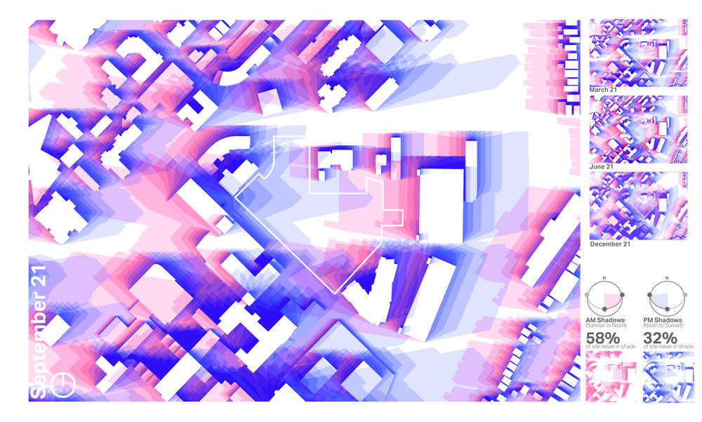
What are we looking at?
The graphic is showing shadows cast by surrounding context buildings on September 21 from sunrise to sunset, in 1 hour time step. The aim was to study shadow patterns in comparison to the two different occupancy patterns of the site (i.e. AM and PM). To this end, the shadows are color-coded into red for sunrise till noon and blue for noon till sunset. This is one of four boards showing shadow analysis through Spring, Summer, Fall and Winter.The aim was to represent these as simply as possible while creating an engaging visual for the non-design community as well. Interestingly, the shadow overlap colors thus generated were eventually used in the overall graphics theme of the final package.
How did you make the graphic?
After the location and orientation were cross-checked, shadows for each hour were exported as image files. The images were separated based on time and color-coded using Grasshopper, Photoshop and Illustrator which generated darker color for each overlap. To get accurate area of the site boundary which is not shaded, each image file is passed through a Grasshopper image processing script. The hourly values were used in the detailed version whereas for the purpose of this graphic the output was averaged for AM and PM.
What specific investigation questions led to the production of this graphic?
What is the impact of context shadows on site's solar access during different seasons? How can the regions in shade as well as their overlap frequency (darker colors) inform the landscape design strategy, specifically the planting pattern for different seasons? Where can we place mechanical equipment or other site equipment without reducing a solar access?
How does this graphic fit into the larger design investigations and what did you learn from producing the graphic?
The graphic was originally intended to study shadow patterns in comparison to the two dominant occupancy patterns and usage of the site i.e. before noon and after 2 pm. However, many more design questions were answered using this study in the larger project investigations such as placement of various programmatic elements such as parking so as to cause minimum disruption to solar access, placement of buildings on site and their heights, the landscape planting strategy based on High, Medium and Low shaded areas during each season, potential future shadow impacts etc. The most important thing I learnt was that sometimes minimum interventions can transform something basic into a something more intuitive and informative to a larger audience. Analytical graphics does not have to be complicated.
What was successful and/or unique about the graphic in how it communicates information?
The most successful aspect of this graphic is that people want to look at it! This automatically leads to interesting questions and useful insights from a room full of people. On one hand it is just a shadow study while on the other hand, there are a lot of useful information one can derive from it. The remaining three images for March, June and December combined with this one together gives a holistic picture of solar access and shade on the site.
What would you have done differently with the graphic if you had more time/fee?
I would have used the color coding and graphic's layout into an interactive dashboard and created animation of the shadows as per user inputs of time of day and season. The four graphics of different seasons played one after the sufficed in this case.