PROJECT INFORMATION
Graphic Name: What is the impact of improved envelope and enhanced comfort systems on peak load?
Submitted by: Jared Landsman
Firm Name: Integral Group
Other contributors or acknowledgements (optional): Neil Bulger
What tools did you use to create the graphic?
-
OpenStudio
-
EnergyPlus
What kind of graphic is this? Scatter Plot
Primary Inputs: Insulation, Glazing, Infiltration, Ceiling Fans, Shading
Primary Outputs: Peak Cooling Load, Peak Heating Load
GRAPHIC INFORMATION
What are we looking at?
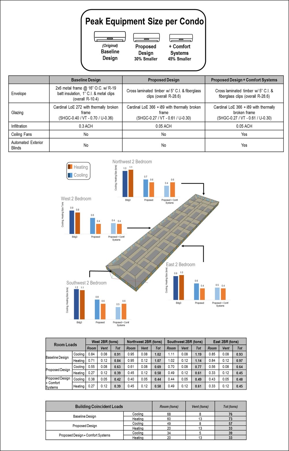
The graphic displays the peak cooling and heating loads for different units of a multifamily residential building under different design conditions. The graphic includes tables of simulation inputs and resulting room and building loads.
How did you make the graphic?
After running the simulation for different design conditions, peak load data was extracted from the load summary report and post processed in excel. Subsequently, the data and graphics were combined in Microsoft PowerPoint.
What specific investigation questions led to the production of this graphic?
The design team was investigating the potential of reducing the size of HVAC systems to satisfy the peak load for multifamily residential units by using a high performance envelope and additional comfort systems (solar control on the south and west facades through automated exterior blinds and ceiling fans in each unit for improved air-movement).
How does this graphic fit into the larger design investigations and what did you learn from producing the graphic?
The overall project was investigating the potential redesign of a multifamily residential building in Boston, MA, with a focus on sustainability, constructability, and integrated design. This graphic was part of an effort to justify the reduction in size of the HVAC system by transferring the first cost to an optimized envelope.
What was successful and/or unique about the graphic in how it communicates information?
The graphic was successful in its clear depiction of the inputs and metrics in both a visual and table format. In addition, the optimization of envelope to reduce peak load and in turn reduce HVAC equipment, is an area of analysis that often gets overlooked and therefore the graphic was providing a unique perspective on building design.
What would you have done differently with the graphic if you had more time/fee?
With more time, I would have incorporated more performance metrics into the graphic such as annual energy and cost data.