PROJECT INFORMATION
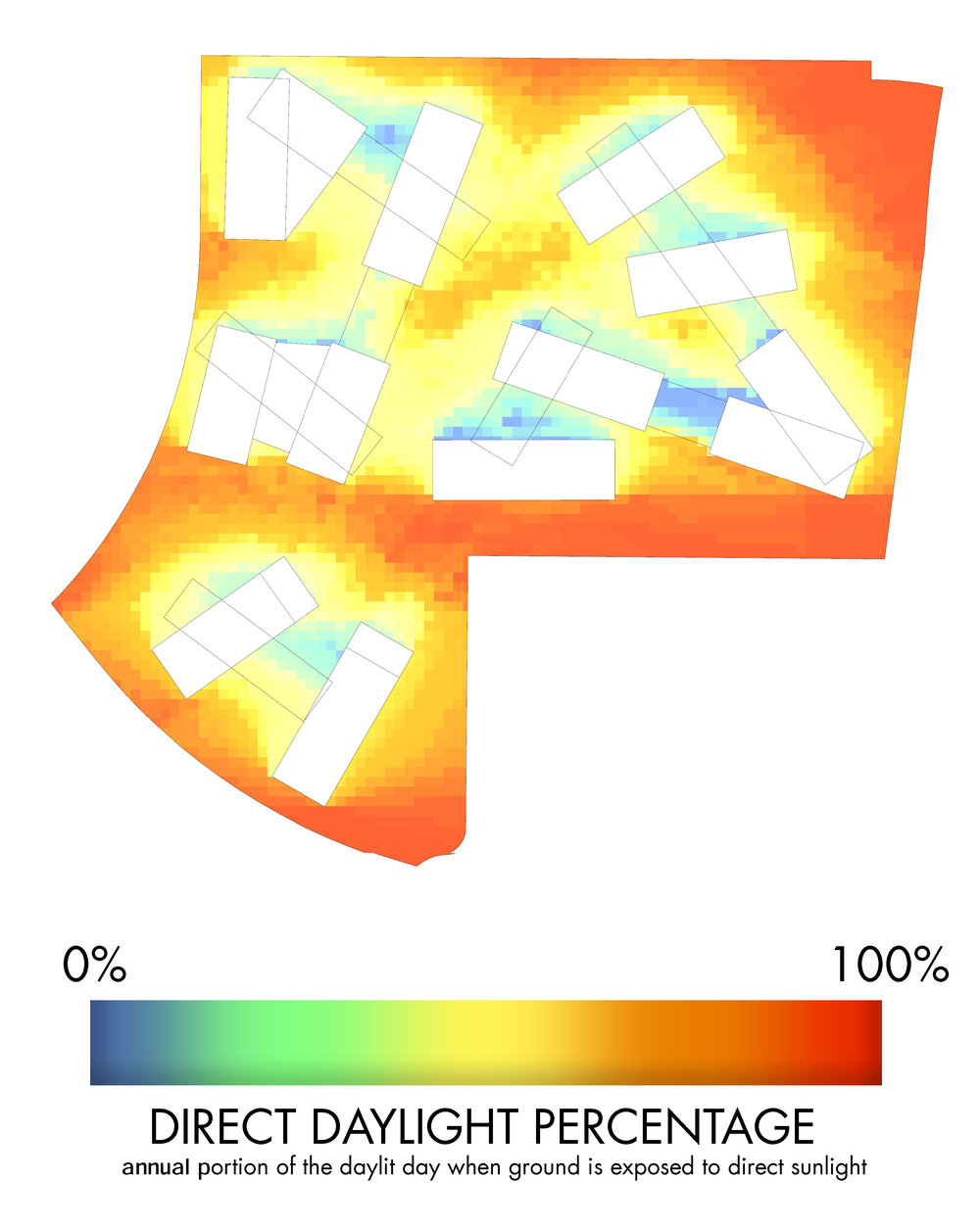
Graphic Name: What percent of the day does the public space get exposed to direct sunlight?
Submitted by: Elizabeth de Regt
Firm Name: ZGF Architects LLP
Other contributors or acknowledgements (optional)
What tools did you use to create the graphic?
-
Excel
-
Grasshopper Diva
What kind of graphic is this?
Primary Inputs: Building massing, topography, weather data
Primary Outputs: Annual Shadow/Daylight data
GRAPHIC INFORMATION
What are we looking at?
This graphic displays a heat map of direct daylight, similar to overlaying a year's worth of shadow studies on one image. It is a simple method of showing which areas get more and less daylight throughout the year. Similar methods can be used to chop the year into seasons, time of day, or other more detailed analyses as needed.
How did you make the graphic?
This graphic was created by manipulating the output data created while using Diva to run annual daylight analyses. Excel was used to divide the number of hours of direct daylight at each grid location by the number of hours of direct daylight received by a flat surface in this location. This information as then fed back into Diva to produce the graphic display of the site.
What specific investigation questions led to the production of this graphic?
What areas of the site are too dark? Which areas get lots of sunlight? Should the massing be adjusted to change these results? Are certain exterior programmatic pieces more suited to some areas than others?
How does this graphic fit into the larger design investigations and what did you learn from producing the graphic?
While laying out building massing and exterior program elements, it became necessary to analyze the brightest and darkest areas of the site. While a series of typical shadow studies displaying shading at various times of day and year would give an idea of the lighting levels, this graphic combines that information into a single visual. This allows a viewer to immediately understand the levels of sunlight throughout the site. It also allows designers to manipulate the massing in order to shift the results according to design constraints.
What was successful and/or unique about the graphic in how it communicates information?
This graphic is able to combine a year's worth of exterior daylighting data into a single graphic. It is easily decipherable by those outside the construction industry and can be used throughout the design process to inform massing decisions.
What would you have done differently with the graphic if you had more time/fee?
It would be useful to make this a live graphic, such that any changes to the massing would be immediately reflected in the graphic. Daylight simulation constraints, as well as Diva for Grasshoppers interface, make this difficult to achieve.