PROJECT INFORMATION
Graphic Name: How can I visualize the upstream and downstream impact of design decisions??
Submitted by: Aly Abdelalim, PhD
Firm Name:
Other contributors or acknowledgements (optional): William O’Brien (contributor). Natural Resources Canada (NRCan), Autodesk, and the Natural Sciences and Engineering Research Council (NSERC) are acknowledged
What tools did you use to create the graphic?
-
EnergyPlus
-
D3.js
-
Excel
-
PHP
-
HTML
-
JAVA Script
What kind of graphic is this? Sankey Diagram
Primary Inputs: The user inserts multiple E+ IDF files (i.e. for each design option). The user then selects the spatial (i.e. building-level and HVAC) and temporal (hourly, daily, and monthly) resolution required for the analysis.
Primary Outputs: Hourly E+ simulation outputs: energy consumption by (lighting, equipment, HVAC system components for different loops) and heat gain/losses (from windows, people, and opaque envelope components).
GRAPHIC INFORMATION
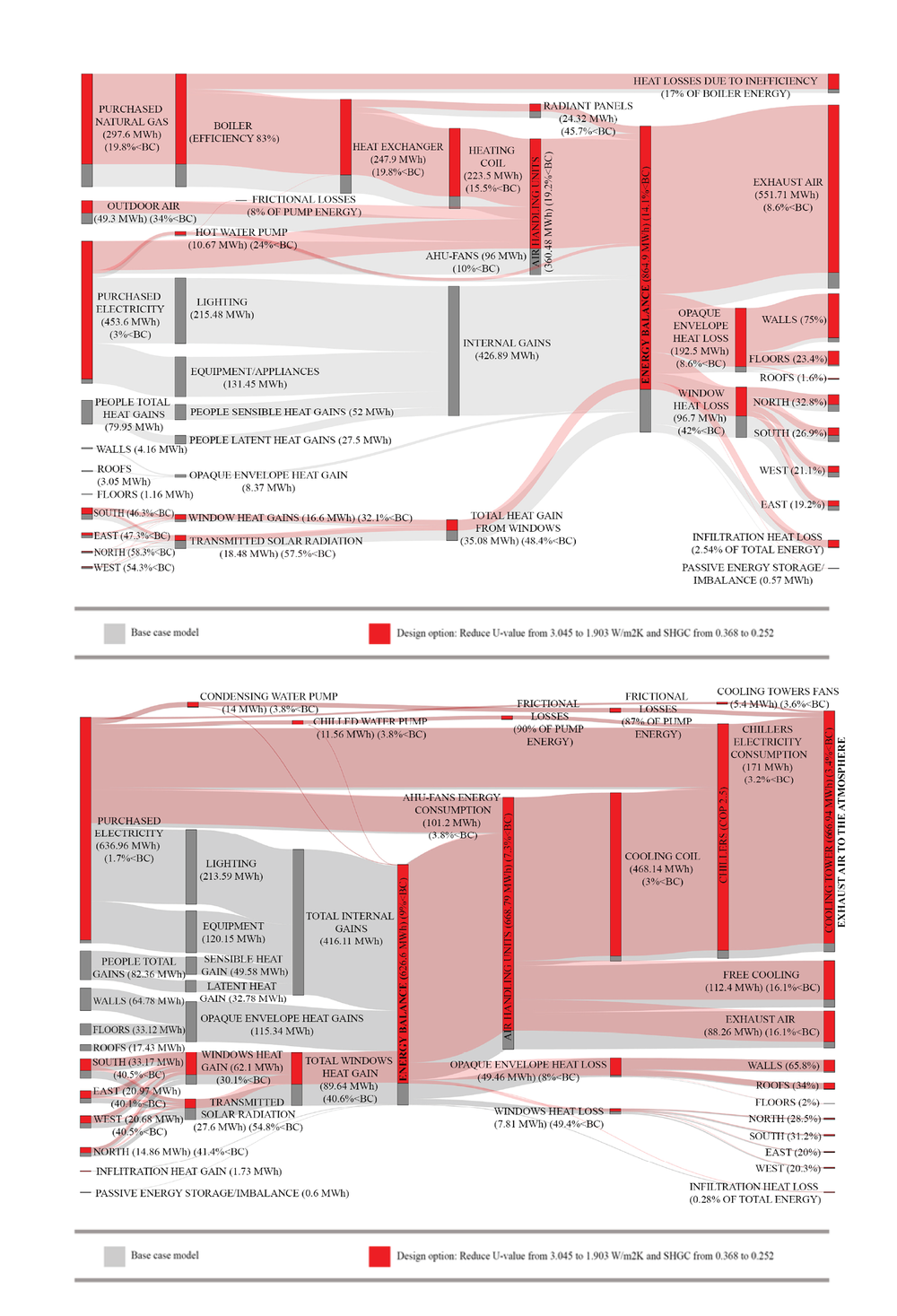
What are we looking at?
Sankey diagrams showing (detailed) energy flows (grey for BC and red for Case C: improved windows) on building-level for the winter season (top) and summer season (bottom). Energy flows for Case A that are equal to the energy flows for BC were removed to make the diagram more legible.
The aim of the Sankey diagrams is to show how the energy enters and leaves/being consumed by different components on the building-level. The multi-layer Sankey diagrams on the building-level are created from E+ simulation outputs. It helps the users to understand the upstream and downstream impact of design decisions
How did you make the graphic?
The framework entails the development of a user-graphical interface webpage using Hypertext Preprocessor (PHP), JavaScript, and Hypertext Markup Language (HTML). The user at first inserts the IDF (EnergyPlus input) file (without including the list of output variables and meters) on the webpage and selects the building type that corresponds to the same in the IDF file. The output variables and meters are then appended to the EnergyPlus IDF file using PHP code. The user then runs the generated IDF file including list of simulation output variables and meters in EnergyPlus V8.6 on local machine and imports the simulation output files (ESO) in the webpage. The PHP code then analyzes the ESO file by matching certain strings and patterns in the IDF file. The PHP code also generates CSV files that are read by JavaScript code to generate the Sankey diagrams. The PHP also checks and corrects the energy balance across each component on the building-level and HVAC system. The user can control the displayed diagrams, including number of diagrams, colors, and fonts. The user also can select spatial resolution (i.e. building-level and HVAC system) and temporal resolution (i.e. monthly, daily, and hourly).
What specific investigation questions led to the production of this graphic?
Building performance simulation tools provide vast data-sets of outputs, which requires a strong background in building physics to properly comprehend. Most existing BPS tools utilize conventional data visualization techniques and tables to display the simulation results. However, as claimed by numerous authors e.g. (Pratt & Bosworth, 2011), conveying simulation results in the form of tables and graphs is not useful to non-experts in the field of building physics.
How does this graphic fit into the larger design investigations and what did you learn from producing the graphic?
Compared to bar graphs and other conventional graphs, Sankey diagrams facilitate the visualization of not only proportions but also the direction of flow of energy within buildings and their systems. For instance, Sankey diagrams were able to visualize the amount of lighting energy to the total internal heat gains. Moreover, they can visualize the amount of mechanical cooling required to remove internal heat gains. Furthermore, Sankey diagrams demonstrated their usability and effectiveness to compare one design variant at a time or all design variants in one diagram. This could help different BPS users evaluate different design alternatives and facilitate the decision-making process. Moreover, the online tool developed allowed users to understand how the energy flows change over time.
What was successful and/or unique about the graphic in how it communicates information?
Sankey diagrams with simple components could be useful in early design stages in determining the amount of energy in – energy used – energy wasted. Sankey diagrams with more complexity could be useful to understand how the energy is being consumed by different components (such as lighting, equipment/appliances, heating coils, radiant panels, AHU-fans and pumps). Sankey diagrams with more detailed energy flows could be useful to inspect system/building components inefficiencies and provide better understanding on the impact of changing building/system components on the whole system performance.
What would you have done differently with the graphic if you had more time/fee?
Future steps for this research include: 1) developing a framework to execute EnergyPlus on a cloud server to automate the process of obtaining ESO files, 2) developing code to generate feedback loops (i.e. recovered energy) for HVAC system, 3) testing the developed workflow on other building systems, 4) integrating the developed framework to automate the process of creating Sankey diagrams into commercial tools, and 5) integrating Sankey diagrams to parametric building modelling tools.