PROJECT INFORMATION
Graphic Name: What is the impact of shade on hourly ASHRAE 55 thermal comfort acceptability limits?
Submitted by: Madeline Gradillas
Firm Name: Atelier Ten
Other contributors or acknowledgements (optional) An Vo – Atelier Ten, Kyosuke Hiyama – Meiji University
What tools did you use to create the graphic?
- Design Builder
- Excel
- Adobe Illustrator
- Adobe InDesign
- Archsim
What kind of graphic is this? 12/24 Plot
Primary Inputs: outdoor climate/weather data, shade vs. sun
Primary Outputs: hourly temperature delta to achieve ASHRAE 55 80% acceptability limit (<20% PPD)
GRAPHIC INFORMATION
What are we looking at?
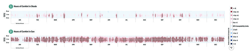
Examples of a chart plotting annual hourly values, where the horizontal shows each day of the year and vertical each hour of the day.
Each data point is plotted according to a conditional relationship with established standards and/or project specific design questions. The light blue color represents hours that meet ASHRAE 55’s 80% acceptability limits (<20% PPD), while the other colors in the legend show how many degrees Fahrenheit (in operative temperature) it would take to achieve the 80% acceptability limit threshold.
Two sample uses of the hourly chart are shown here:
Example 1 (top image) – Operative Temperature, per ASHRAE 55 Adaptive Thermal Comfort Model 80% Acceptability Limits
Example 2 (bottom image) – Perceived Operative Temperature of a Body in Direct Sun, per ASHRAE 55 Adaptive Thermal Comfort Model 80% Acceptability Limits
How did you make the graphic?
Excel was used to post-process the data. Illustrator and InDesign were used to edit the original chart into a legible graphic.
What specific investigation questions led to the production of this graphic?
This graphic was first developed to be a flexible tool for post-analysis assessment, to understand the relationship between energy model/calculative outputs and project-specific questions such as:
-When does the value fall out of acceptability limits? What is the magnitude and frequency of these occurrences over a year?
-Do client or designer expectations of acceptability match those of the established standards’?
-Do the values show daily and/or seasonal trends?
How does this graphic fit into the larger design investigations and what did you learn from producing the graphic?
This is a useful as tool to establish baseline performance during conceptual design, and then as a comparison tool during design development.
Several plots can be easily viewed side by side to track the effect of design decisions on project performance.
Because data is plotted according to a series of conditional statements explicitly defined by the analyst, the resulting graphics’ communicative success depends on the clarity of questions the analyst asks during its making.
What was successful and/or unique about the graphic in how it communicates information?
We continue to adapt this graphic at Atelier Ten to help ourselves and clients better understand increasingly complex questions and discover correlations between performance and design decisions, without having to re-run time-consuming models every time a design changes. Example 2 is one of the more recent plots that shows not only the relationship of operative temperature to ASHRAE adaptive comfort limits, but the “perceived” operative temperature an occupant experiences when in direct sun.
We found both graphics helpful when viewed side by side to communicate the importance of an extensive exterior shading system that was in danger of being VE’d out of a project.
What would you have done differently with the graphic if you had more time/fee?
Our current Excel to Illustrator to InDesign workflow is clunky. Ideally this tool would auto-populate a legend and chart text that are easy to customize.