PROJECT INFORMATION
Graphic Name: What’s the impact of different glazing patterns on daylight illuminance?
Submitted by: Jacob Dunn
Firm Name: Eskew+Dumez+Ripple
Other contributors or acknowledgements (optional): Z Smith – Eskew+Dumez+Ripple
What tools did you use to create the graphic? Autodesk Insight 360 (Daylight) / Indesign
What kind of graphic is this? Graphic Table
Primary Inputs: building geometry, material reflectances, glazing specifications
Primary Outputs: % area above illuminance threshold, % window to wall area ratio
GRAPHIC INFORMATION
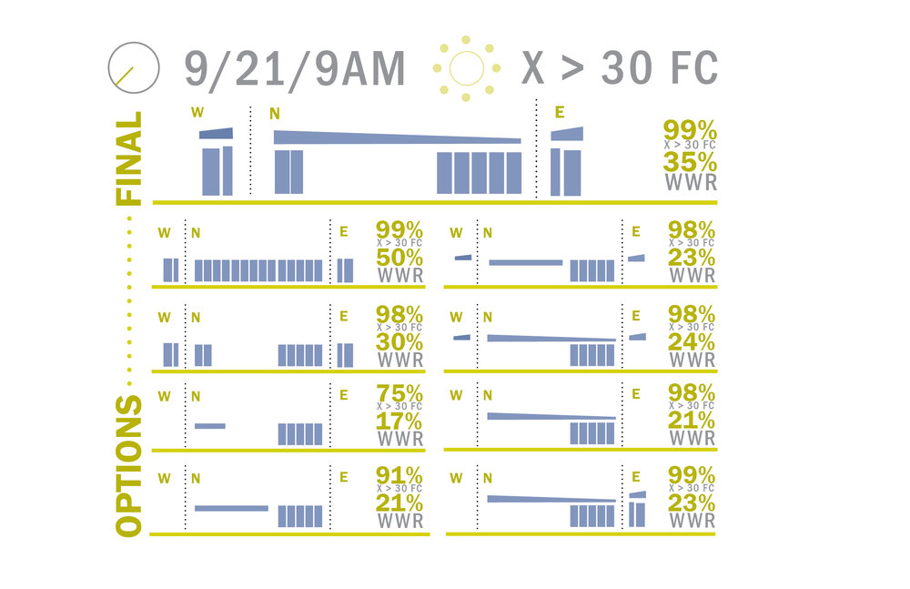
What are we looking at?
This is a combination graphic that shows nine design iterations, each with two pieces of information simultaneously: the percentage of the space that is daylit and the amount/distribution of glazing for each iteration. The number in the upper right hand corner of each option shows the % daylit value for the project at a single point in time. The illumination criteria, time, and sky condition are listed at the top of the graphic (>30 footcandles, 9/21 9am, sunny sky). The second percentage number represents the window to wall area ratio for that option (E, W, and N façade). Additionally, a simplified diagram of the façade window pattern is shown, unfolded, for those three orientations. Smaller thumbnails are shown for all of the images, while the recommended option is enlarged at the top.
How did you make the graphic?
I exported the three Revit model elevations for a couple of the options and drew over them in Indesign to get the window patterns. Once I had all of the different window shapes I could just draw and reconfigure the diagrams without having to export from Revit. Once that was completed, I simply added the output daylight values from the Autodesk Lighting Analysis for Revit simulations on the right hand side of each diagram.
What specific investigation questions led to the production of this graphic?
What was the highest amount of daylight we could achieve with the lowest window to wall area ratio that still met all of the functional and aesthetic requirements of the project.
How does this graphic fit into the larger design investigations and what did you learn from producing the graphic?
The project goal was to design a net zero single-space classroom building that was 100% daylit. The analysis team was brought into the project after a form and glazing pattern had been decided, which was close to 80% WWR on the north, west, and east sides of the building. Given the space was fairly small and thin (roughly 25′ by 50′), we knew that daylighting shouldn’t be an issue. However, since we were targeting net zero, we wanted to make sure we reduced the WWR as much as possible to lower impact on heating and cooling, while still saving as much lighting energy as possible with a fully daylit environment. Between the different options, the lowest WWR (17%) produced a 75% daylit space, while baseline WWR (50%, whole building) produced a 99% daylit space. Most importantly, the analysis showed that WWR between as low as 23%, with the right distribution, could achieve a 99% daylt space. The team ended up reducing the amount of windows to 35% based on this analysis, which was deemed the right balance between façade patterning and performance. This value was then used as one of multiple efficiency measures in a comprehensive net zero modeling analysis.
What was successful and/or unique about the graphic in how it communicates information?
I think the main benefit of this type of combination graphic is that it simultaneously allows viewers to understand both the design and performance impact between the different options. This is especially helpful when working internally with design teams who need to understand the formal implications of the analysis, which is where spatially-integrated graphics can go along way.
What would you have done differently with the graphic if you had more time/fee?
Despite how simplicity of the diagrammatic representations of the façade and the two metrics, the graphic is still quite dense. It still takes a lot of focus to look between the different options and compare them to eachother. Locating each one on a scatter plot, color coding the % values in a heat map, or simply ranking them by daylight performance would have made it more apparent which options performed best.